College attainment is a compelling topic for me. Both of my parents had educations that stopped at the 8th grade (although my mother got a GED as an adult), and none of my siblings graduated from college. So I'm keenly aware of the value of a college degree, and the importance of the opportunity to earn a degree. But where opportunity resides, and how that has shifted over time, are both important topics worthy of exploration and discussion.
I suppose it's no secret that urban areas in the US have more college educated people than rural areas do. But has it always been that way?
Yes. And no.
Yes, it's always been that way because on average, rural areas have always had lower college degree attainment rates that urban areas. No, it's not always been as bad as it is now. As educational attainment in the US increased (see this visualization, which was so astonishing to me that I had to check the numbers; I've updated it here) most of that increase has accrued in urban areas.
One explanation, of course, is that students from urban areas might be more likely to go to college; another is that people with college degrees are more likely to be attracted to the types of jobs that require college degrees, which tend to be in urban areas. Or, it may be educational deserts that limit both exposure and opportunity of students in rural areas.
This matters for a lot of reasons, not the least of which is the great divide in American politics these days. As I've published before, counties with higher college degree attainment rates (again, mostly urban) tend to vote for Democrats, while counties with lower educational attainment rates tend to vote for Republicans. Lots of people have leapt to the wrong conclusions about what this means, or what causes it, and depending on your side of the political fence, you may take solace or have great concern about the trend.
But those of us who work in higher education look at this gap and see it as an opportunity gap as much as an attainment gap, because parents with college degrees tend to have children who earn college degrees.
Here is the USDA data which I've downloaded, cleaned up and restructured in order to present it here. (If you use Higher Ed Data Stories in your job and want to support hosting costs, software costs, and time invested, you can Buy Me a Coffee here. But if you're a counselor who uses this data in your work of helping students go to college, just ignore that link! )
Onto the data, in six views:
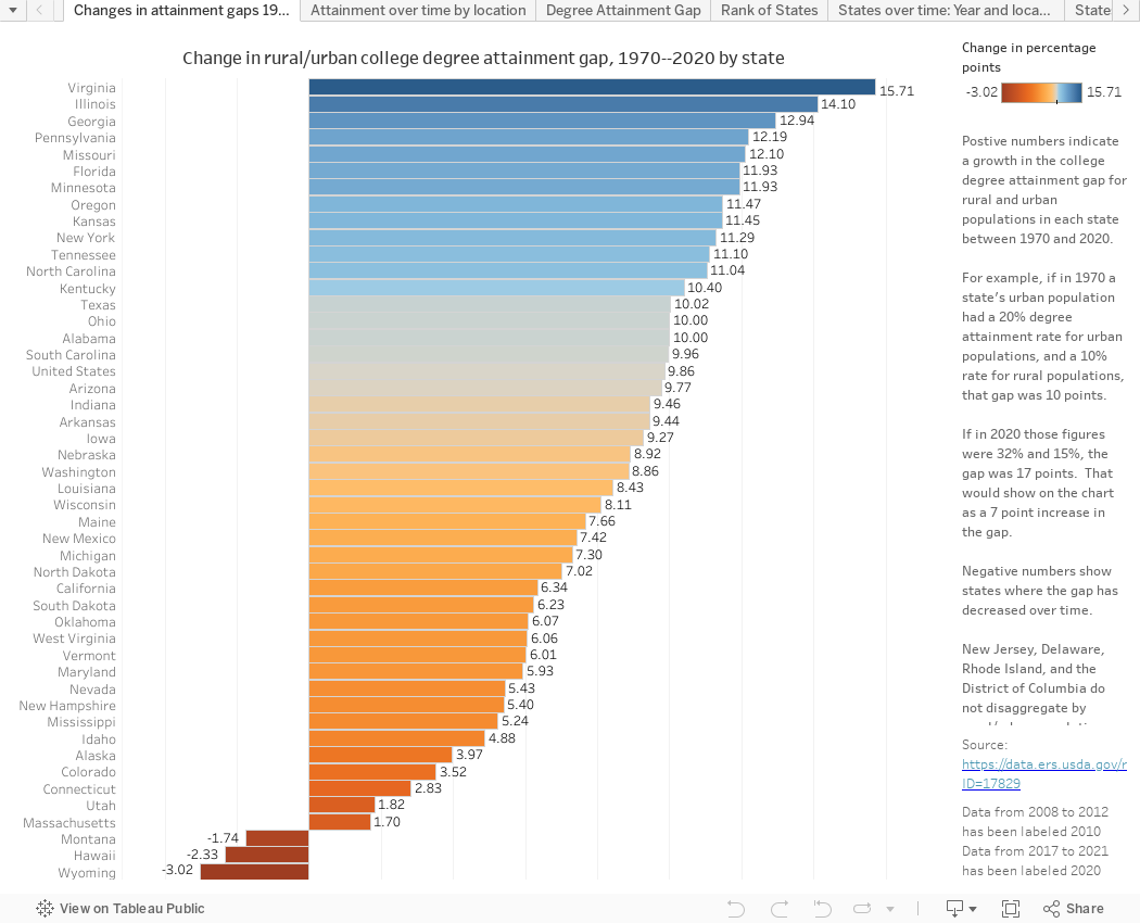
The first view, Changes in Attainment Gaps, shows how the gaps between urban and rural attainment rates have changed between 1970 and 2020. It's static, but gives you a good place to put your feet down. The gap has increased in the US by almost ten points over that time, and you can see which states are doing better (low numbers) and worse (high numbers). Be sure to read the explanation of what you're looking at on the right.
The second view (using the tabs across the top), Attainment Over Time by Location, shows four different attainment levels. As you can see, the percentage of people whose highest level of attainment is a "less than a high school diploma" is shrinking while other levels are increasing. Choose years and regions and filter to just one attainment level if you want to interact.
The third view, Degree Attainment Gap, shows the degree of variation between urban and rural areas on two college attendance levels. The filter at top right changes the view from the US to any state you select. Note that New Jersey, Delaware, Rhode Island, and the District of Columbia do not disaggregate, so no values can be calculated.
The fourth view, Rank of States shows where your state stands among all the other states on any educational attainment level. You can choose any attainment level, and urban, rural, or total populations, but you really should use the highlight filter at top right to showcase individual states and the trend over time.
The last two views show the same data, just categorized differently: States over Time Year and Location and States Over Time Location and Year group the data differently. Choose the years and the attainment level you're looking for, and the bars update for you.
I hope this points out the need to address educational opportunity and attainment among rural populations, and I hope you'll let me know what you see that seems compelling or interesting. Leave a comment below.
Comments
Post a Comment