<Still under construction>
Almost every data display I do on this blog is created in Tableau Software. While you'll probably notice the aesthetic characteristics of the beautiful charts right away, the real power of Tableau is the ability of the viewer to interact, and to create your own view of the data.
Doing some analysis of visitors, though, it seems a lot come for a quick look at the chart and bug out. While there is nothing wrong with that, I think these people are missing a lot.
So, here are a couple of tips to get you going. Let's take a look at a simple one, first: My post on Endowment Resources and the Enrollment of Low-Income Students.

What you see is 961 dots arranged on two scales, with each dot being one college: The x-axis compares the percentage of students with no financial aid from the institution (so-called "full-pay") to the percentage with Pell Grants (the program for low-income students). Colleges to the right have more full-pay than Pell students, and colleges to the left have more Pell than full-pay. The y-axis shows institutional wealth in terms of endowment resources per FTE (full-time equivalent enrollment). It's not perfect because these colleges represent a wide range of missions and purposes, and not all endowment resources are unrestricted, but it's still a fair proxy. In general, colleges higher on the chart have more wealth.
Let's start with an easy one. But before that, a simple tip. I think people are afraid of breaking things. No matter what you do; no matter how far down a wormhole you get; you can always find your way out by clicking this little icon at the bottom of the visualization to re-set it.
Click on any of the screenshots below for a larger view.

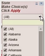
On the right, there are several filters. Let's say we want to look at colleges in just one state, Massachusetts. It's easy. Click on the dropdown box and first de-select "All." Then click "Massachusetts," and click "Apply." And instantly, the view changes to show only colleges in Massachusetts.


Almost every data display I do on this blog is created in Tableau Software. While you'll probably notice the aesthetic characteristics of the beautiful charts right away, the real power of Tableau is the ability of the viewer to interact, and to create your own view of the data.
Doing some analysis of visitors, though, it seems a lot come for a quick look at the chart and bug out. While there is nothing wrong with that, I think these people are missing a lot.
So, here are a couple of tips to get you going. Let's take a look at a simple one, first: My post on Endowment Resources and the Enrollment of Low-Income Students.
What you see is 961 dots arranged on two scales, with each dot being one college: The x-axis compares the percentage of students with no financial aid from the institution (so-called "full-pay") to the percentage with Pell Grants (the program for low-income students). Colleges to the right have more full-pay than Pell students, and colleges to the left have more Pell than full-pay. The y-axis shows institutional wealth in terms of endowment resources per FTE (full-time equivalent enrollment). It's not perfect because these colleges represent a wide range of missions and purposes, and not all endowment resources are unrestricted, but it's still a fair proxy. In general, colleges higher on the chart have more wealth.
Let's start with an easy one. But before that, a simple tip. I think people are afraid of breaking things. No matter what you do; no matter how far down a wormhole you get; you can always find your way out by clicking this little icon at the bottom of the visualization to re-set it.
Click on any of the screenshots below for a larger view.
On the right, there are several filters. Let's say we want to look at colleges in just one state, Massachusetts. It's easy. Click on the dropdown box and first de-select "All." Then click "Massachusetts," and click "Apply." And instantly, the view changes to show only colleges in Massachusetts.
OK, but everyone knows there are good colleges outside of Massachusetts, right? What if we wanted Massachusetts, Connecticut, New York and New Jersey? Easy. Boom.
And Boom:
Easy, right? Let's reset the view to all 961 colleges, and use one of the other filters, Mean SAT Score (on the 1600 point CR+M scale.) Suppose I only wanted to look at colleges with mean SAT scores of 1100 to 1400? All I need to do is pull the sliders (this one lets you do it in both directions) to change the display. You can either slide the ends of the sliders, or double click in the box and type the values you want.
Now, all we see is those colleges
Of course, you can combine filters, and look at only colleges on the West Coast with Mean SAT scores between 800 and 1000, or in any combination you want.
Finally, on this view, you notice that the institutions, represented by the dots, are colored. Each color represents a selectivity band (that is, the percent of freshman applicants offered admission.) The red dots are the most selective, admitting less than 15% of freshman applicants. What if we wanted to look at just them? Tableau gives you two ways to do that: First, you can see the filter at the top right. You know by now that you can just click on the dropdown and select "Under 15%" and click apply.
And immediately, a pattern appears. The most selective institutions have way more full-pay students than Pell students, for the most part.
But Tableau gives us another option. Go back and reset the view, then hover over the color legend in the top left. Wait until the pencil appears and the box saying "Highlight Selected Items" pops up. Click on the pencil, then click on the "Under 15%" box.
Now, instead of filtering, Tableau highlights the selection, so you can see it in context. Now the pattern appears, but you can also see where those institutions compare to other, less selective colleges.
And you can do it for any group, like the 15% to 30% group, too.
In fact, try clicking through the colors to see if you notice anything.
The lesson here is that you get more from a visualization if you interact with it. And remember, your "Get out of Jail Free" card is always there, ready to help.
Comments
Post a Comment