One of the intended consequences of test-optional admission policies at some institutions prior to the COVID-19 pandemic was to raise test scores reported to US News and World Report. It's rare that you would see a proponent of test-optional admission like me admit that, but to deny it would be foolish.
Because I worked at DePaul, which was an early adopter of the approach (at least among large universities), I fielded a lot of calls from colleagues who were considering it, some of whom were explicit in their reasons for doing so. One person I spoke to came right out at the start of the call: She was only calling, she said, because her provost wanted to know how much they could raise scores if they went test-optional.
If I sensed or heard that motivation, I advised people against it. In those days, the vast majority of students took standardized admission tests like the SAT or ACT, but the percentage of students applying without tests was still relatively small; the needle would not move appreciably by going to test-optional admission.
On the other hand, of course, I knew the pressure admissions offices were under by trustees, presidents, provosts, and faculty, and as Campbell's Law and its many variants tells us, what gets measured gets produced. DePaul, a private university with a public mission, was using a test-optional approach to ensure those students who were a part of our mission would not be left behind as applications grew. (I often say how lucky I was to work at a place where--in 17 years--I was never once asked about how to increase test scores or selectivity, but I heard frequently about the Pell percentage in the class.)
If you wanted different outcomes, there were lots of ways to manipulate admissions statistics to effect the same outcome, I'd tell the callers.
Motivations, of course, were different in the summer of 2020, when it had become clear that test-optional admission was a necessary utilitarian decision that also carried with it good reputational benefits: Even if you were doing it to survive, you could at least look like you were being altruistic. And, of course, you could learn something in the process.
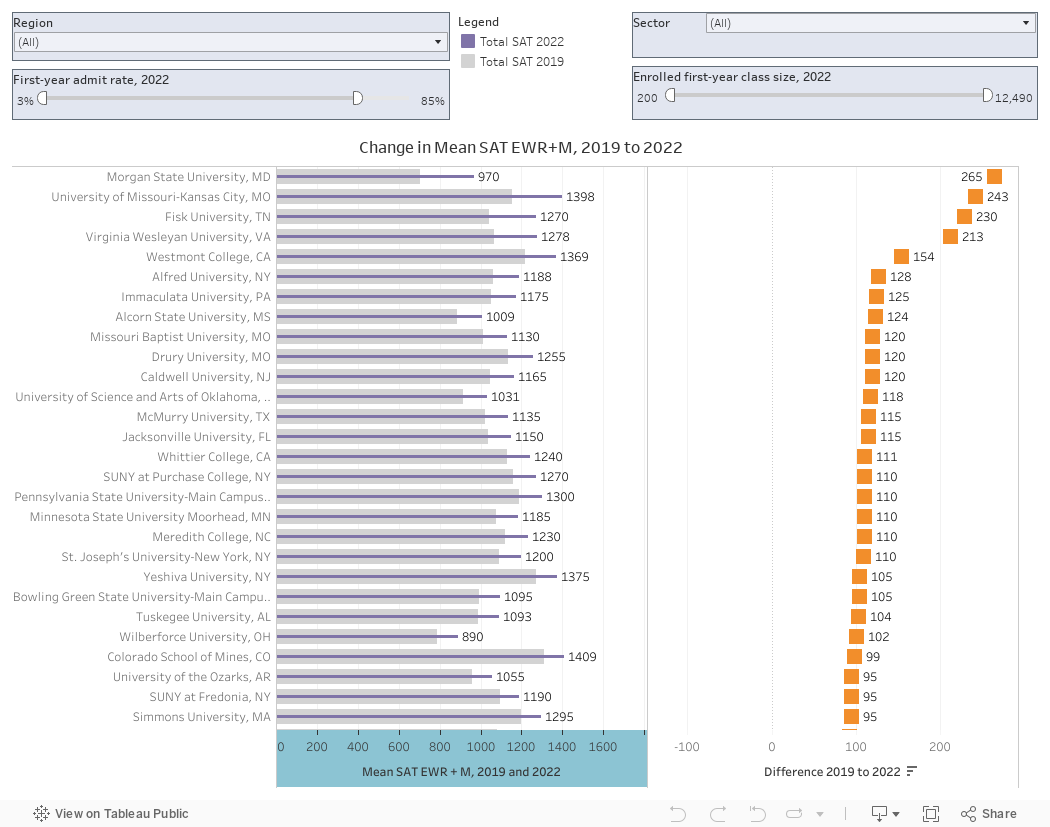
So what's happened? About what you would expect. At the overwhelming majority of colleges, the Mean SAT EWR+M score has risen between the fall of 2019 and 2022. I used 2019 as the base because the data reported to IPEDS is for enrolling students, and the 2020 term was affected by COVID.
It's dangerous, of course, to try to figure out exactly why they went up, other than the expected sampling bias. It could be that reputation that drove such things was already increasing. It could be that the college took a lot more or a lot fewer chances in admission (either is possible); it could be location and migration (out on the west coast, people care about tests, it seems, a lot less than they do in the Eastern Time Zone), and students who cross state lines to attend college tend to be wealthier, and wealthier students tend to score higher on tests.
Or it could be all of those things, and others. We'll never really know. But it's still fun to look at. So here we go, with just one view this time.
One the left are mean SAT scores in 2019 and 2022, calculated from the reported 25th and 75th percentiles of the two sections. Numbers are rounded. On the left are gray bars with the 2019 figure, and purple bars with the 2022 score. On the right are the changes, and the chart is sorted on the value in descending order.
There are four filters to get the view you want: At top left you can use the control to limit the region; at top right you can look at public and/or private four-year universities. You can also use the sliders to look at colleges by limiting the 2022 selectivity or class size.
Again, this is interesting, but not necessarily instructive. See if you can guess what your favorite college looks like before and after the pandemic. Have fun.
(Note: Some institutions that went test-optional stopped reporting test scores as a result, and they are not included here.)
Comments
Post a Comment