
A different look at US Educational Attainment

I've often said that the visualization on educational attainment in the US was perhaps the first visualization I did that blew my mind.  I thought it was a problem with the data.

And, frankly, I'm possibly more amazed that more people aren't amazed.  I've done a few posts on this topic, and it never seems to get much traction.  So I'll give it another shot this time.

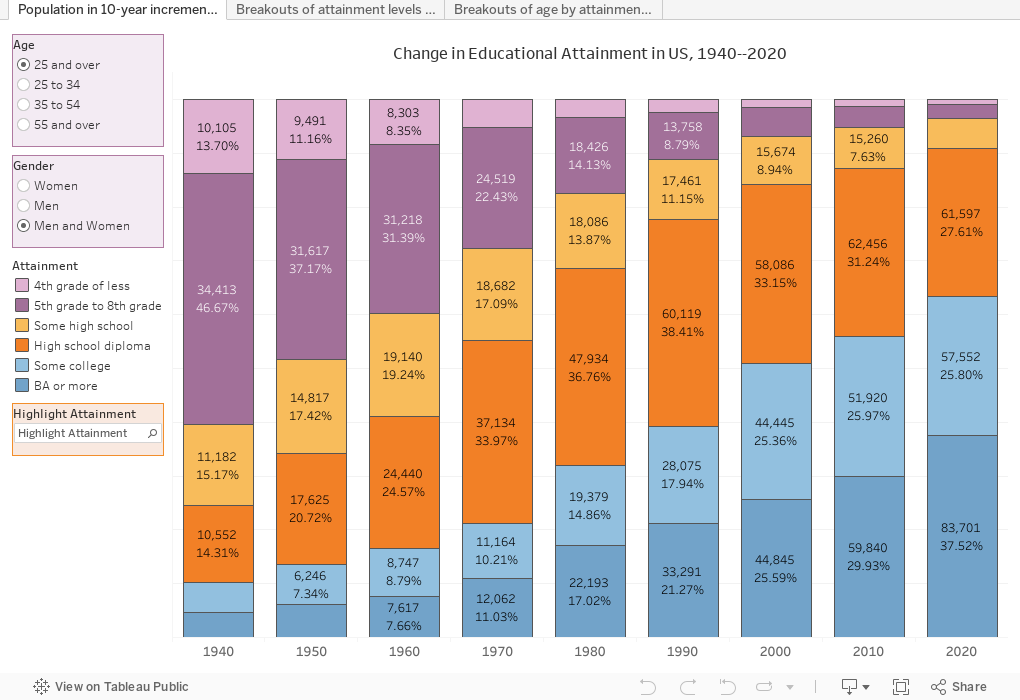
In 1940, less than 5% of adults in the US had a college degree or more.  By 2020, it's risen to almost 38%.  I was born in the late 50's and when I went to college in the 70's, the number was still only in the 15% range.  That's why the term "first generation" wasn't even a thing: The majority of college students at that time were probably first gen kids.

We were all a spillover effect of WWII and the GI Bill, which offered college access to the veterans who made it back alive (but unfortunately, the benefits didn't go to everyone who fought).  And if we know one thing, it's that people who have a college education have children who go to college.  The ramp up continued well after my time in college.

What also happened after WWII was unprecedented economic expansion.  The growth of the two indices may be coincidental; they may be cause and effect.  You decide, but I know what I think. 

Shameless plug: If HigherEdDataStories is helpful to you in your job, I would appreciate your support to defray web hosting and other costs, as I do this all on my own dime.  (Don't click if you're a high school counselor...just keep reading.  You do enough already.)

If you're a regular reader, you may recognize the first tab shown below.  It shows the profile of adults in the US from 1940 to 2020 in ten-year increments.  Use the filters at left to choose only certain age groups, or limit by gender.  The highlighter lets you more easily compare attainment levels across time.

The second tab shows the gender breakouts of each attainment level (chosen in the filter at left) over time.  The default view shows that in 2000, for instance, for all adults over 25, 51.85% of bachelor's degree holders were men.  Make you selections at left, and hover over the bars for an explanation. 

And finally, the last view (this is using the tabs across the top, of course) is quite compelling to me.  It shows the distribution of educational attainment by age.  Look at the lower right hand segment in the default view and hover for an explanation. And then notice the change in the red segments over time.

Could America be facing a shortage of college-educated people in the future as baby boomers retire?

As always, play around, use the reset button if you get stuck, and let me know what you see.


Comments

Popular posts from this blog

Educational Attainment and the Presidential Elections

I've been fascinated for a while by the connection between political leanings and education: The correlation is so strong that I once suggested that perhaps Republicans were so anti-education because, in general, places with a higher percentage of bachelor's degree recipients were more likely to vote for Democrats. The 2024 presidential election puzzled a lot of us in higher education, and perhaps these charts will show you why: We work and probably hang around mostly people with college degrees (or higher).  Our perception is limited. With the 2024 election data just out , I thought I'd take a look at the last three elections and see if the pattern I noticed in 2016 and 2020 held.  Spoiler: It did, mostly. Before you dive into this, a couple of tips: Alaska's data is always reported in a funky way, so just ignore it here.  It's a small state (in population, that is) and it's very red.  It doesn't change the overall trends even if I could figure out how to c...

Changes in AP Scores, 2022 to 2024

Used to be, with a little work, you could download very detailed data on AP results from the College Board website: For every state, and for every course, you could see performance by ethnicity.  And, if you wanted to dig really deep, you could break out details by private and public schools, and by grade level.  I used to publish the data every couple of years. Those days are gone.  The transparency The College Board touts as a value seems to have its limits, and I understand this to some extent: Racists loved to twist the data using single-factor analysis, and that's not good for a company who is trying to make business inroads with under-represented communities as they cloak their pursuit of revenue as an altruistic push toward access. They still publish data, but as I wrote about in my last post , it's far less detailed; what's more, what is easily accessible is fairly sterile, and what's more detailed seems to be structured in a way that suggests the company doesn...

The Highly Rejective Colleges

If you're not following Akil Bello on Twitter, you should be.  His timeline is filled with great insights about standardized testing, and he takes great effort to point out racism (both subtle and not-so-subtle) in higher education, all while throwing in references to the Knicks and his daughter Enid, making the experience interesting, compelling, and sometimes, fun. Recently, he created the term " highly rejective colleges " as a more apt description for what are otherwise called "highly selective colleges."  As I've said before, a college that admits 15% of applicants really has a rejections office, not an admissions office.  The term appears to have taken off on Twitter, and I hope it will stick. So I took a look at the highly rejectives (really, that's all I'm going to call them from now on) and found some interesting patterns in the data. Take a look:  The 1,132 four-year, private colleges and universities with admissions data in IPEDS are incl...