
Educational Attainment in the US, 1940--2013

The last half of the previous century was an astounding time for increasing educational attainment in the United States.  In 1940, for instance, the majority of adults had an 8th grade education or less; 13% of the adult population never made it to fifth grade.  And in 1940, if you had a college degree, you were special indeed: Only 5% of all adults were so privileged. The first interesting point is the effect of compulsory education through high school.

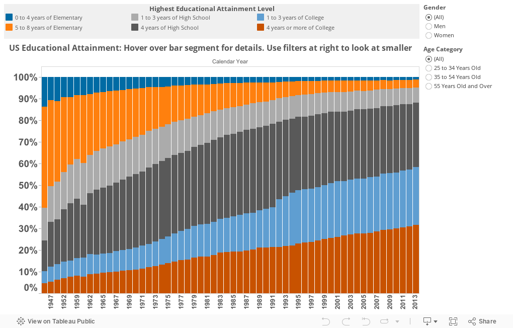
Many people believe the rise in family incomes and quality of life is related to educational attainment, although which is the cause, and which is the effect is subject to interesting debate.  It's pretty clear, however, that the end of World War II was the turning point.

This visualization started out very complex, but I decided to make it simpler in the end: Choose an age category and, if you like, a smaller subset of years.  Compare men to women in educational attainment, and see how that changes over time.

I'm drawn to the 55+ age group: The baby boomers and older.  Notice how college degrees exploded over time for both men and women, but how men in this group are still more likely to have a college degree or more.  Now look at the other age groups: In the younger categories, women have surged ahead, or, depending on your perspective, men have fallen behind.: That's the real story here.  And with enrollment rates of women continuing to be much higher than for men, it's likely to stay that way for a long time.


Comments

Popular posts from this blog

Educational Attainment and the Presidential Elections

I've been fascinated for a while by the connection between political leanings and education: The correlation is so strong that I once suggested that perhaps Republicans were so anti-education because, in general, places with a higher percentage of bachelor's degree recipients were more likely to vote for Democrats. The 2024 presidential election puzzled a lot of us in higher education, and perhaps these charts will show you why: We work and probably hang around mostly people with college degrees (or higher).  Our perception is limited. With the 2024 election data just out , I thought I'd take a look at the last three elections and see if the pattern I noticed in 2016 and 2020 held.  Spoiler: It did, mostly. Before you dive into this, a couple of tips: Alaska's data is always reported in a funky way, so just ignore it here.  It's a small state (in population, that is) and it's very red.  It doesn't change the overall trends even if I could figure out how to c...

First-year student (freshman) migration, 2022

A new approach to freshman migration, which is always a popular post on Higher Ed Data Stories. If you're a regular reader, you can go right to the visualization and start interacting with it.  And I can't stress enough: You need to use the controls and click away to get the most from these visualizations. If you're new, this post focuses on one of the most interesting data elements in IPEDS: The geographic origins of first-year (freshman) students over time.  My data set includes institutions in the 50 states and DC.  It includes four-year public and four-year, private not-for-profits that participate in Title IV programs; and it includes traditional institutions using the Carnegie classification (Doctoral, Masters, Baccalaureate, and Special Focus Schools in business, engineering, and art/design. Data from other institutions is noisy and often unreliable, or (in the case of colleges in Puerto Rico, American Samoa, and other territories, often shows close to 100% of enro...

Education Levels in the US, by State and Attainment

Attainment has always been an interesting topic for me, every since I first got stunned into disbelief when I looked at the data over time.  Even looking at shorter periods can lead to some revelations that many don't make sense at first. Here is the latest data from NCES, published in the Digest of Education Statistics . Please note that this is for informational purposes only, and I've not even attempted to visualize the standard errors in this data, which vary from state-to-state.  There are four views year, all looking at educational attainment by state in 2012 and 2022.   The first shows data on a map: Choose the year, and choose the level of attainment.  Note that the top three categories can be confusing: BA means a Bachelor's degree only; Grad degree means at least a Master's (or higher, of course); and BA or more presumably combines those two.  Again, standard errors might mean the numbers don't always add up perfectly. The second shows the data o...