Used to be, with a little work, you could download very detailed data on AP results from the College Board website: For every state, and for every course, you could see performance by ethnicity. And, if you wanted to dig really deep, you could break out details by private and public schools, and by grade level. I used to publish the data every couple of years.
Those days are gone. The transparency The College Board touts as a value seems to have its limits, and I understand this to some extent: Racists loved to twist the data using single-factor analysis, and that's not good for a company who is trying to make business inroads with under-represented communities as they cloak their pursuit of revenue as an altruistic push toward access.
They still publish data, but as I wrote about in my last post, it's far less detailed; what's more, what is easily accessible is fairly sterile, and what's more detailed seems to be structured in a way that suggests the company doesn't want you digging down into it.
But based on a series of tweets by Marco Learning, based on research by its founder John Moscatiello, I set about scraping the data off the website, as on this page for 2024, this page for 2023, and this page for 2022. After first making a mistake because of the way the data are formatted and laid out, I've done manual checks and double-checks on this, especially on the exams where the results look way out of whack with what you would expect.
Marco Learning's take was that this was intentional on the part of the College Board, and that it would continue on other exams in the future.
They also pointed out that this would save students a lot of money in college tuition, and of course, that's true; if the tests were correctly designed, and students did better, that would be good news. But the question is really: Should they be getting credit for these results? Do the changes in performance mean that students are more qualified, or that the tests are easier? And in some subjects, does giving credit for some courses actually set students up for failure in subsequent classes?
This is problematic because College Board has spent a lot of money lobbying state legislatures to pass laws requiring public universities grant credit for AP exams (usually a 3 or above). The assumption on college campuses is that--despite some mistrust of the College Board and their methods--they have good psychometricians who ensure test design meets rigorous standards that ensure a grade of 4, for instance, means the same thing today as it did five years ago.
But the incentive to enforce that rigor is gone, since states have effectively endorsed the outcomes of these exams as valid and worthy. College Board can now shift to growing market penetration, as they do when they encourage school districts to push AP, and encourage even students who might not be prepared to take AP classes.
And, of course, as always seems to be the case, there is some measure of hypocrisy in the current statements of College Board compared to things they've said in the past. Remember the book "Measuring Success" which was written in large part by College Board staff members and fans, and railed against grade inflation, using data that suggested otherwise? (College Board disavows any formal connection to the book, but their Communications Staff Members were thanked in the foreword.)
Paul Tough, in his book "The Years that Matter Most" pointed out that College Board's own conclusions contradict the evidence they published:

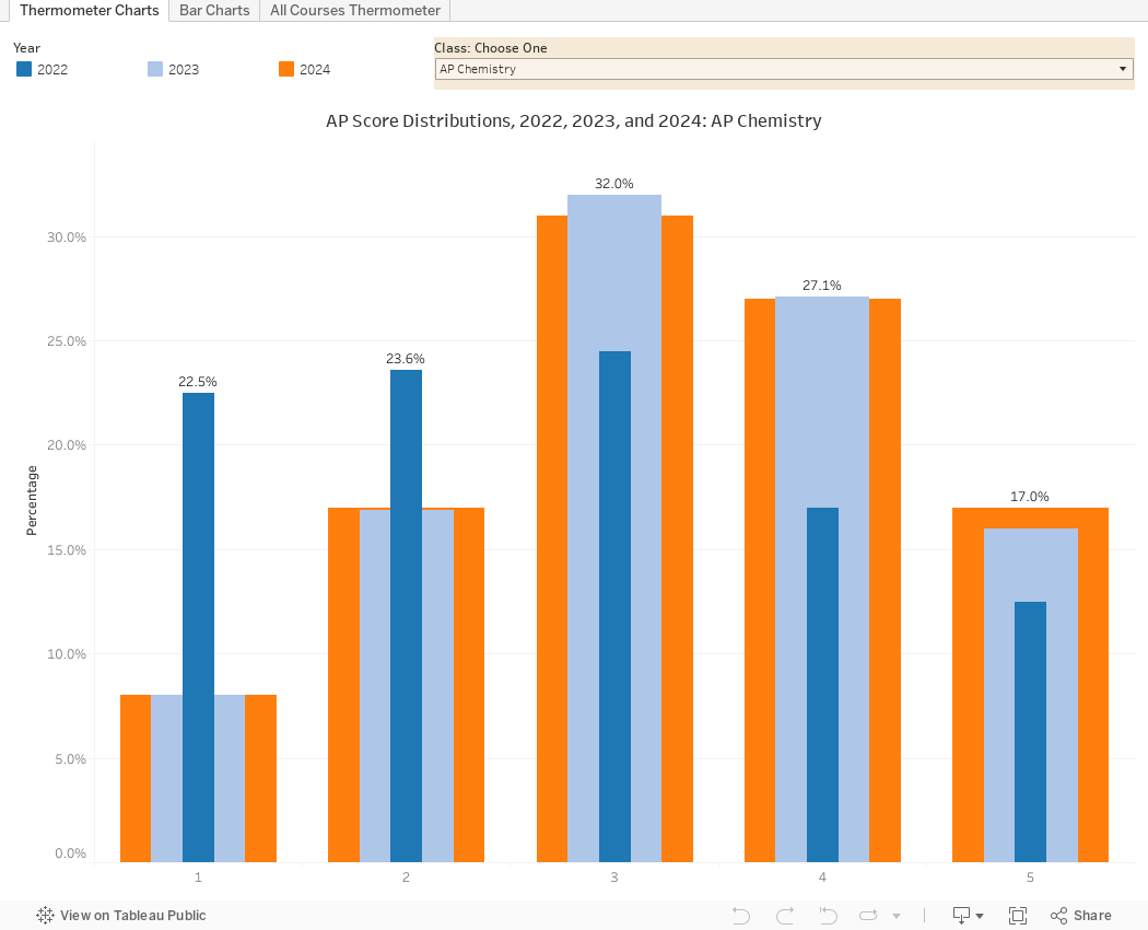
The data are below, in three views: And before I allow you to leap to conclusions, there are a lot of things that might explain why scores in some exams are swinging so wildly in a year, but College Board's refusal to publish this data in an easily, machine-readable format makes that insight really hard to get at (and they won't do it themselves, as they never respond publicly to criticism like this.)
View one (using the tabs across the top) shows thermometer charts: Choose any class using the drop down box. You'll find big changes in some of the classes, and some that seem perfectly tuned over time.
View two shows the same data in a format some might find easier.
View three shows all exams that have three years of data (thus, excluding African-American Studies and Pre-Calc) for a wider view of the program.
Comments
Post a Comment