
Public universities and the public mission

My last post looked at the US population by ethnicity, and how it varied by age group in the states.  I thought it might be interesting for anyone, but especially for those who do university planning or enrollment forecasting, as income and ethnicity factor into college going rates.

It made me wonder about each state and the state of public education: Specifically, how does enrollment at public universities in each state compare to the population of college-aged people (generally speaking) in that state?

So I re-used that data and merged some enrollment data into the mix, and voilà, as they say.

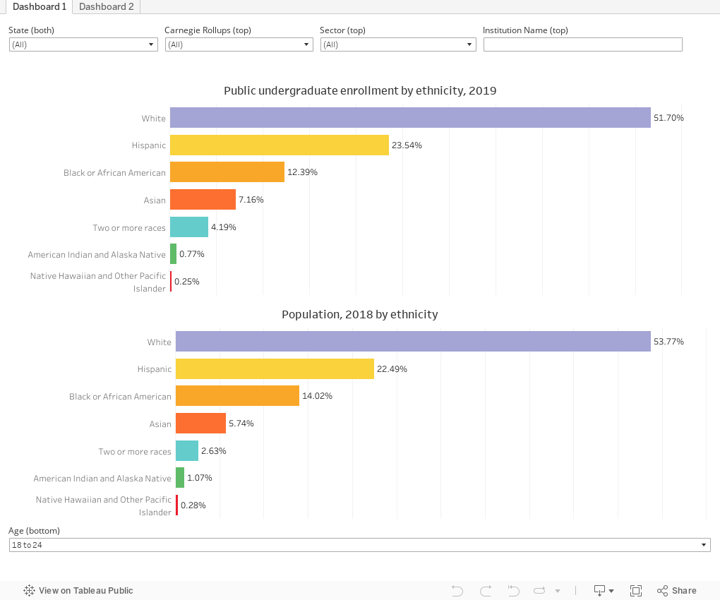
What this shows: On the top chart, you see undergraduate enrollment at four-year and two-year public institutions in the US, broken out by ethnicity.  I've excluded international students and those for whom an ethnicity is not known, both of which are about 3.5% of the total.  This allows for easier comparison against the US population (where there is no category for either.)

On the bottom, you see the same breakouts for the US population aged 18-24 (as of the American Community Survey in 2018).

Customize your views:

The State filter changes both the top and the bottom view.

The Carnegie, Sector, and Institution name filters only change the top view, so you can look at any subset of enrollment.

And the Age filter at the bottom allows you to change the US population groups; it defaults to the 18-24 category.

There are some limitations here, of course.  Many public institutions draw a considerable percentage of their enrollment from beyond their state borders, and I made no attempt to adjust for that.  Removing international students and students with unknown ethnicity from the enrollment data inflates (slightly) all the groups shown.  And of course, data don't explain themselves; state policies and histories of access have a lot to do with the shape of enrollment in public universities.  This is a good place to start, but it's not a statistically-controlled analysis.

The second dashboard breaks out enrollment by broad Carnegie categories.  There is only one filter to allow you to select a single state.

As always, let me know what you see.


Comments

Popular posts from this blog

The Highly Rejective Colleges

If you're not following Akil Bello on Twitter, you should be.  His timeline is filled with great insights about standardized testing, and he takes great effort to point out racism (both subtle and not-so-subtle) in higher education, all while throwing in references to the Knicks and his daughter Enid, making the experience interesting, compelling, and sometimes, fun. Recently, he created the term " highly rejective colleges " as a more apt description for what are otherwise called "highly selective colleges."  As I've said before, a college that admits 15% of applicants really has a rejections office, not an admissions office.  The term appears to have taken off on Twitter, and I hope it will stick. So I took a look at the highly rejectives (really, that's all I'm going to call them from now on) and found some interesting patterns in the data. Take a look:  The 1,132 four-year, private colleges and universities with admissions data in IPEDS are incl

Freshman Migration, 1986 to 2020

(Note: I discovered that in IPEDS, Penn State Main Campus now reports with "The Pennsylvania State University" as one system.  So when you'd look at things over time, Penn State would have data until 2018, and then The Penn....etc would show up in 2020.  I found out Penn State main campus still reports its own data on the website, so I went there, and edited the IPEDS data by hand.  So if you noticed that error, it should be corrected now, but I'm not sure what I'll do in years going forward.) Freshman migration to and from the states is always a favorite visualization of mine, both because I find it a compelling and interesting topic, and because I had a few breakthroughs with calculated variables the first time I tried to do it. If you're a loyal reader, you know what this shows: The number of freshman and their movement between the states.  And if you're a loyal viewer and you use this for your work in your business, please consider supporting the costs

Doctoral recipients by bachelor's degree-granting institution, 2016-2020

Each time I publish this visualization I get a lot of traffic on the site, and I can see why. It shows all doctoral recipients (in 2016-2020) broken out by where they received their bachelor's degrees.  So, for instance, the top level view shows that UC Berkeley is the alma mater of more doctoral recipients than any other institution, followed by The University of Michigan and Cornell University. That would be interesting, but of course, these are large institutions, and it's natural to think lots of graduates will lead to lots of doctoral degrees.  No surprise there. So the visualization allows you to look at the types of colleges you or your students might want: Select a state, select public or private, select by Carnegie type if you wish.  You can also look at HBCUs if you'd like.  Most important, you can filter by doctoral degree, so if you want to see which institution sends the most students to doctorates in chemistry, you can do so. To head off the questions I get ev