I have always enjoyed writing, and I consider this and my other blog like a hobby. Usually, I spend no more than 45 minutes on any post, as I don't make my living by writing, and my blogs are not "monetized." But once in a while, an opportunity presents itself to write for a wider audience, and that's when I see what it takes to make a living putting words to paper. That happened this week.
You may have seen my opinion piece in the Chronicle of Higher Education. If not, you can read it first, read it last, or not at all; I think both this and that stand alone, despite their relationship. In the end, we ended up with about 40% of my first draft, which is what happens when you write for a print publication. And of course, a print publication makes interactive charts, well, difficult.
I think there is more to say on the topic, because the similarities in recruitment challenges for first-generation, low-income, and minority students tend to look a lot alike, and the more data you look at, the clearer this all becomes. So I took what I had pulled together to research and write the CHE piece, formatted it for this blog, and put it here with the understanding I'd not publish until the Chronicle piece was online.
Frankly, this topic is a little bit personal for me. My parents, born on farms in Iowa in 1916 and 1917, were among those who never attended high school, let alone college; of their four children, I'm the only one with a college degree. So I was a quintessential first-generation college student, and as I wrote on my other blog, my father made $17,000 in his best year, (or about $48,000 today's dollars) which would qualify us as low-income by most standards. In fact, I've always pointed to those factors as powerful influences in my choice of a profession.
I think the story is an interesting one, and I hope you'll stick with it to the end.
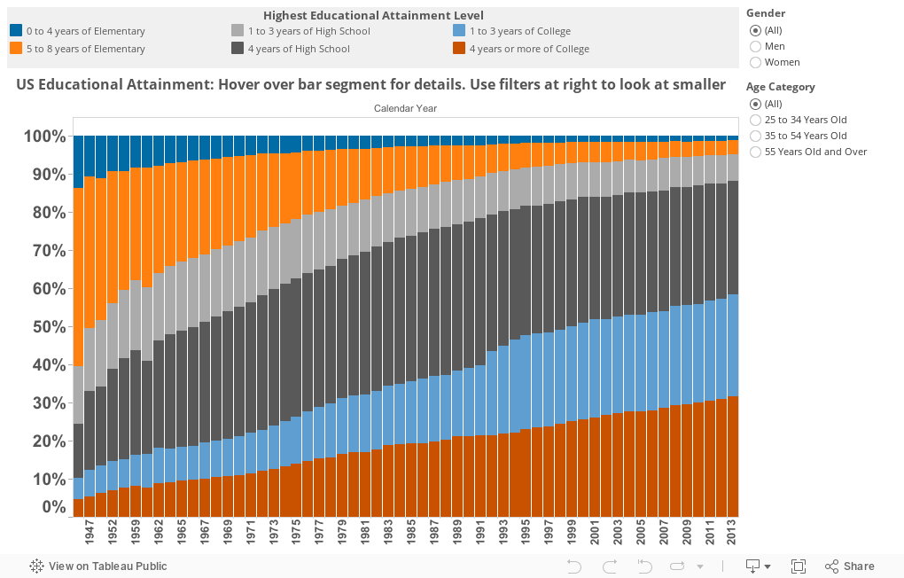
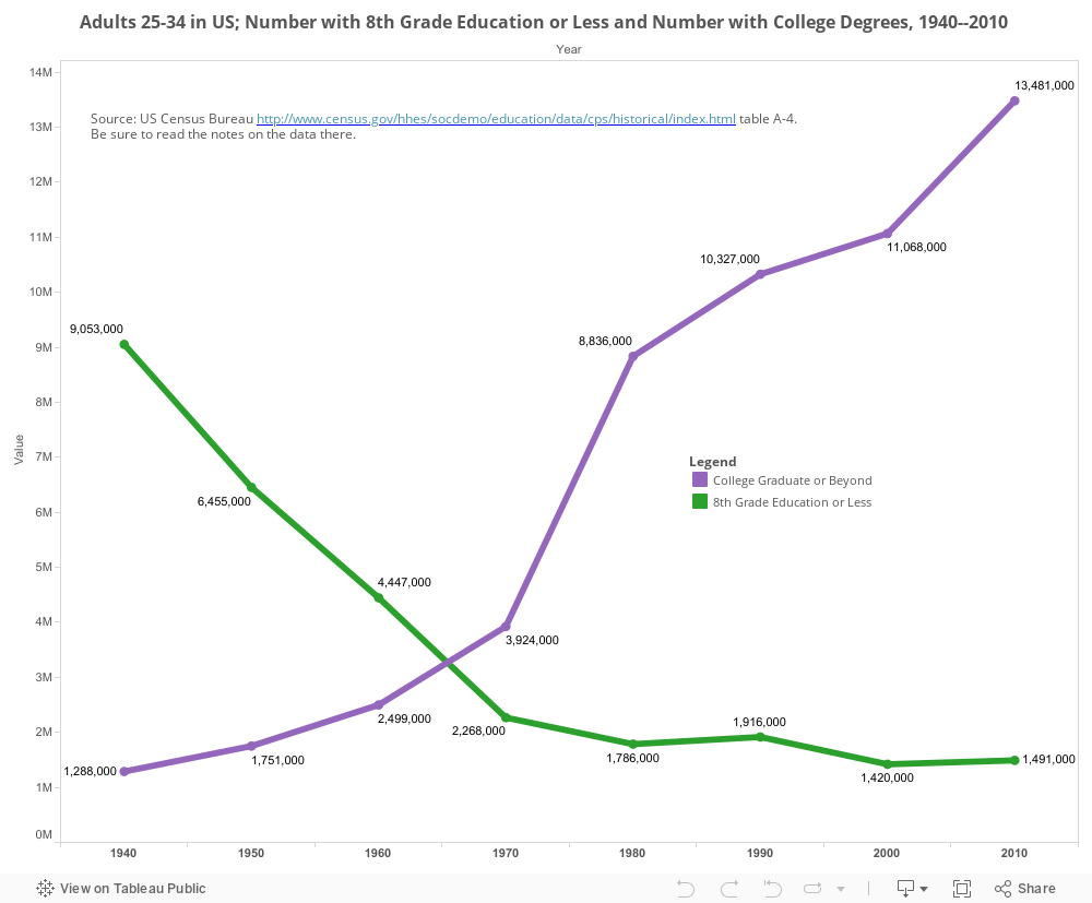
Point 1: The challenge of increasing attainment is not a new one, and America has made considerable progress in the past on this front. Consider this mind-blowing statistic: In 1940, about 60% of adults, like my parents, didn't make it past 8th grade. A lot of that generation who lived through the Depression and World War II sent their kids to college in large numbers in the 1960's and 1970's, increasing attainment rates dramatically.
The first chart here is very detailed and interactive, and the second is very simple, but they are based on and show the same data.
With all the charts, hover over a data point for details.
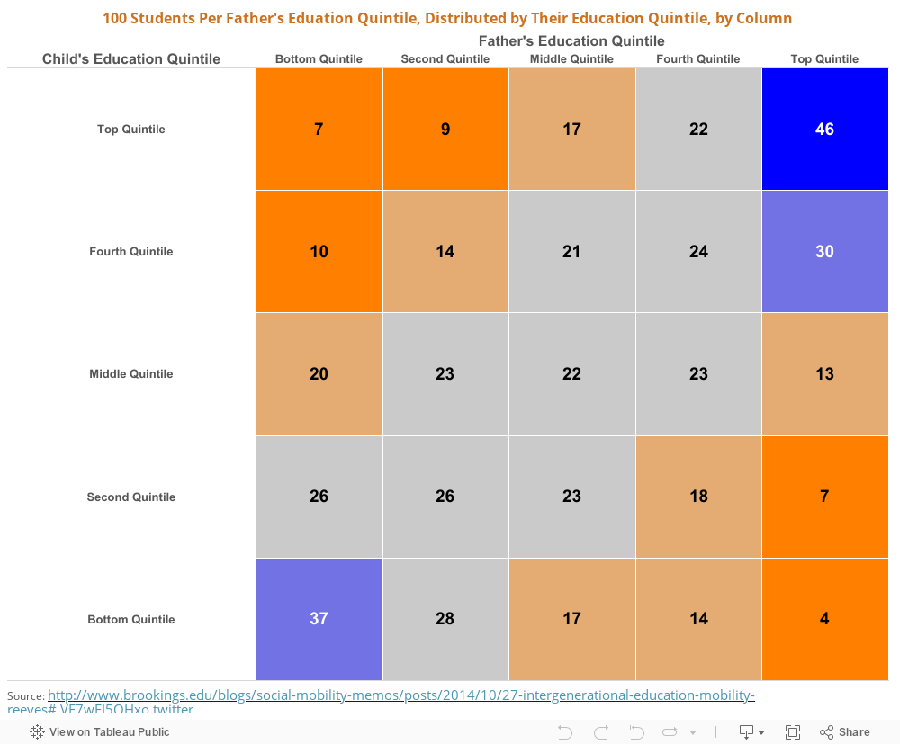
Point 2: Is education inherited? That is, does it get passed on from parents to students like silverware and pocket watches? Some data from the Brookings Institution suggests so: If your parents are educated, you're likely to be, and if they're not, the same is probably true of you. Anyone who's done admissions understands there is a cultural component and a context sensitivity that are important when recruiting first-generation students. Students whose parents have never been to college don't navigate the process as well as those who do.
To read this chart, look at each column, representing the educational attainment of fathers, from low on the left, to high on the right. Each column adds to 100 or so (rounding errors) and the boxes represent where 100 children of fathers with this level of education end up in the educational attainment spectrum. The children of fathers with lower attainment end up near the bottom in greater numbers; the children of well educated fathers end up near the top (blue boxes are higher numbers). Orange boxes (low numbers) show up when we see how many children move in either direction; gray boxes are numbers in the middle.
Feel free to argue nature, nurture, or systematic issues here. We like to think education is based on meritocracy; in fact, it may be an "inheritocracy."
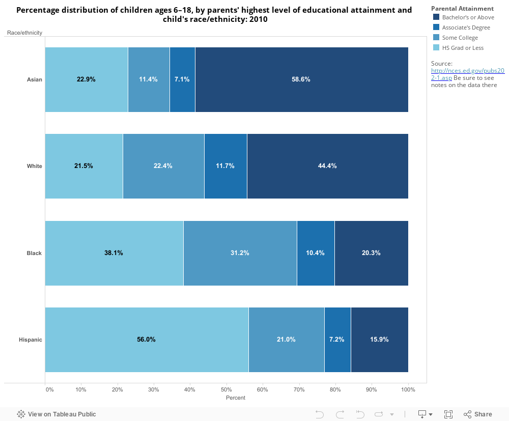
 Point 3: If education is inherited, this presents a problem that affects students of color, because African-American and Hispanic students are less likely to live in homes where a parent has a bachelor's degree. Thus, they cannot "inherit" educational attainment. So ethnicity = attainment, to a large degree.
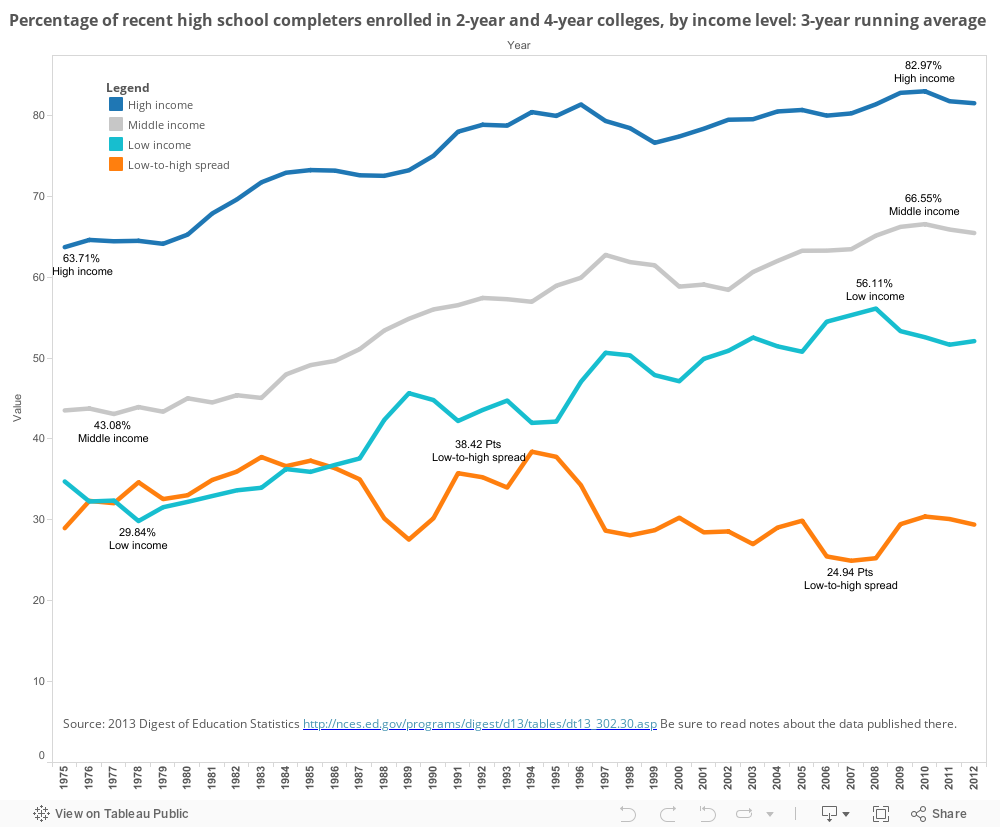
 Point 4: And not surprisingly, college attendance rates already vary dramatically by both income:
And by ethnicity:
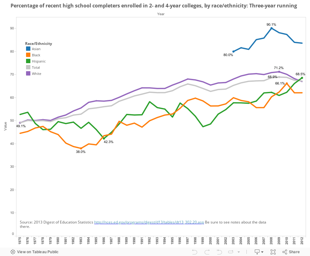
So income = ethnicity and ethnicity = attainment and attainment leads to attainment. (And I use the term "equals" pretty liberally here, of course. It's obvious that nothing is destiny.)
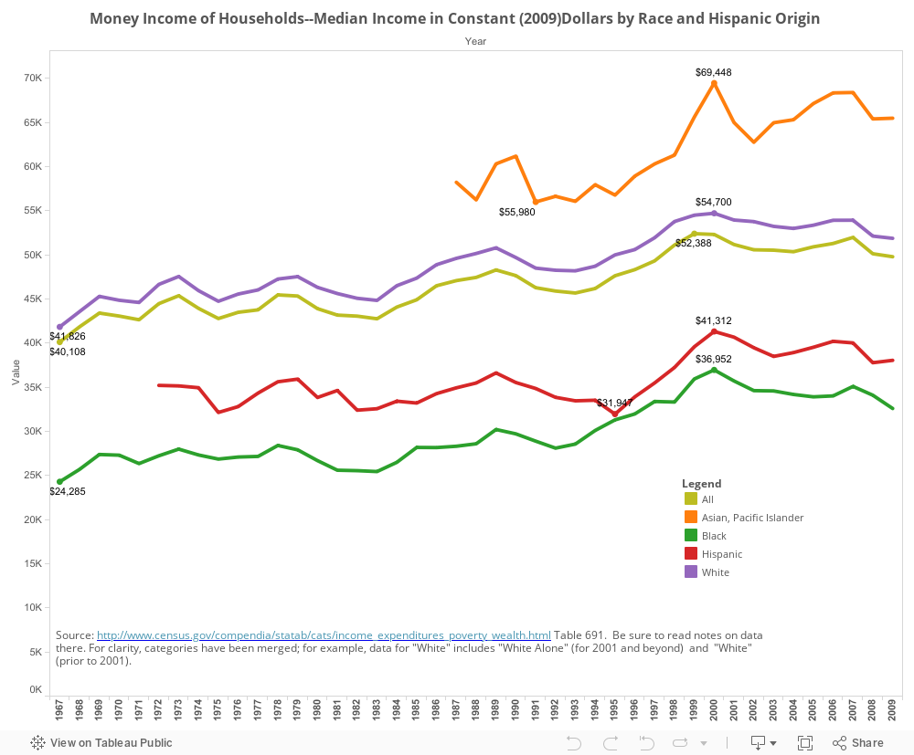
Point 5: There is also the issue of affordability: Students of color tend to come from families with lower income levels. And I doubt we need a chart to demonstrate the relationship between parental education and family income. But it may be that believing you can't afford a college education, accomplishment notwithstanding, may be the biggest barrier to educational attainment we have.
On one of the criteria that is weighted heavily in admissions, standardized test scores, students of color and low-income students tend to score lower. If colleges and universities are serious about enrolling more first-generation students, low-income students, or students of color, they need to take a serious look at the weight of tests in the admissions process, and the extent to which they let the public judge them on freshman test scores. While I'm generally agnostic about the US News and World Report rankings and the pursuit of them, this is the one area where I believe criticism is justified.
The 50 boxes for each ethnicity (five test score bands by ten income levels) are colored to show the percent of total by ethnicity, and those values add up to 100. Blue values are higher, and orange values are lower. So you notice that the bluest box for African-American and Hispanic students is in the lower left corner (low income, low scores); for Asian and Caucasian, it's near the upper right (high income, high scores). Hover over any box for details; this is from ACT EIS Data for 2010 and is created by compiling spreadsheets extracted from the software.
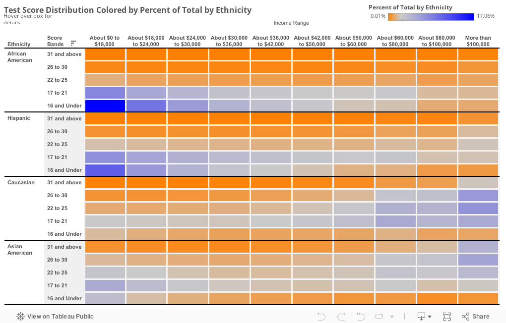 Of course, no one believes that being Hispanic or poor is the direct cause of lower attainment on standardized tests. Many believe the lower scores are proxy values for opportunity, and there are many who believe that standardized tests simply reflect the accumulation of social capital throughout a child's lifetime. And much of the social capital necessary to be admitted to college comes with wealth and parental attainment.
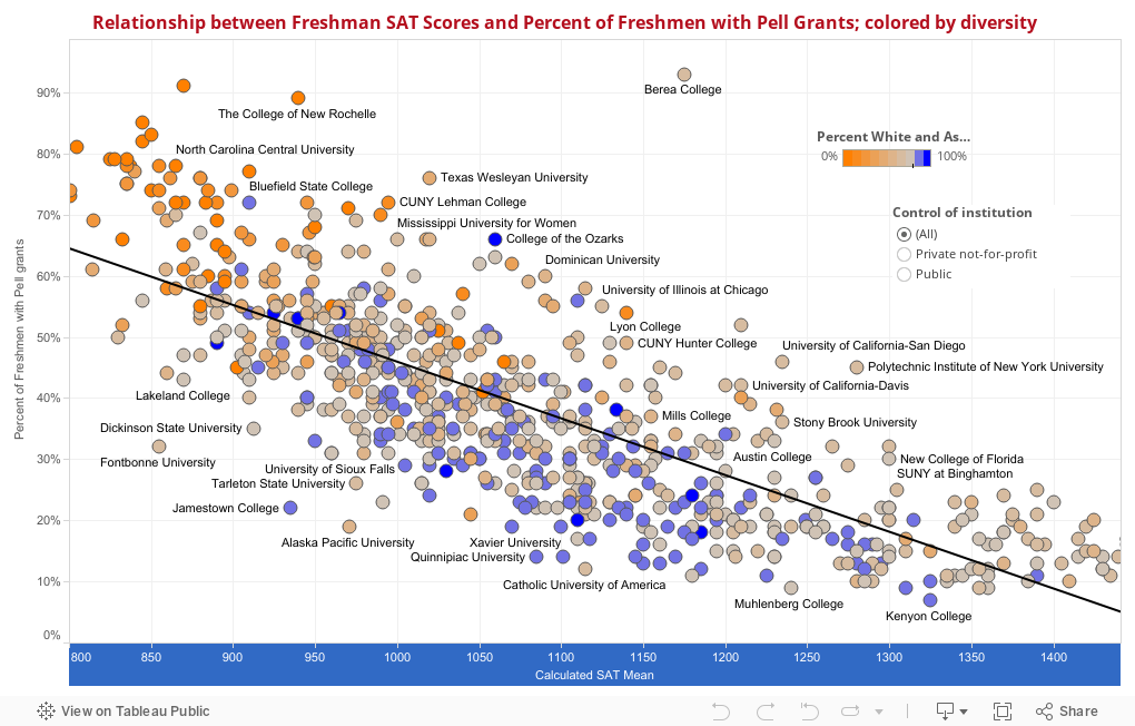
Point 6: And finally, I offer these two charts. First, the relationship between freshman test scores, ethnicity and Pell at American Colleges and Universities. You can look at private and/or public by using the filter, but regardless, you can see the relationships played out: In general, the higher your freshman class SAT, the lower the percentage of freshmen on Pell, and the less diverse you are. Thus, when we ask universities to be "excellent" and we define "excellence" by input variables like SAT or ACT scores and selectivity, this is what we're left with: Colleges who want to do the right thing have to act counter to their own interests.
 And this: The relationship between institutional wealth and economic profile of the freshman class. You can click here to read the blog post when I originally published it, if you'd like.
So, I hope the points and the patterns in them are obvious: When we talk about increasing college attendance among first-generation, low-income, and minority students we're really talking about the same thing. And all those factors pull, unintentionally, against the very things many colleges and universities strive to achieve. It will take some very brave institutions at the top of the food chain to break out of the pack and move us collectively in the right direction.
I think it's a vicious circle of our own doing. What do you think?
You may have seen my opinion piece in the Chronicle of Higher Education. If not, you can read it first, read it last, or not at all; I think both this and that stand alone, despite their relationship. In the end, we ended up with about 40% of my first draft, which is what happens when you write for a print publication. And of course, a print publication makes interactive charts, well, difficult.
I think there is more to say on the topic, because the similarities in recruitment challenges for first-generation, low-income, and minority students tend to look a lot alike, and the more data you look at, the clearer this all becomes. So I took what I had pulled together to research and write the CHE piece, formatted it for this blog, and put it here with the understanding I'd not publish until the Chronicle piece was online.
Frankly, this topic is a little bit personal for me. My parents, born on farms in Iowa in 1916 and 1917, were among those who never attended high school, let alone college; of their four children, I'm the only one with a college degree. So I was a quintessential first-generation college student, and as I wrote on my other blog, my father made $17,000 in his best year, (or about $48,000 today's dollars) which would qualify us as low-income by most standards. In fact, I've always pointed to those factors as powerful influences in my choice of a profession.
I think the story is an interesting one, and I hope you'll stick with it to the end.
Point 1: The challenge of increasing attainment is not a new one, and America has made considerable progress in the past on this front. Consider this mind-blowing statistic: In 1940, about 60% of adults, like my parents, didn't make it past 8th grade. A lot of that generation who lived through the Depression and World War II sent their kids to college in large numbers in the 1960's and 1970's, increasing attainment rates dramatically.
The first chart here is very detailed and interactive, and the second is very simple, but they are based on and show the same data.
With all the charts, hover over a data point for details.
Point 2: Is education inherited? That is, does it get passed on from parents to students like silverware and pocket watches? Some data from the Brookings Institution suggests so: If your parents are educated, you're likely to be, and if they're not, the same is probably true of you. Anyone who's done admissions understands there is a cultural component and a context sensitivity that are important when recruiting first-generation students. Students whose parents have never been to college don't navigate the process as well as those who do.
To read this chart, look at each column, representing the educational attainment of fathers, from low on the left, to high on the right. Each column adds to 100 or so (rounding errors) and the boxes represent where 100 children of fathers with this level of education end up in the educational attainment spectrum. The children of fathers with lower attainment end up near the bottom in greater numbers; the children of well educated fathers end up near the top (blue boxes are higher numbers). Orange boxes (low numbers) show up when we see how many children move in either direction; gray boxes are numbers in the middle.
Feel free to argue nature, nurture, or systematic issues here. We like to think education is based on meritocracy; in fact, it may be an "inheritocracy."
And by ethnicity:
So income = ethnicity and ethnicity = attainment and attainment leads to attainment. (And I use the term "equals" pretty liberally here, of course. It's obvious that nothing is destiny.)
Point 5: There is also the issue of affordability: Students of color tend to come from families with lower income levels. And I doubt we need a chart to demonstrate the relationship between parental education and family income. But it may be that believing you can't afford a college education, accomplishment notwithstanding, may be the biggest barrier to educational attainment we have.
On one of the criteria that is weighted heavily in admissions, standardized test scores, students of color and low-income students tend to score lower. If colleges and universities are serious about enrolling more first-generation students, low-income students, or students of color, they need to take a serious look at the weight of tests in the admissions process, and the extent to which they let the public judge them on freshman test scores. While I'm generally agnostic about the US News and World Report rankings and the pursuit of them, this is the one area where I believe criticism is justified.
The 50 boxes for each ethnicity (five test score bands by ten income levels) are colored to show the percent of total by ethnicity, and those values add up to 100. Blue values are higher, and orange values are lower. So you notice that the bluest box for African-American and Hispanic students is in the lower left corner (low income, low scores); for Asian and Caucasian, it's near the upper right (high income, high scores). Hover over any box for details; this is from ACT EIS Data for 2010 and is created by compiling spreadsheets extracted from the software.
Point 6: And finally, I offer these two charts. First, the relationship between freshman test scores, ethnicity and Pell at American Colleges and Universities. You can look at private and/or public by using the filter, but regardless, you can see the relationships played out: In general, the higher your freshman class SAT, the lower the percentage of freshmen on Pell, and the less diverse you are. Thus, when we ask universities to be "excellent" and we define "excellence" by input variables like SAT or ACT scores and selectivity, this is what we're left with: Colleges who want to do the right thing have to act counter to their own interests.
So, I hope the points and the patterns in them are obvious: When we talk about increasing college attendance among first-generation, low-income, and minority students we're really talking about the same thing. And all those factors pull, unintentionally, against the very things many colleges and universities strive to achieve. It will take some very brave institutions at the top of the food chain to break out of the pack and move us collectively in the right direction.
I think it's a vicious circle of our own doing. What do you think?
Comments
Post a Comment