Freshman Migration--or patterns of enrollment by new students, has always been of interest to me. So I'm always thrilled when IPEDS releases new data, and the 2018 stuff is out. This time, I decided to download every bit of it that's available, and give users the option to take a longer view, if they want.
Some caveats: IPEDS only requires this data in even-numbered years, so that's what I downloaded. Still, there are some colleges that did not report for some years; don't write to let me know about it, as I've included it if they did. Second, there are always a few mistakes in the data. One year I found that Harvard reported 237 freshmen from Arkansas when they meant California. It happens.
Anyway, four views here, using the tabs across the top:
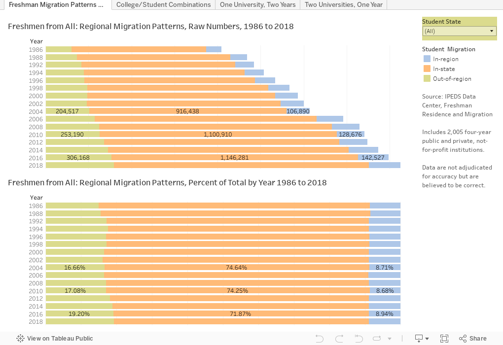
Freshman Migration Patterns shows data over time: What number and percentage of students went to college in-state, in-region, or out-of-region. Use the filter at top right to choose one state. The different patterns are interesting, I think.
College/Student combinations shows all 2,005 four-year, public and private not-for-profit colleges in the data set. Pick a year. Choose a region for the college, if you want. Choose a student region if you want, and if you only want to see a pattern, choose the migration pattern. For instance, if you're a counselor, you may want to see which colleges in the Great Lakes region enrolled the most students from the Far West in 2018. (Purdue is the champ).
One University, Two Years allows you to pick any university, and choose any two years to see how the freshman class has changed. Just click. You won't break anything. You can choose to color the boxes by individual state or region using the control.
Two Universities, One Year is the same, but the opposite. I think. Choose one year, and see how the freshman classes at two universities of your choice compare.
To my Tableau friends: There are dozens of questions you might that aren't answered here: The workbook is downloadable, and I can make the Access Database available too. I had lots of questions I can't answer because my skills with calculated variables are frankly just not that sharp. Dive in. I'd be pleased if you did.
And to everyone, let me know what you think.
Some caveats: IPEDS only requires this data in even-numbered years, so that's what I downloaded. Still, there are some colleges that did not report for some years; don't write to let me know about it, as I've included it if they did. Second, there are always a few mistakes in the data. One year I found that Harvard reported 237 freshmen from Arkansas when they meant California. It happens.
Anyway, four views here, using the tabs across the top:
Freshman Migration Patterns shows data over time: What number and percentage of students went to college in-state, in-region, or out-of-region. Use the filter at top right to choose one state. The different patterns are interesting, I think.
College/Student combinations shows all 2,005 four-year, public and private not-for-profit colleges in the data set. Pick a year. Choose a region for the college, if you want. Choose a student region if you want, and if you only want to see a pattern, choose the migration pattern. For instance, if you're a counselor, you may want to see which colleges in the Great Lakes region enrolled the most students from the Far West in 2018. (Purdue is the champ).
One University, Two Years allows you to pick any university, and choose any two years to see how the freshman class has changed. Just click. You won't break anything. You can choose to color the boxes by individual state or region using the control.
Two Universities, One Year is the same, but the opposite. I think. Choose one year, and see how the freshman classes at two universities of your choice compare.
To my Tableau friends: There are dozens of questions you might that aren't answered here: The workbook is downloadable, and I can make the Access Database available too. I had lots of questions I can't answer because my skills with calculated variables are frankly just not that sharp. Dive in. I'd be pleased if you did.
And to everyone, let me know what you think.
Reminder: I appreciate support for webhosting and other costs associated with creating Higher Ed Data Stories. You can support these efforts here.
Comments
Post a Comment