Attainment has always been an interesting topic for me, every since I first got stunned into disbelief when I looked at the data over time. Even looking at shorter periods can lead to some revelations that many don't make sense at first.
Here is the latest data from NCES, published in the Digest of Education Statistics. Please note that this is for informational purposes only, and I've not even attempted to visualize the standard errors in this data, which vary from state-to-state.
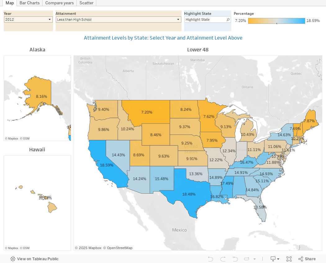
There are four views year, all looking at educational attainment by state in 2012 and 2022.
The first shows data on a map: Choose the year, and choose the level of attainment. Note that the top three categories can be confusing: BA means a Bachelor's degree only; Grad degree means at least a Master's (or higher, of course); and BA or more presumably combines those two. Again, standard errors might mean the numbers don't always add up perfectly.
The second shows the data on a bar chart, in three views: 2012 data, 2022 data, and the change, in percentage points. You can choose the attainment level, and then use the control to decide which column to sort the data by.
The third view is a slope chart, where you can see the two years for any state. Choose the attainment level, and then highlight the state you're interested in. Hover over the points for details.
And finally, the scatter shows the same data, with the same controls; the bubbles are sized by percentage-point change. Additionally, you can use the filter to see which states have changed the most or the least.
If anything surprises you here, drop a comment below, or send me an email.
Comments
Post a Comment