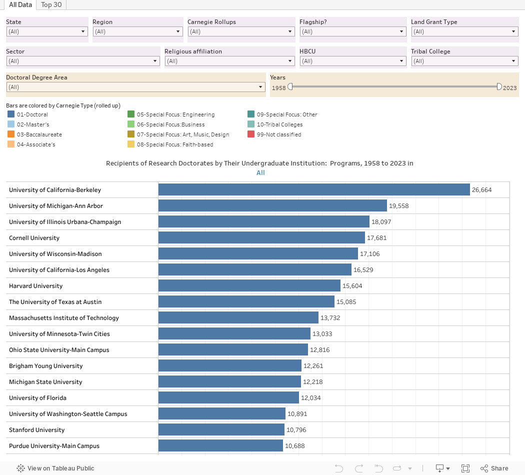
This is a popular post each year with high school and independent counselors working with students who are already thinking about a doctorate. It shows the undergraduate institutions of doctoral recipients from 1958 to 2023. (It does not show where the doctorate was earned, to be clear.)
It's based on data I downloaded from the National Science Foundation using their custom tool. It's a little clunky, and--this is important--it classifies academic areas differently before 2020 and after, but with a little (OK, a lot) of data wrangling over the long weekend, we have something for the data junkies out there.
This is for fun and entertainment only, because, as I indicated, the categories are not quite the same, and for the sake of clarity, I had to combine similar (but not identical) disciplines.
There are two views, using the tabs across the top. The "All Data" view allows you to filter to your heart's content. The purple boxes allow you to limit the type of institution of the bachelor's degree recipients: You may want to look at Public Universities in the Southeast, for instance, or all Catholic colleges (listed as "Roman Catholic" in the filter, by the way). The tan boxes allow you to specify the doctoral degree area (Chemistry, or Political Science, for instance), and to limit the years. You might want to look at 2017 to 2023, or you might want to get nostalgic and look at 1958 to 1965, for instance.
The bars, which are colored by Broad Carnegie type, display the counts. Us the scroll function at the right to see more data.
The "Top 30" view limits to those places that produce the most students earning doctorates. The labels show you the Rank (in orange), the counts (in blue) and the percent of total (in purple). The percents are only calculated on the group you've selected, not the grand totals.
This always generates four questions:
Can you show these as a percentage of the graduates of this institution? No, because not everyone who graduates with a doctorate does it in the same time. I'd have to take lots of data and make some wild guesses.
Can you show what these students majored in at the undergraduate level? No, that's not available in the public sets, and I don't want to apply for the restricted use license. If you do, and you want me to work on this, let me know.
Can you crosstab this data to show, for instance, where the Stanvard graduates earned their doctorate? Again, it's not in the public data set, so no.
What about other doctorates, like MD or Pharm.D or DDS? It's not included: These are research doctorates only.
If you use this in your business and want to support my time and software and hosting costs, you can do so here. If you're a high school counselor or a student or parent, just skip that link.
Thanks for publishing these data. It appears Penn State Main Campus is missing while the branch campuses are included. Do you know why this is?
ReplyDeletePenn State has changed its reporting mechanisms several times over the last decade. It went from PSU Main with Branch Campuses to The Pennsylvania State University (all consolidated) and now back again. Normalizing the data over time would require an incredible amount of manual data entry and corrections that I'm not inclined to do. The people at IPEDS are also frustrated with this, and don't have a solution.
DeleteCompounding this is the fact that this is a 2023 IPEDS file merged with the NSF data over 65 years.
I'm surprised by just many more doctorates Oberlin has produced compared to any other baccalaureate school--6090. Next is Swarthmore at 4240. I
ReplyDelete