
The annual graduation rate post

I know I've been barking up the tree of "Graduation Rates are inputs, not outputs" for a long time.  And I know no one is listening.  So I do this, just to show you (without the dependent variable) just how unsurprising they are.

Here are four views of graduation rates at America's four-year public and private, not-for-profit colleges and universities. And I've put them in four views, with several different ways to look at the data.

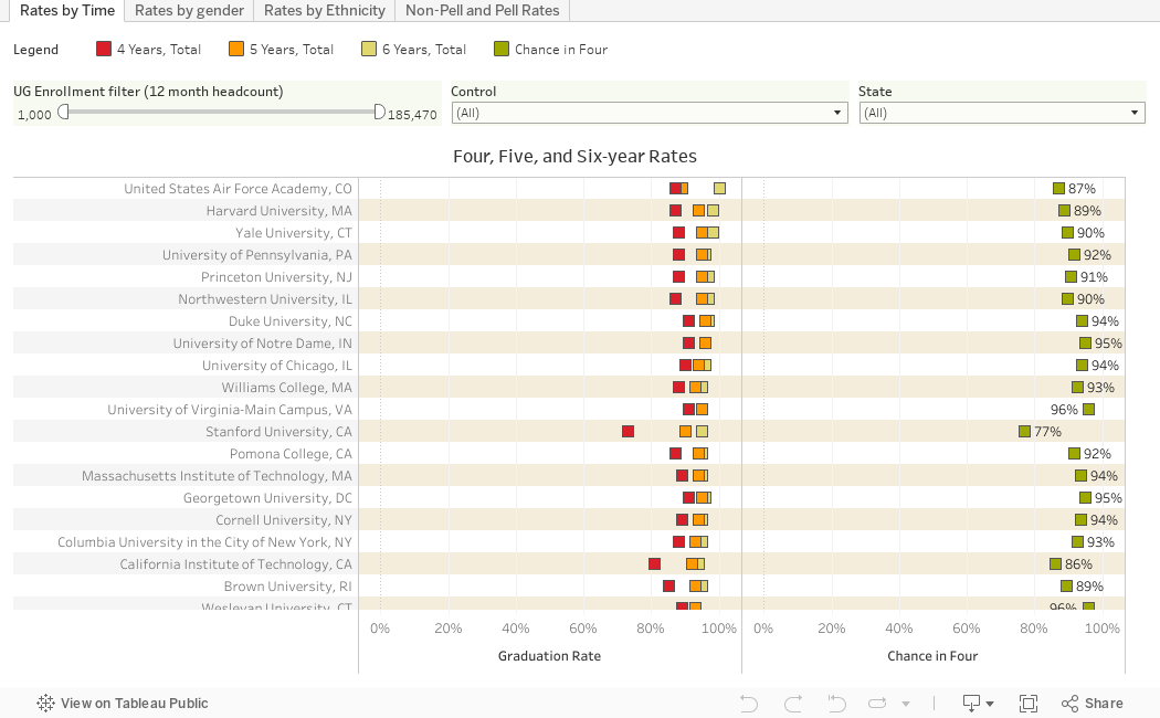
The first (using the tabs across the top) shows four-, five-, and six-year graduation rates on the left, and "Chance in four" on the right.  In other words, since everyone pretty much thinks they're going to graduate from the college they enroll in as a freshman, what are the chances of graduating in four years, rather than six?  There are some surprises there, as you'll see.

On all the visualizations, you can apply filters to limit the colleges you're looking at.  The scroll bar (to move up or down) is on the right but it's sometimes hard to see.  And the size slider is set to a minimum of 1,000 students, but you can change that; just beware that small colleges often have wonky data, for several reasons.

The second view shows six-year rates by gender.

The third view breaks out six-year rates by ethnicity, comparing African-American, Hispanic, and Asian rates (the shapes) to the rate for White students (on the gray bars).

And the final view breaks out six-year rates by Pell Grant status, then shows the gap between the two on the right. On the gap chart, a negative number shows colleges where Pell graduation rates are higher than non-Pell rates.

Enjoy! 


Comments

Popular posts from this blog

Freshman Migration, 1986 to 2020

(Note: I discovered that in IPEDS, Penn State Main Campus now reports with "The Pennsylvania State University" as one system.  So when you'd look at things over time, Penn State would have data until 2018, and then The Penn....etc would show up in 2020.  I found out Penn State main campus still reports its own data on the website, so I went there, and edited the IPEDS data by hand.  So if you noticed that error, it should be corrected now, but I'm not sure what I'll do in years going forward.) Freshman migration to and from the states is always a favorite visualization of mine, both because I find it a compelling and interesting topic, and because I had a few breakthroughs with calculated variables the first time I tried to do it. If you're a loyal reader, you know what this shows: The number of freshman and their movement between the states.  And if you're a loyal viewer and you use this for your work in your business, please consider supporting the costs

Changes in AP Scores, 2022 to 2024

Used to be, with a little work, you could download very detailed data on AP results from the College Board website: For every state, and for every course, you could see performance by ethnicity.  And, if you wanted to dig really deep, you could break out details by private and public schools, and by grade level.  I used to publish the data every couple of years. Those days are gone.  The transparency The College Board touts as a value seems to have its limits, and I understand this to some extent: Racists loved to twist the data using single-factor analysis, and that's not good for a company who is trying to make business inroads with under-represented communities as they cloak their pursuit of revenue as an altruistic push toward access. They still publish data, but as I wrote about in my last post , it's far less detailed; what's more, what is easily accessible is fairly sterile, and what's more detailed seems to be structured in a way that suggests the company doesn&

The Highly Rejective Colleges

If you're not following Akil Bello on Twitter, you should be.  His timeline is filled with great insights about standardized testing, and he takes great effort to point out racism (both subtle and not-so-subtle) in higher education, all while throwing in references to the Knicks and his daughter Enid, making the experience interesting, compelling, and sometimes, fun. Recently, he created the term " highly rejective colleges " as a more apt description for what are otherwise called "highly selective colleges."  As I've said before, a college that admits 15% of applicants really has a rejections office, not an admissions office.  The term appears to have taken off on Twitter, and I hope it will stick. So I took a look at the highly rejectives (really, that's all I'm going to call them from now on) and found some interesting patterns in the data. Take a look:  The 1,132 four-year, private colleges and universities with admissions data in IPEDS are incl