This is a refresh of a popular post I've done a few times, asking the important question in the title.
People tend to think of graduation rates as an output of the institution, and of course, in some sense, they are; they are certainly measured that way. But what if I told you that a college's six-year graduation rate (and, to a lesser extent, its four-year graduation rate) can be easily predicted by a single variable that we know before a student ever sets foot on campus?
I bet you'd want to see the proof.
The variable is the mean SAT (or ACT) score of the incoming class of first-year students. AHA! some of you are saying. How can you be test-optional then?
Relax. The SAT and ACT are nice proxies for all the things that help determine who is going to graduate from college in America. In one nice little number, it encapsulates several of those factors: Academic preparation (remember, the scores are good proxies for high school GPA, the best predictor of student performance in college), parental wealth, parental educational attainment, and race or ethnicity.
The tests don't tell us much beyond the high school GPA, and they don't help predict how well an individual student will do in college, but when you get a large pool of students together and average the results and all they encapsulate, they work quite well. It's the exact same reason your stock portfolio will avoid risk if you have 30 stocks in it. (This is not financial advice, of course, and you should only invest in stocks after getting advice from a professional.)
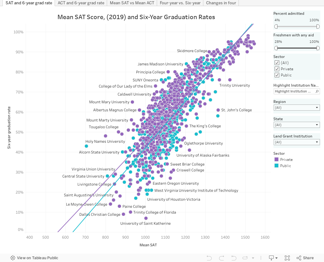
Here is the data presented in five views:
The first two show SAT and then ACT means of every institution arrayed on the x-axis, and the six-year graduation rate on the y-axis. Hover over the regression lines to get the r-squared values and ask your friendly social scientist if that's telling. But don't stop there. Use the filters to see if you can get it better. Look at percent admitted, or percent with financial aid; you might suspect that the highly rejective colleges who can choose whom they admit, or the ones with fewer students on aid, might cluster together. Do they? Yes, they do. Or use the other filters if you wish, in any combination.
The third view is for the skeptics who continue to think the SAT and ACT are different tests.
The fourth view shows each institution's four- and six-year rates plotted against each other. And the fifth view shows the percentage of students who graduate who managed to do so in four years. Some programs (engineering, or accounting, for instance) will often be five-year programs by design, so lower rates at institutions with these types of programs will usually show up lower on this criterion.
A note: I used 2019 mean SAT and ACT scores because that is the last "normal" year prior to COVID. While the 2020 entering class was admitted with test scores at most institutions, these numbers show enrolling students, and we know who enrolled was greatly affected by the pandemic.
If you use this in your for-profit work, you can help defray my costs of software and hosting by buying me a coffee (or beer) by clicking here. If you're an interested parent or you work for a not-for-profit, just skip right to the visualization, below.
And as always, let me know if you see anything interesting or important (but don't ask me about Northeastern's four-year graduation rate...I just use what IPEDS publishes.)
Comments
Post a Comment