If you believe you can extract strategy from prior activities, I have something for you to try to make sense of here. This is a long compilation of tuition and fees at America's Flagship and Land Grant institutions. If you are not quite sure about the distinction between those two types of institutions, you might want to read this first. TLDR: Land Grants were created by an act of congress, and for this purpose, flagships are whoever I say they are. There doesn't seem to be a clear definition.
Further, for this visualization, I've only selected the first group of Land Grants, funded by the Morrill Act of 1862. They tend to be the arch rival of the Flagship, unless, of course, they're the same institution.
Anyway, today I'm looking at tuition, something you'd think would be pretty simple. But there are at least four ways to measure this: Tuition, of course, but also tuition and required fees, and both are different for residents and nonresidents. Additionally, you can use those variables to create all sorts of interesting variables, like the gap between residents and nonresidents, the ratio of that gap to resident tuition, or even several ways to look at the role "required fees" change the tuition equation. All would be--in a perfect world--driven by strategy. I'm not sure I'd agree that such is the case.
Take a look and see if you agree.
There are five views here, each getting a little more complex. I know people are afraid to interact with these visualizations, but I promise you can't break anything. So click away.
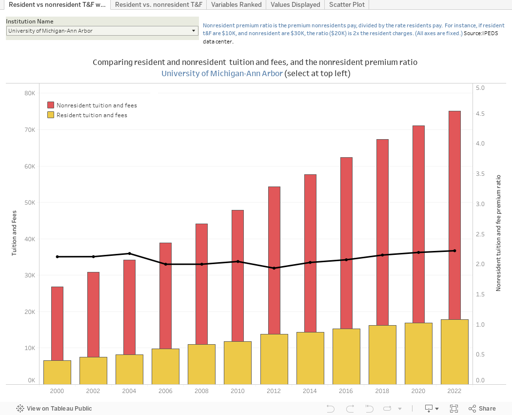
The first view (using the tabs across the top) compares state resident full-time, first-time, undergraduate tuition and required fees (yellow) to those for nonresidents (red bar). The black line shows the gap ratio. For instance, if resident tuition is $10,000 and nonresident tuition is $30,000, the gap is $20,000, and that is 2x the resident rate. The view defaults to the University of Michigan, but don't cheat yourself: Us the filter at top left to pick any other school. If you've read this blog before, you know why Penn State is showing strange data. It's not you, it's IPEDS, so don't ask.)
The second tab shows four data points explicitly, and more implicitly. This view starts with the University of Montana, but the control lets you change that. On top is resident tuition (purple) and resident tuition and fees (yellow). Notice how the gap between the two varies, suggesting the role of fees in the total cost of attendance. The bottom shows those figures for nonresidents.
The third view looks a little crazy. Choose a value to display at top left, and the visualization will rank all 77 institutions from highest to lowest. Use the control at top right to highlight an institution to put it in a national context. Hover over the dots for details in a popup box. If you want to look at a smaller set of institutions, you can do that, too, using the filters right above the chart. The fourth view is the exact same, but shows the actual values, rather than the rank. As always, hover for details.
Finally, the fifth view is a custom scatter plot: Choose the variable you want on the x-axis and the variable to plot it against on the y-axis. Then use the filters to limit the included institutions. As always, let me know what you find that's interesting.
Comments
Post a Comment