
The Changing Shape of American Higher Ed Enrollment

Much has been made recently of changes in enrollment in US Higher Ed: Fewer males (is it a crisis or not?).  Shrinking enrollments.  Changes in admissions due to test optional and COVID.

In this recent piece in the Chronicle of Higher Education, I recently pointed out that one of the ways colleges stayed viable during previous enrollment shifts was to expand both physical campus locations and offerings and degree programs tailored to working adults.  So that got me thinking about the shifts in enrollment by age, something I'd not explicitly looked at before.

On the surface it may not seem that exciting, but if you dig down enough and connect the dots, you might find some interesting societal trends.  So follow along.

Before we do, if you're using this data in your professional life, either as a college EM staff member or a for-profit consultant, I appreciate your support for my time, webhosting, and software costs.  You can show support by clicking here.

Some background: Part of what you'll see here is driven by other factors.  For instance, the market in the 1970's, 80's, and 90's for "adult" education was because there were large segments of that population that did not have a bachelor's or even an associate's degree.  It was untapped potential.  As you'll see below, that opportunity is less obvious than it used to be; higher education is a victim of its own success.  And at the same time, it's still opportunistic.

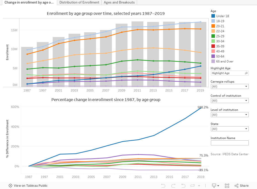
There are three views here: The first, Change in enrollment by age over time shows total undergraduate enrollment on gray bars, and age break outs on the colored lines.  You can use the highlight function to provide visual emphasis to any age group.  Some interesting stuff here: The big increase in the Under 18 category, driven by dual-enrollment, certainly.  The continuing increase in 18, 19, 20, and 21 year-olds, which may be making colleges complacent.  The troubling drop-off in 22-24 year olds.  And the relative drop of "adult" students (I have always hated that term to describe students over 25, because 18-year-old freshmen are adults, even if they don't act that way.)

On this view, you can filter by Carnegie type, Control, level, or state to drill down if you'd like a smaller view.

The second view, Distribution of Enrollment, is a little less complex.  It just shows the makeup by age of undergraduate enrollment in the US over time.  Here you can really see the "young-shift" of college enrollment.  Students under 22 now make up about 60% of college enrollment; in 1987 it was under 50%.  (This is where the IR staff will remind me that we're looking at headcount, not FTE, of course.  It's very likely that the overwhelming majority of those under 18 are taking fewer credits.)

And the final view, Ages and Breakouts, allows you to get a little more granular still.  Choose an age group, and then choose a way to break out the colored lines.  Once again, you'll see actual numbers on the gray bars, and percentage changes on the lines.

What do you see that surprised you?  Drop me an email or post your comments below.


Comments

Popular posts from this blog

The Highly Rejective Colleges

If you're not following Akil Bello on Twitter, you should be.  His timeline is filled with great insights about standardized testing, and he takes great effort to point out racism (both subtle and not-so-subtle) in higher education, all while throwing in references to the Knicks and his daughter Enid, making the experience interesting, compelling, and sometimes, fun. Recently, he created the term " highly rejective colleges " as a more apt description for what are otherwise called "highly selective colleges."  As I've said before, a college that admits 15% of applicants really has a rejections office, not an admissions office.  The term appears to have taken off on Twitter, and I hope it will stick. So I took a look at the highly rejectives (really, that's all I'm going to call them from now on) and found some interesting patterns in the data. Take a look:  The 1,132 four-year, private colleges and universities with admissions data in IPEDS are incl

Freshman Migration, 1986 to 2020

(Note: I discovered that in IPEDS, Penn State Main Campus now reports with "The Pennsylvania State University" as one system.  So when you'd look at things over time, Penn State would have data until 2018, and then The Penn....etc would show up in 2020.  I found out Penn State main campus still reports its own data on the website, so I went there, and edited the IPEDS data by hand.  So if you noticed that error, it should be corrected now, but I'm not sure what I'll do in years going forward.) Freshman migration to and from the states is always a favorite visualization of mine, both because I find it a compelling and interesting topic, and because I had a few breakthroughs with calculated variables the first time I tried to do it. If you're a loyal reader, you know what this shows: The number of freshman and their movement between the states.  And if you're a loyal viewer and you use this for your work in your business, please consider supporting the costs

Doctoral recipients by bachelor's degree-granting institution, 2016-2020

Each time I publish this visualization I get a lot of traffic on the site, and I can see why. It shows all doctoral recipients (in 2016-2020) broken out by where they received their bachelor's degrees.  So, for instance, the top level view shows that UC Berkeley is the alma mater of more doctoral recipients than any other institution, followed by The University of Michigan and Cornell University. That would be interesting, but of course, these are large institutions, and it's natural to think lots of graduates will lead to lots of doctoral degrees.  No surprise there. So the visualization allows you to look at the types of colleges you or your students might want: Select a state, select public or private, select by Carnegie type if you wish.  You can also look at HBCUs if you'd like.  Most important, you can filter by doctoral degree, so if you want to see which institution sends the most students to doctorates in chemistry, you can do so. To head off the questions I get ev