A lot has been made of graduation rates at America's colleges and universities. Some point to what they see as rates that are too low, while others think that high graduation rates are a testament to something happening inside the college.
And I, of course, think graduation rates are mostly inputs, rather than outputs. If your admissions process simply takes the most capable children of wealthy, college-educated parents, it's almost a certainty your graduation rates will be higher. If you take more risks in admitting students--either by mission or economic necessity--your graduation rates are going to be lower.
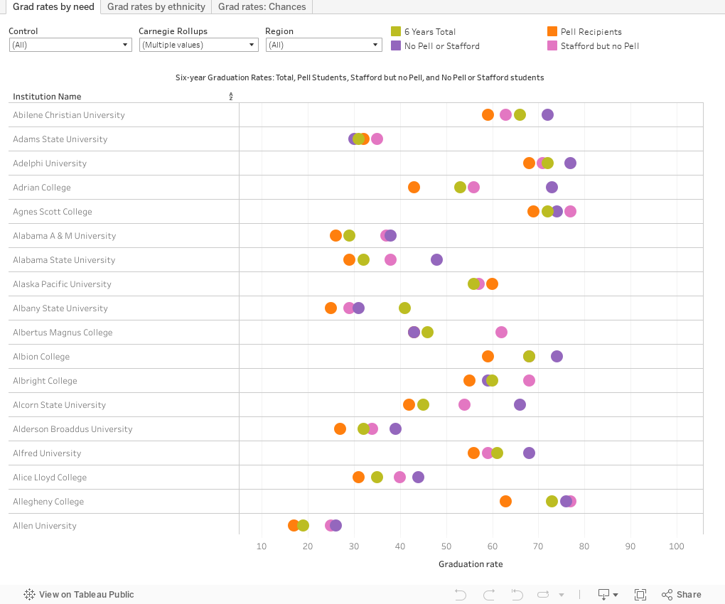
But there is still some interesting stuff in the IPEDS data. A few caveats about this data:
First, I've started the views showing only traditional doctoral, master's and baccalaureate institutions. Other types, which tend to be smaller, have noisier data. You can look at them if you wish by using the Carnegie rollups, region, and control filters along the top.
Second, the four-, five- and six-year rates here are from consecutive years, not from the same cohort. So it's technically possible that the four-year rate from 2016, for instance, could be a bit higher than the five-year rate from 2015. But these numbers are largely stable over time, so the chances of that are probably slim.
Finally, on some of the displays, there are a lot of colleges that report grad rates of zero from some groups (a college in Alabama, for instance, might not enroll any Asian/Pacific Islander students in a given year, so there is no data to report.) Because of that noise, I've changed the axis to start at 5%. There could be some colleges that report 3% or 4% grad rates, but not many. If so, you won't see them here.
If you find Higher Ed Data Stories useful in your work, you can support it by buying me a coffee. Just click here to do so, unless you're a high school counselor, or you work at a CBO that focuses on low-income students. You should always use this resource free of guilt and cost.
The views: The first view shows six-year graduation rates using rough approximations of student financial need. Notice, if you will, how the orange point is almost always lower on the scale than the purple point. That shows the difference between Pell students and those who get no federal aid (which does not mean they're wealthy, of course). Extrapolate from that as you might. The pink point shows students with no Pell but Stafford loans, and the gold point shows the overall six-year grad rate for all students.
The second tab shows six-year rates by ethnicity. It's a little messier than I like my visualizations to be, but there is a point there, too: Notice the spreads. Use the highlight control to focus on a single ethnicity across all colleges, and the other filters to limit the colleges shown. Sometimes the lesson is not in the details, but the 30,000 foot view. Ethnicity still matters in America, despite what some people would tell you.
Finally, a different view on the third tab. Note that it does not show the actual graduation rates. There's a reason for that. The premise on this visualization is simple: That when a student enrolls at a college, it's very likely that they plan to graduate from that college. So if they do, what's the chance they'll graduate in four or five years? This uses the universe of six-year graduates as the denominator, and the four- and five-year rates as numerator. The two data points on the left side show the chance that a student graduates in four; the line on the right shows the gap between the two.
As always, let me know what you see here. I'm always eager to hear your thoughts. And follow me on Twitter if you want to see these new posts while they're fresh.
Comments
Post a Comment