It seems obvious: Students come in, and students go out. The type of students who enter your university are measured on lots of things, like test scores, GPA, ethnicity, and parental income, to name just a few. Universities are measured too, on lots of those same things, as well as others, including the graduation rate. Lots of people think the graduation rate is a function of what the university does or does not do, and in some sense, of course, they are correct: If you don't care about your students, or their progress, or you're not challenging their minds, they may leave.
But in another sense, it's also possible to think of outputs as a function of inputs. It's been suggested before by Malcolm Gladwell, for instance, that we often confuse selection effects with treatment effects:
But in another sense, it's also possible to think of outputs as a function of inputs. It's been suggested before by Malcolm Gladwell, for instance, that we often confuse selection effects with treatment effects:
Social scientists distinguish between what are known as treatment effects and selection effects. The Marine Corps, for instance, is largely a treatment-effect institution. It doesn’t have an enormous admissions office grading applicants along four separate dimensions of toughness and intelligence. It’s confident that the experience of undergoing Marine Corps basic training will turn you into a formidable soldier. A modelling agency, by contrast, is a selection-effect institution. You don’t become beautiful by signing up with an agency. You get signed up by an agency because you’re beautiful.
At the heart of the American obsession with the Ivy League is the belief that schools like Harvard provide the social and intellectual equivalent of Marine Corps basic training—that being taught by all those brilliant professors and meeting all those other motivated students and getting a degree with that powerful name on it will confer advantages that no local state university can provide. Fuelling the treatment-effect idea are studies showing that if you take two students with the same S.A.T. scores and grades, one of whom goes to a school like Harvard and one of whom goes to a less selective college, the Ivy Leaguer will make far more money ten or twenty years down the road.
The extraordinary emphasis the Ivy League places on admissions policies, though, makes it seem more like a modelling agency than like the Marine Corps, and, sure enough, the studies based on those two apparently equivalent students turn out to be flawed. How do we know that two students who have the same S.A.T. scores and grades really are equivalent? It’s quite possible that the student who goes to Harvard is more ambitious and energetic and personable than the student who wasn’t let in, and that those same intangibles are what account for his better career success. To assess the effect of the Ivies, it makes more sense to compare the student who got into a top school with the student who got into that same school but chose to go to a less selective one. Three years ago, the economists Alan Krueger and Stacy Dale published just such a study. And they found that when you compare apples and apples the income bonus from selective schools disappears.
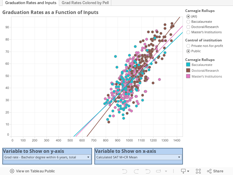
Take a look at the interactive graph below, and see how strongly certain input characteristics are associated with graduation outputs. What do you think? You might also want to look at research from HERI at UCLA, especially the table on the bottom of page 23 in this publication.
Comments
Post a Comment