This is my annual (sort of) look at tuition at public universities across America. Even when I worked at private universities, this was a topic of interest to me, and it should be for you too. Public universities educate the vast majority of students in the US (and when you add in community colleges, the skew toward publics becomes even more pronounced.) There are real consequences to an educated population, as I've written about here and here and many other places.
There is no definition of "Flagship University" but we can look at Land Grant institutions, of which there are three categories: The institutions chartered as a result of the 1862 Morrill Act; the 1890 institutions, of which many are HBCUs; and the 1990 institutions, which include many Tribal Colleges and community colleges.
For this, I've chosen the 1862 land grants, the flagships (see below) and the other large public universities, with enrollments over 20,000 undergraduates in order to get the greatest coverage with the least coding. In my choice of flagships, I eyeballed it: I used a College Board list (which is not definitive) as a guideline, but mostly just asked, "If each state were a ship, which university would carry the flag with the state name.?" It's not precise, and this is not intended to be definitive.
There are many states where the flagship and the land grant are the same: Wisconsin, Minnesota, Illinois, Wyoming, Florida, Georgia, and Arizona, for example. Others, like Michigan, Iowa, Kansas, and Oregon have a flagship (The University of ....) and a land grant (......State University). There are challenges of course: The California system is a land grant, but I didn't want to designate all of them that way, and besides, most came in with the large public selections. Cornell in New York is a private/public hybrid, but I excluded them because they once excluded me, so take it up with them. LOL as the kids say.
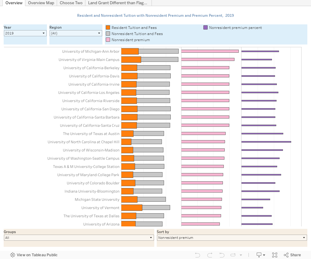
Anyway, there are four views here: Overview shows all 109 institutions in my selection. Cut it down by selecting a region or a group, like Flagships, for instance. You'll see four data points for the year you choose: Resident and nonresident tuition; the nonresident premium (or upcharge, as it were) and premium percent. Use the control at lower right to sort the institutions by any column, based on your interest.
Overview Map offers a geographic view. Choose a year and a value to display, and the map will update and color code the states. Pretty easy. Hover over the state to see that state's detail.
Choose Two lets you compare any two institutions in the set. It starts with Iowa and Iowa State, but you can use the filter to deselect those and choose two of your own, in any combination (they don't have to be in the same state). You'll see the same four values as on the first view, but over time, going back to 2009.
Finally, the last map shows the states where the land grant and public university are different, and allows you to compare 2019 tuition and fees for residents and nonresidents. It's interesting to note that in most states, the flagship has higher rates for both, even though most land grants are more heavily focused on STEM programs that are presumably more costly. What's your theory? Brand? Something else?
I hope this is helpful for benchmarking, or for use with students you're counseling.
New: This is the time when I normally ask people to let me know what they see. Today I'm trying something different: If (and only if) you use this blog (or any of my blogs) in your business or personal education or betterment, you can help defray the cost of web hosting by buying me a beer. (Public high school counselors should always consider this a free resource and read without any guilt, by the way!) Just click here to do so. I'd be grateful, and it will keep Higher Ed Data Stories free for everyone.
Comments
Post a Comment