In 2017, I stumbled upon some 2016 election data and started to look at the relationship between educational attainment in the US and election results. The title was only half serious, but some people took exception to it. Still, it's remained a topic of interest to me since then.
Before I begin writing about the latest visualization, let me point out a couple of things on this new display with the 2020 election data. You'll likely notice some similar patterns, but patterns don't prove causality. Even if they did, I could come up with two equally plausible explanations of this data that come at the answer from diametrically opposed political perspectives. Take your pick, or just look and see what you find interesting. It doesn't always have to lead to something.
This time we're dealing with another hot political topic, COVID-19 and vaccinations. And, it seemed to me that the political divisions in America tend to fall along the same lines. Or so I thought (and maybe I still do.)
There are five views here, and while they're pretty easy to understand, I think, I'd recommend you read below before diving in.
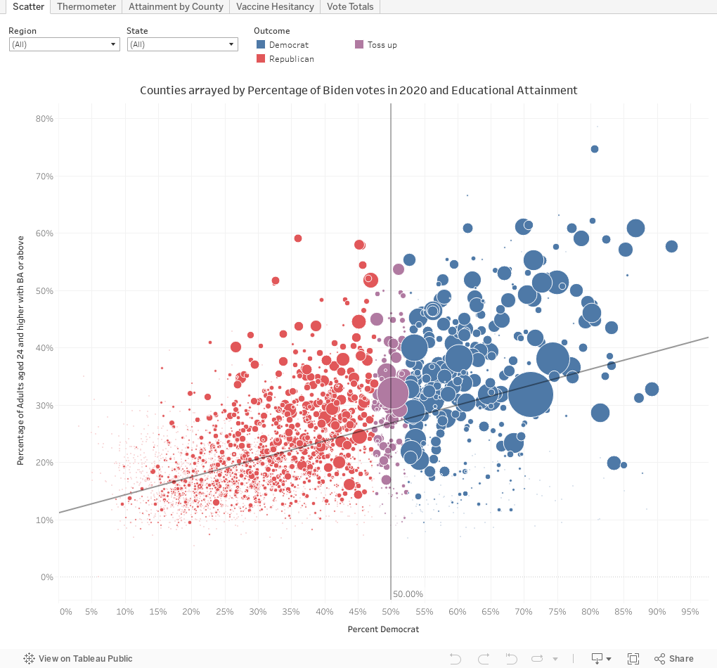
Scatter arrays (almost) every county in the US on two scales: The percentage of votes cast for Biden (x-axis) and the percentage of adults age 24+ with at least a bachelor's degree (the definition of attainment throughout this post). Each county is a bubble, and the bubble is sized by the number of votes cast. Hover for details. What is most interesting to me is the way in which the pattern stays the same even if you select a region or a single state.
Thermometer breaks counties into bands based on attainment, and then shows the total votes for Biden (blue) and Trump (red). Again, that pattern is clear: Counties with higher educational attainment tend to vote for Democrats; lower attainment indicates more votes for Republicans. On this visualization, the colored filters in purple (half way between blue and red) refer to the counties selected, not the voters. So if you choose to slide to at least 50% Hispanic, for instance, you will only show counties that are at least half Hispanic. In this case, it would not show you how Hispanic voters voted. Vulnerability refers to the CDC Social Vulnerability Index, which you can read about here. And play around with the vaccine data here too. It's interesting, and, maybe, surprising. (Note: I removed very small groups in the "under 5%" and "over 65%" to make the chart easier to read.)
Note: The filters are cumulative, and you can see how your choices affect the population in the visualization at top left. But if you try to choose a county that's at least 51% White and 51% Black, you won't get any data because that's mathematically impossible. And data from Alaska is not reported by county, fyi.
Attainment by county is a reference guide. Choose a state if you'd like, and hover over the county to see a lot of data about it.
Perhaps the most surprising display is the Vaccine Hesitancy view. What is so compelling here is how borders seem to create extremely sharp lines of demarcation, especially compared to the attainment view; if you expected them to look the same (I did) this is curious, to say the least. I have no explanation for it. Maybe someone does?
And, getting back to the original point is the final view, Vote Totals, showing how many votes each party got from each group of counties, clustered by attainment. The top shows counts, the bottom percentage of their totals. Democrats got 51M votes, or 64% of their total, from the counties with the highest educational attainment. Republicans got 33M, or 45% of theirs from that same group.
As always, play around with this; you won't break it, and you can always use the reset button to start over. And, of course, let me know what you see that strikes you as interesting.
Comments
Post a Comment