
Doctoral recipients in the US, by ethnicity over time

A while ago I published this visualization, showing the baccalaureate institutions of doctoral degree recipients over about 60 years.  It's a post I do every few years, and it always seems to be helpful for high school and independent counselors who work with students and families, and just interesting for the rest of us. 

Shortly after posting, I got an email from colleague Crys Latham at Washington Latin who wanted to know if you could look at that data by ethnicity.  The answer, unfortunately, is no: You can choose to download the data by undergraduate institution or ethnicity of the recipients, but not both.  (Perhaps NSF will give more granular data to bona fide academic researchers, so maybe someone can find out.) However, that got me thinking a bit, so I went back and looked at the tables again.

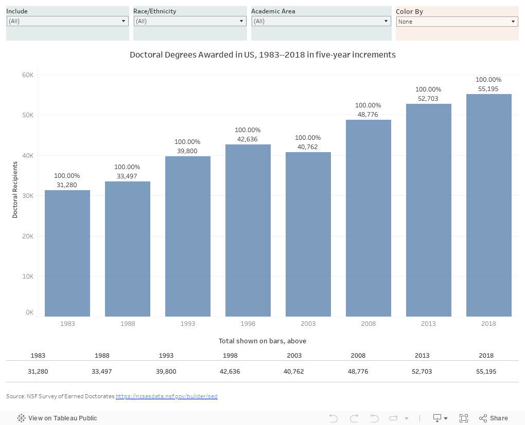
I downloaded ethnicity of doctoral recipients since 1983, in five year increments, and created the visualization below.  It's pretty simple, and if someone with better skills wants to make this visualization better, feel free; I left the Tableau workbook open for downloading.

First decide if you want to include all recipients or just those with known ethnicity (far left filter).  Then you can select any combination of ethnicity and academic area to see the trends over time (Asian recipients in social sciences, for instance).  But if you wish to choose only one of those, you can use the Color By control to color the bars by the other.  

For instance, choose "Black or African-American" on the race/ethnicity control, then color by "Academic Area."  You'll see that in 2018, about 20% of African-American recipients earned degrees in each of three areas: Education, Life Sciences, and Social Sciences.  Compare that to 1983, when half of the 1,009 African-American recipients earned doctorates in education.

As much as the growth is good news, the numbers can still be concerning: In 2018 fewer than 100 Hispanic doctoral recipients earned degrees in math and computer science.  Assuming many of them will not go to work at institutions of higher education, it shows how hard it can be for a university to attract and maintain a diverse faculty in some disciplines.  And of course, instead of being satisfied with the reality we see, it can cause us to ask why that is, and what we do about it.

As always, let me know what you see here that interests you.


Comments

Popular posts from this blog

Freshman Migration, 1986 to 2020

(Note: I discovered that in IPEDS, Penn State Main Campus now reports with "The Pennsylvania State University" as one system.  So when you'd look at things over time, Penn State would have data until 2018, and then The Penn....etc would show up in 2020.  I found out Penn State main campus still reports its own data on the website, so I went there, and edited the IPEDS data by hand.  So if you noticed that error, it should be corrected now, but I'm not sure what I'll do in years going forward.) Freshman migration to and from the states is always a favorite visualization of mine, both because I find it a compelling and interesting topic, and because I had a few breakthroughs with calculated variables the first time I tried to do it. If you're a loyal reader, you know what this shows: The number of freshman and their movement between the states.  And if you're a loyal viewer and you use this for your work in your business, please consider supporting the costs

Changes in AP Scores, 2022 to 2024

Used to be, with a little work, you could download very detailed data on AP results from the College Board website: For every state, and for every course, you could see performance by ethnicity.  And, if you wanted to dig really deep, you could break out details by private and public schools, and by grade level.  I used to publish the data every couple of years. Those days are gone.  The transparency The College Board touts as a value seems to have its limits, and I understand this to some extent: Racists loved to twist the data using single-factor analysis, and that's not good for a company who is trying to make business inroads with under-represented communities as they cloak their pursuit of revenue as an altruistic push toward access. They still publish data, but as I wrote about in my last post , it's far less detailed; what's more, what is easily accessible is fairly sterile, and what's more detailed seems to be structured in a way that suggests the company doesn&

The Highly Rejective Colleges

If you're not following Akil Bello on Twitter, you should be.  His timeline is filled with great insights about standardized testing, and he takes great effort to point out racism (both subtle and not-so-subtle) in higher education, all while throwing in references to the Knicks and his daughter Enid, making the experience interesting, compelling, and sometimes, fun. Recently, he created the term " highly rejective colleges " as a more apt description for what are otherwise called "highly selective colleges."  As I've said before, a college that admits 15% of applicants really has a rejections office, not an admissions office.  The term appears to have taken off on Twitter, and I hope it will stick. So I took a look at the highly rejectives (really, that's all I'm going to call them from now on) and found some interesting patterns in the data. Take a look:  The 1,132 four-year, private colleges and universities with admissions data in IPEDS are incl