
Baccalaureate origins of doctoral recipients

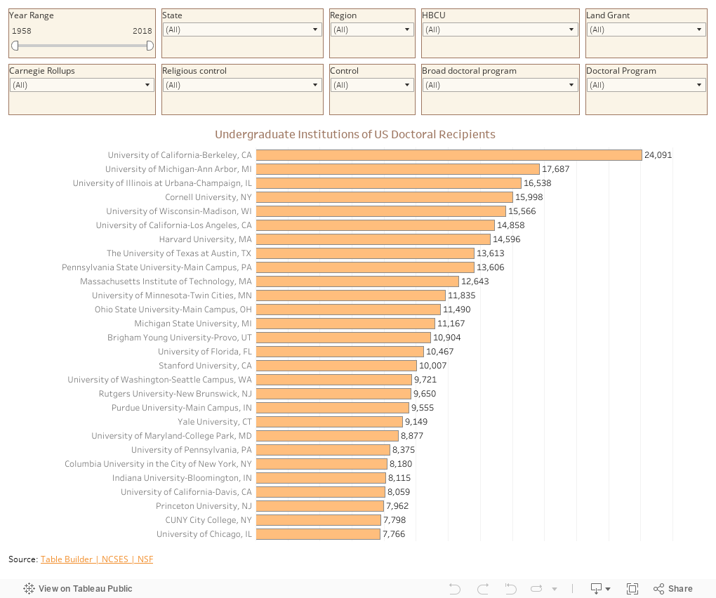
Here's a little data for you: 61 years of it, to be precise.  The National Science Foundation publishes its data on US doctoral recipients sliced a variety of ways, including some non-restricted public use files that are aggregated at a high level to protect privacy. The interface is a little quirky, and if you're doing large sets, you need to break it into pieces (this was three extracts of about 20 years each), but it may be worth your time to dive in.

I merged the data set with my mega table of IPEDS data, which allows you to look at institutions on a more granular level:  It's not surprising to find that University of Washington graduates have earned more degrees than graduates of Whitman College, for instance.  So, you can filter the data by Carnegie type, region or state, or control, for instance; or you can look at all 61 years, or any range of years between 1958 and 2018 and combine it with broad or specific academic fields using the controls.

High school and independent counselors tell me they've found this handy when working with students, and others just find it interesting: Which private, liberal arts college in Oregon is right up there with the big publics in the number of graduates who earn a doctorate?  What's happened to Harvard's rank in the last six decades? Of course the big doctoral public universities are high producers, but what about private, master's degree institutions?  What happened in the year I was born?  How about HBCU's? All available with the click of a few buttons.

The Tableau workbook is open for downloading, as there are hundreds of questions that might be asked that you can find out yourself with a little manipulation.  Have at it.

Reminder: I appreciate support for webhosting and other costs associated with creating Higher Ed Data Stories.  You can support these efforts here.


Comments

Popular posts from this blog

The Highly Rejective Colleges

If you're not following Akil Bello on Twitter, you should be.  His timeline is filled with great insights about standardized testing, and he takes great effort to point out racism (both subtle and not-so-subtle) in higher education, all while throwing in references to the Knicks and his daughter Enid, making the experience interesting, compelling, and sometimes, fun. Recently, he created the term " highly rejective colleges " as a more apt description for what are otherwise called "highly selective colleges."  As I've said before, a college that admits 15% of applicants really has a rejections office, not an admissions office.  The term appears to have taken off on Twitter, and I hope it will stick. So I took a look at the highly rejectives (really, that's all I'm going to call them from now on) and found some interesting patterns in the data. Take a look:  The 1,132 four-year, private colleges and universities with admissions data in IPEDS are incl

Freshman Migration, 1986 to 2020

(Note: I discovered that in IPEDS, Penn State Main Campus now reports with "The Pennsylvania State University" as one system.  So when you'd look at things over time, Penn State would have data until 2018, and then The Penn....etc would show up in 2020.  I found out Penn State main campus still reports its own data on the website, so I went there, and edited the IPEDS data by hand.  So if you noticed that error, it should be corrected now, but I'm not sure what I'll do in years going forward.) Freshman migration to and from the states is always a favorite visualization of mine, both because I find it a compelling and interesting topic, and because I had a few breakthroughs with calculated variables the first time I tried to do it. If you're a loyal reader, you know what this shows: The number of freshman and their movement between the states.  And if you're a loyal viewer and you use this for your work in your business, please consider supporting the costs

The College Finder

Note: A few people have commented on slow loading with the visualization.  If you have troubles, click here to be taken right to the visualization .  It should open in a new tab and you can follow along from there.    This is always a popular post with high school counselors, IECs, parents, and students who are looking for general information on degrees awarded, or a very specific combination of academic programs, location, and other institutional characteristics. It uses IPEDS data I downloaded as soon as I can when it became available (and before a looming government shutdown), and shows all 1,700 majors recognized by the federal government in the IPEDS system, using CIP codes, and the number of degrees awarded by college in any selected area. For instance, you might have a question about which college awards the most degrees in French Language and Literature: A few clicks, and you find it's the University of Arizona.  If you want a colder climate, choose the Great Lakes region,