This morning, The Chronicle of Higher Education published a story about the University of South Carolina, and its ambitious goal to bring African-American enrollment more in line with the state's population of African-American residents. Given that the state population is over a quarter African-American, and USC's student population is about 9.5%, and given the timeline (by 2025), this goal is ambitious, to say the least.


The story had a chart, showing the mathematical gap of the states, using a simple measure: Percentage of African-Americans in the state flagship institution, minus the percentage of African-American students in the state population. In case you can't get to the story (and if you work in education you really should consider supporting our trade paper with a subscription), it looks like this:
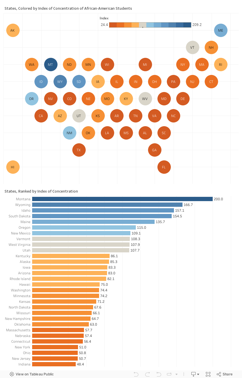
On this map, you can see the light colors, where the gap is the largest, and the dark colors, where the gap is the smallest, or in some cases, actually negative (that is, the percentage of African-Americans in the flagship is higher than the state population.)
But I wanted a little more, so I did some quick re-work on the data. (As a side note, I wish publishers would make their data available; I had to manually re-create this, which might explain any errors you find.)
If I were doing this, I'd have started with a different base: The African-American population of 17-24 year-olds, for instance. And I might have adjusted representation based on the inter-state migration patterns, if I had the time and the modeling skills. I would have also used raw numbers, and then calculated the percentages separately, as both numbers and percents can be helpful. Collectively, this quibbling demonstrates how hard it is to define precisely which institutions are doing the best job in enrolling diverse populations. Maybe another time.
As an aside, I supposed I should re-do this five-year-old visualization that used Simpon's Diversity Index.
Using the data available, I found myself dissatisfied with the simple arithmetic gap, and instead calculated a variable called Index of Concentration where 100 is perfectly representational; anything over 100 shows over-representation, and anything under 100 indicates under-representation. It's calculated by (flagship population/state population) * 100.
As you can see in the visualization below, this shows a different picture. The top is an array of the states, to show some sense of values, and the bar chart on the bottom to show rank and ranges. Blue values show over-representation; orange values show under-representation, and gray values are in the middle.
This is not to suggest, of course, that this way of looking at the data is better; it's just different. And even this view can skew your perception of reality. It might be easy to conclude that southern states do the worst job, while northern states do better. While it might be fair to criticize the dark orange states, it probably wouldn't be a good idea to congratulate the blue or gray states, however.
Why? Look at the same data, viewed in yet another way: A scattergram crossing state population and flagship populations of African-American students. It's clear that the blue states (the ones presumably doing the best job) are also the ones with lower percentages of African-Americans in the general population.
That makes the question different, and the answer "it depends."
As always, dig into this, and let me know what you see. And especially, what you might do better.
Comments
Post a Comment