
Educational Attainment in the States

In case the coverage of the 2016 presidential election didn't convince you, this might help you see why people in the rest of the country seem different somehow.

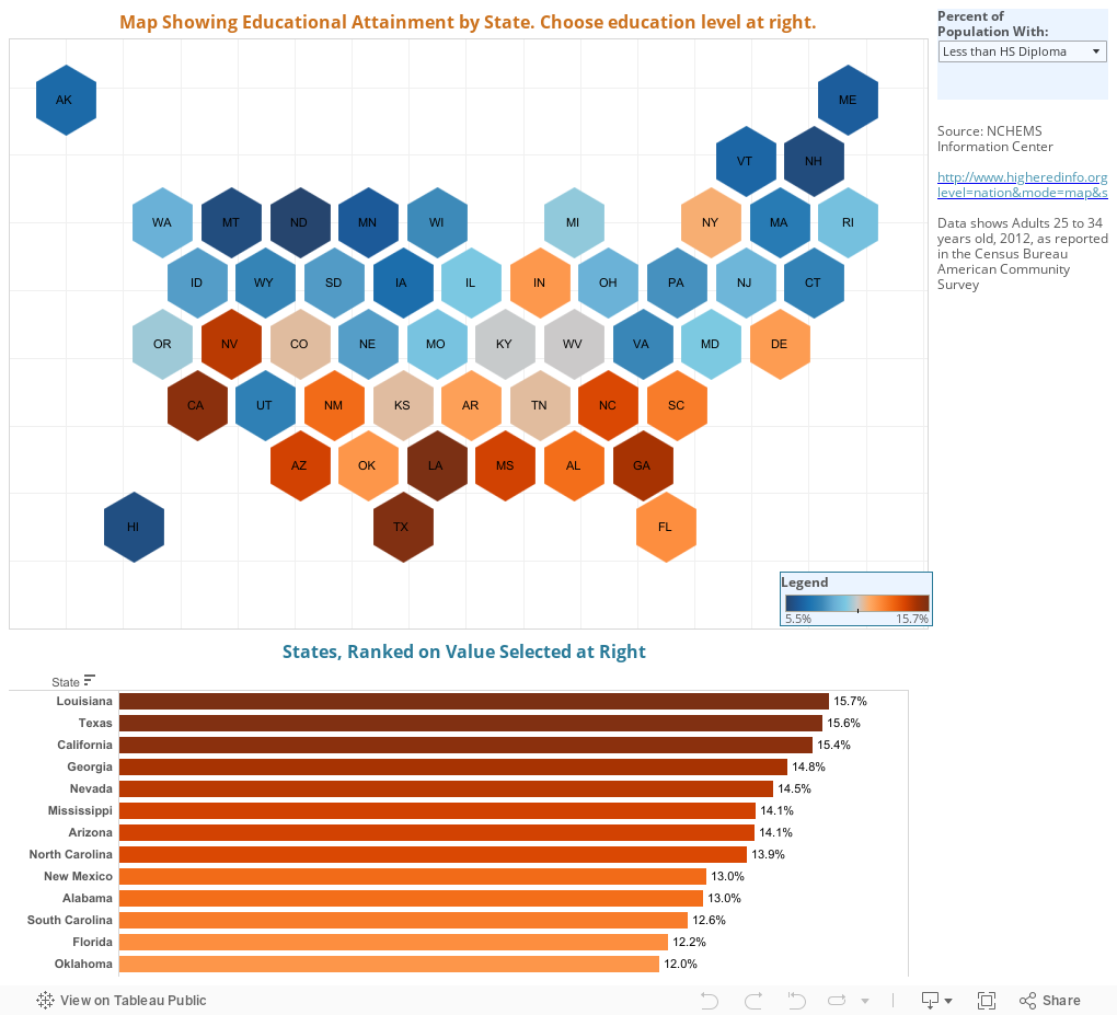
The data are from the US Census Bureau's American Community Survey, in 2012; this shows the educational attainment of adults 25-34 in that year.  Use the control at top right to pick a value to display on the map, and the states (represented by hex boxes here) change color to show the value you've chosen.  The bar chart also updates.

There are seven values:


  • Less than a HS Diploma shows the percentage of the population in that state aged 25-34 that did not complete high school
  • HS Diploma or Less shows the number above plus the percentage of people who have just a high school diploma
  • Exactly a HS Diploma shows just that: Everyone who graduated from high school but did not continue
  • HS Diploma or Higher is the percentage with at least a high school diploma, including everyone who went beyond that
  • Bachelor's Degree shows people who have just a BA or a BS
  • Bachelor's Degree or Higher and Graduate Degree should be self explanatory
Once you make a selection, the map and the bar chart update; both are color-coded with blue numbers lower and orange numbers higher.  Be careful with this: With low attainment rates, blue is presumably better (at least if you work in higher education); with higher attainment rates, orange is better.  Hover over a state to see the value, or look at the bar chart at the bottom, which displays the same data in a different format.

You may notice the map style; this is the first time I've used it, and I like it a lot.  It allows you to see values on small states that would otherwise get lost on traditional maps; and it allows Alaska and Hawaii to display just off the coasts without a lot of effort.  But I'd like to know what you think about them, too.


Comments

Popular posts from this blog

Changes in AP Scores, 2022 to 2024

Used to be, with a little work, you could download very detailed data on AP results from the College Board website: For every state, and for every course, you could see performance by ethnicity.  And, if you wanted to dig really deep, you could break out details by private and public schools, and by grade level.  I used to publish the data every couple of years. Those days are gone.  The transparency The College Board touts as a value seems to have its limits, and I understand this to some extent: Racists loved to twist the data using single-factor analysis, and that's not good for a company who is trying to make business inroads with under-represented communities as they cloak their pursuit of revenue as an altruistic push toward access. They still publish data, but as I wrote about in my last post , it's far less detailed; what's more, what is easily accessible is fairly sterile, and what's more detailed seems to be structured in a way that suggests the company doesn...

The Highly Rejective Colleges

If you're not following Akil Bello on Twitter, you should be.  His timeline is filled with great insights about standardized testing, and he takes great effort to point out racism (both subtle and not-so-subtle) in higher education, all while throwing in references to the Knicks and his daughter Enid, making the experience interesting, compelling, and sometimes, fun. Recently, he created the term " highly rejective colleges " as a more apt description for what are otherwise called "highly selective colleges."  As I've said before, a college that admits 15% of applicants really has a rejections office, not an admissions office.  The term appears to have taken off on Twitter, and I hope it will stick. So I took a look at the highly rejectives (really, that's all I'm going to call them from now on) and found some interesting patterns in the data. Take a look:  The 1,132 four-year, private colleges and universities with admissions data in IPEDS are incl...

Changes in SAT Scores after Test-optional

One of the intended consequences of test-optional admission policies at some institutions prior to the COVID-19 pandemic was to raise test scores reported to US News and World Report.  It's rare that you would see a proponent of test-optional admission like me admit that, but to deny it would be foolish. Because I worked at DePaul, which was an early adopter of the approach (at least among large universities), I fielded a lot of calls from colleagues who were considering it, some of whom were explicit in their reasons for doing so.  One person I spoke to came right out at the start of the call: She was only calling, she said, because her provost wanted to know how much they could raise scores if they went test-optional. If I sensed or heard that motivation, I advised people against it.  In those days, the vast majority of students took standardized admission tests like the SAT or ACT, but the percentage of students applying without tests was still relatively small; the ne...