I've been fascinated for a while by the connection between political leanings and education: The correlation is so strong that I once suggested that perhaps Republicans were so anti-education because, in general, places with a higher percentage of bachelor's degree recipients were more likely to vote for Democrats.
The 2024 presidential election puzzled a lot of us in higher education, and perhaps these charts will show you why: We work and probably hang around mostly people with college degrees (or higher). Our perception is limited.
With the 2024 election data just out, I thought I'd take a look at the last three elections and see if the pattern I noticed in 2016 and 2020 held. Spoiler: It did, mostly.
Before you dive into this, a couple of tips: Alaska's data is always reported in a funky way, so just ignore it here. It's a small state (in population, that is) and it's very red. It doesn't change the overall trends even if I could figure out how to connect the data to maps. Hawaii's data is fine, but I don't put it on the map because it takes a lot of work to get it to fit so that you can read the other states. It's a blue state, but also small. So they balance out.
Some definitions: Bachelor's degree attainment is the percentage of people in the county who have a Bachelor's Degree or higher using 2020 data. If a county has 100,000 people and 27,500 have a BA, that's an attainment rate of 27.5. Nationally, the rate is about 38%.
Median income is the Census Bureau statistic showing median earnings in the past twelve months for people who have earnings.
The statistic "Percent Democrat" is the percentage of voters who voted for Democrats, among those who voted Democrat or Republican. In other words, it excludes third-party voters. The Democrats and Republicans are the only parties with a candidate on every state's ballot, so it's the only fair comparison, I think. If you want to count people who throw away their vote, be my guest.
Simpson's Diversity Index is a way to talk about diversity that's a little different than you might think. It is not the percentage of people of color. Simpson's Diversity essentially calculates the probability of selecting at random two different categories from a population. So, if 95% percent of a county is White, it's not very diverse. Same as one that's 80% Black or African-American, or 65% Hispanic. Higher numbers on Simpson's means more diversity of the group. A group with one Hispanic person, one White person, one Black person, and one Asian person would be perfectly diverse, as you'd always pick two people from different groups in a random sample.
Final tips: It's important to interact here by using the sliders and/or filters, and/or highlighters. You can't break anything; you can always reset the view using the little arrow at lower right.
There are seven views here, accessible via the tabs across the top.
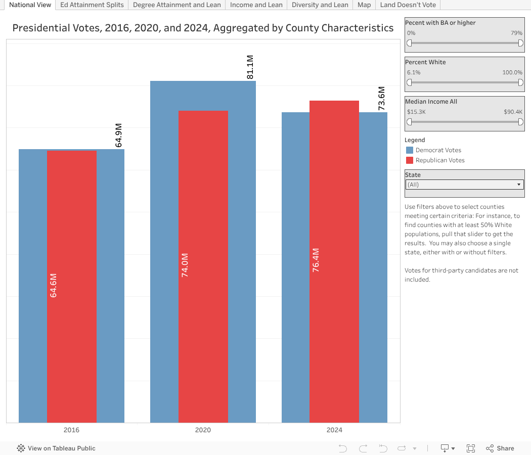
National View shows all the data from all the counties rolled up to a year. You can see Democrat and Republican votes on the bars. Use the sliders to only include counties with certain levels of income, diversity or educational attainment, nationally or in a single state. You'll probably quickly see the great American divide.
Ed Attainment Splits is the same data, but divided. Each group of bars shows increasing attainment, from left to right. So at the far left is the aggregation of all counties with lower attainment, and as you move to the right within a year, you see higher levels of bachelor's degree attainment. The three tallest blue bars tell the story of 2024 in a way no political scientist can.
The next three views show scatter plots, with Percent Voting Democrat on the y-axis (vertical). The three different views just swap out three different values: Bachelor's degree attainment, Median Income, and Simpson's Diversity. These three things largely covary, so the similar patterns should not surprise. The bubbles are sized by the number of voters, and you can hover over any bubble for details. Use the Highlight Tool at top to focus only on Blue, Purple, or Red counties.
The cleverly named view titled "Map" shows every county colored by its political lean. You can choose a year at top left, and only show certain counties using the various filters at top. Again, you can't break anything by interacting, and a reset is a click away.
And finally, because there is one in every group who points to the preponderance of red on the map and thinks it's meaningful, the final view shows Land Doesn't Vote. Los Angeles County (in yellow) has more people by itself than all the blue states plus Hawaii combined. And it has more people than all the orange states combined, too.
I hope you find this as interesting as I did.
Comments
Post a Comment