Women have made tremendous strides in educational attainment of bachelor's degrees in the last half of 20th century and the first decade of the 21st. And even though doctoral degrees have lagged behind, we can see dramatic changes there as well.
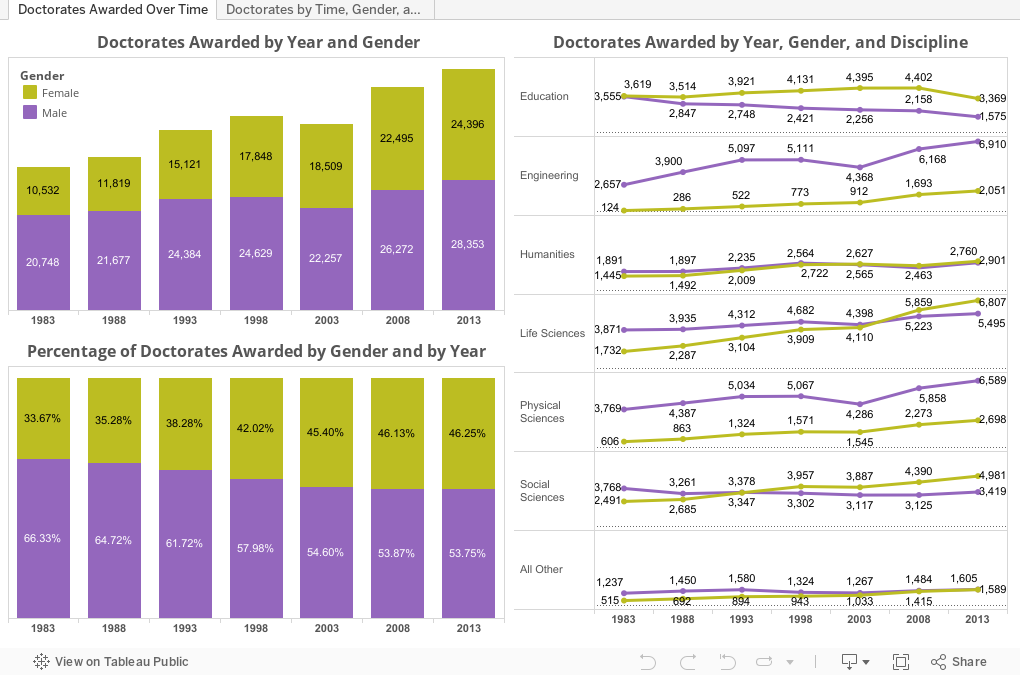
Take a look at this visualization using National Science Foundation Data (this link downloads the data for you in Excel as Table 14). What you see over time is a dramatic increase in the number of women who earned doctorates since 1983, but also a shift in the percentage distributions. Women are now the majority in Life Sciences, Education, and Social Sciences, and close to dead even with men in all fields except Physical Sciences and Engineering.
The second view (using the tabs across the top) shows doctorate by broad discipline over time. Use the filter at the top to compare men and women, or to see the totals. Note the tremendous percentage growth in women in engineering since 1983: From 124 to 2,051, an increase of over 1,500%.
While it's not necessarily true that most doctoral recipients work in higher education, it's true that higher education gets most of its instructional faculty from doctoral recipients; the long, slow trend (assuming it will continue, or even just stabilize) means there are some interesting changes in store in the higher education labor force in the coming decades. It's possible college faculty will look very different 20 years from now
What do you think?
P.S. You might also be interested in this, showing bachelor's attainment over time.
Comments
Post a Comment