
Diversity of Institutions, by Type

A few posts ago, I wrote about where students of certain ethnicities went to college.  In other words, if you looked at all the Hispanic students in the US, we'd want to see where they go to college, and compare that to Asian students, or students of two or more races.  I asked whether a student's ethnicity determined where they go to college.

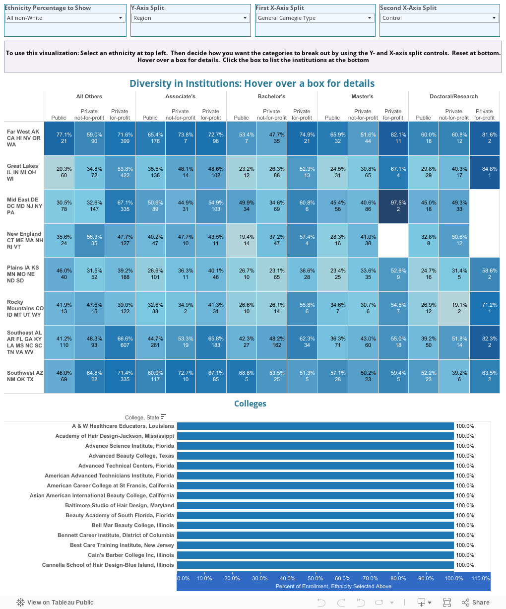
This is the same data, but it examines it at the other end: The colleges, and how diverse they are.  In other words, does your location, control, and size, and Carnegie Type, for instance, determine how diverse you are, or limit how diverse you can become?

Again, the answer is no, but you can find some interesting trends.

If you're timid about using Tableau and interacting with it, here's your chance.


  • First, choose an Ethnicity in the top left corner.  For instance, assume you want to display the percentage of enrollment that is Asian.
  • Then, choose what value you want to display along the y-axis (the left side, from top to bottom)
  • Choose how to display the x-axis using two controls.  If you want just one dimension along the x-axis, make it the same variable for both x-axis controls.
Using the default values, look at the top right box.  This means that at the two private-for-profit Doctoral/Research Institutions in the Western States, the undergraduate enrollment is 81.6% non-white.  Hover over the box for details.


Now, click on that box, and the bar charts at the bottom update to show you those three schools, and the percentage of the student body of the ethnicity indicated.


As always, if you get stuck, just use the undo or reset buttons at the lower left:


There is a LOT to play with here.  What do you notice?


Comments

Popular posts from this blog

Educational Attainment and the Presidential Elections

I've been fascinated for a while by the connection between political leanings and education: The correlation is so strong that I once suggested that perhaps Republicans were so anti-education because, in general, places with a higher percentage of bachelor's degree recipients were more likely to vote for Democrats. The 2024 presidential election puzzled a lot of us in higher education, and perhaps these charts will show you why: We work and probably hang around mostly people with college degrees (or higher).  Our perception is limited. With the 2024 election data just out , I thought I'd take a look at the last three elections and see if the pattern I noticed in 2016 and 2020 held.  Spoiler: It did, mostly. Before you dive into this, a couple of tips: Alaska's data is always reported in a funky way, so just ignore it here.  It's a small state (in population, that is) and it's very red.  It doesn't change the overall trends even if I could figure out how to c...

Changes in AP Scores, 2022 to 2024

Used to be, with a little work, you could download very detailed data on AP results from the College Board website: For every state, and for every course, you could see performance by ethnicity.  And, if you wanted to dig really deep, you could break out details by private and public schools, and by grade level.  I used to publish the data every couple of years. Those days are gone.  The transparency The College Board touts as a value seems to have its limits, and I understand this to some extent: Racists loved to twist the data using single-factor analysis, and that's not good for a company who is trying to make business inroads with under-represented communities as they cloak their pursuit of revenue as an altruistic push toward access. They still publish data, but as I wrote about in my last post , it's far less detailed; what's more, what is easily accessible is fairly sterile, and what's more detailed seems to be structured in a way that suggests the company doesn...

The Highly Rejective Colleges

If you're not following Akil Bello on Twitter, you should be.  His timeline is filled with great insights about standardized testing, and he takes great effort to point out racism (both subtle and not-so-subtle) in higher education, all while throwing in references to the Knicks and his daughter Enid, making the experience interesting, compelling, and sometimes, fun. Recently, he created the term " highly rejective colleges " as a more apt description for what are otherwise called "highly selective colleges."  As I've said before, a college that admits 15% of applicants really has a rejections office, not an admissions office.  The term appears to have taken off on Twitter, and I hope it will stick. So I took a look at the highly rejectives (really, that's all I'm going to call them from now on) and found some interesting patterns in the data. Take a look:  The 1,132 four-year, private colleges and universities with admissions data in IPEDS are incl...