
Diversity in the First-year Class at the Ivy Plus Institutions

 I'm not sure where to begin on this one, so let's veer off topic a bit.  

I've decided I'll likely be phasing out Higher Ed Data Stories in the near future as I go into retirement and start my new venture, which is soft launched but not officially open for business.  When I do, I'll be posting regularly on my blog over there, but won't be putting everything out on the web for free, as I've been doing on this site.  I do appreciate the contributions people made on the Buy Me Coffee site, but the hosting, software, and labor costs never balanced with the revenue, and while there was a lot of good will that came from my work, I was still in a deficit situation (especially on the time part) and I'll need to dedicate that to the business side of things.  Medicare Parts B and D ain't free, you know.

But this is some unfinished business, and it might be a good place to end.  You know I've been personally opposed to the very idea of the SAT and ACT for some time, while being professionally neutral: If colleges find value in it, I don't care if they use one, the other, or both.

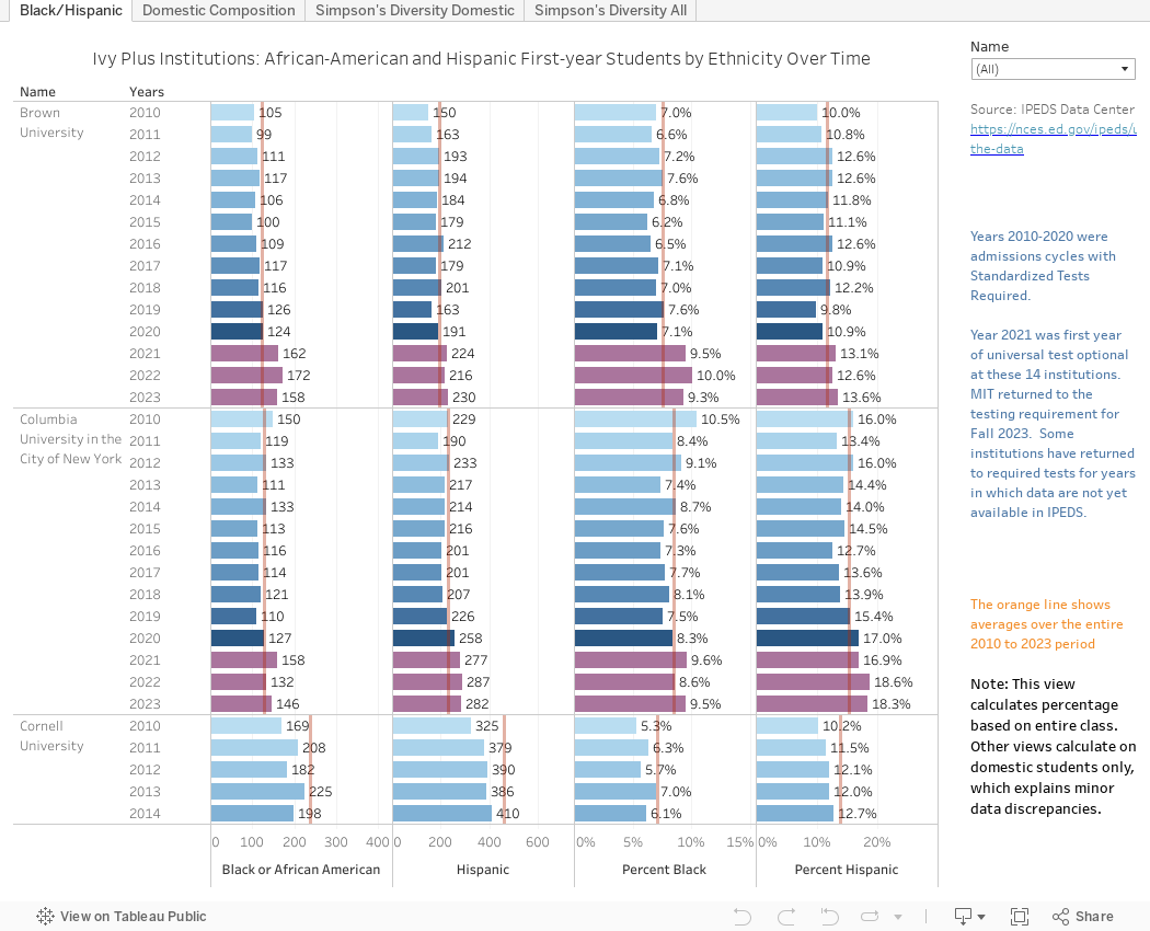
But I do care about the truth.  On that note, two issues: The headlines suggesting that lots of colleges are returning to standardized tests for first-year admissions are just not true, of course, and everyone in the business knows this.  The testing agencies are curiously silent on the misinterpretation of this information, of course.

The larger issue of "truth" is the justification put forth by the universities that are returning to the SAT or ACT.  They are all suggesting that they need the tests to find qualified students of color, or low-income students.  Is that true?  If it is, does it mean they denied admission to other, more highly qualified students of color with test scores? You can look at the data below, and while it's not absolutely definitive, it is interesting.

Before diving in, however, some caveats:

  • IPEDS reporting recognizes "two or more" as an ethnic category, but does not allow breakouts.  So many colleges will report some percentage of students in every category they check, and of course, there is good reason to do so.  There is no reason, however, to increase the numerator and not the denominator in the equation, as some of them do.  So you may notice that the numbers here don't line up with what colleges have published.
  • IPEDS data on income or financial need is far less clear, as it only breaks out by Pell/Non-Pell.  Perhaps the researchers who have access to the unit record data can dive in more deeply.
  • We don't have a lot data (at least not published as supporting evidence for the claim) that says there is a problem with performance among the students admitted without tests.  If that comes to light later, it might change your perception of this data, as it should.  What I have seen shows only minor differences, and given COVID and its disproportionate effects on students, I'm not sure the SAT would survive other testing.
  • Some of these charts show Simpson's diversity, which is a different way of thinking about diversity.  It's not the percentage of minority students; it is essentially the chance that two randomly selected members of a group will be different.  If your population was 100 and all 100 in the group were different, you'd have perfect diversity (a value of 1).  If all 100 were the same, you'd have a value of 0.  Higher numbers indicate greater diversity.
OK.  Got it?

There are four views in the visualization.  The first shows just Hispanic and Black/African-American enrollment in the first-year classes at the "Ivy Plus" institutions (The Ivy League institutions plus Duke, MIT, Stanford, and the University of Chicago.)  You can see the trend (in both numbers and percentage of the class) over time.  The denominator is the entire class. The blue bars show data up until 2020, and the purple bars show test optional years.

The second shows the entire ethnic composition of the domestic students in the class.  Look at them collectively to start, then look at individual institutions using the control at right. 

The last two views show the Simpson's Index of Diversity for each institution over time.  The first is for domestic students, and the second is for everyone, including international students counted as an ethnicity.  Use the highlight control to focus on one institution.

So, what do you think?  Do highly rejectives need the SAT to find students of color?  Let me know.

Comments

Popular posts from this blog

Changes in AP Scores, 2022 to 2024

Used to be, with a little work, you could download very detailed data on AP results from the College Board website: For every state, and for every course, you could see performance by ethnicity.  And, if you wanted to dig really deep, you could break out details by private and public schools, and by grade level.  I used to publish the data every couple of years. Those days are gone.  The transparency The College Board touts as a value seems to have its limits, and I understand this to some extent: Racists loved to twist the data using single-factor analysis, and that's not good for a company who is trying to make business inroads with under-represented communities as they cloak their pursuit of revenue as an altruistic push toward access. They still publish data, but as I wrote about in my last post , it's far less detailed; what's more, what is easily accessible is fairly sterile, and what's more detailed seems to be structured in a way that suggests the company doesn...

The Highly Rejective Colleges

If you're not following Akil Bello on Twitter, you should be.  His timeline is filled with great insights about standardized testing, and he takes great effort to point out racism (both subtle and not-so-subtle) in higher education, all while throwing in references to the Knicks and his daughter Enid, making the experience interesting, compelling, and sometimes, fun. Recently, he created the term " highly rejective colleges " as a more apt description for what are otherwise called "highly selective colleges."  As I've said before, a college that admits 15% of applicants really has a rejections office, not an admissions office.  The term appears to have taken off on Twitter, and I hope it will stick. So I took a look at the highly rejectives (really, that's all I'm going to call them from now on) and found some interesting patterns in the data. Take a look:  The 1,132 four-year, private colleges and universities with admissions data in IPEDS are incl...

Freshman Migration, 1986 to 2020

(Note: I discovered that in IPEDS, Penn State Main Campus now reports with "The Pennsylvania State University" as one system.  So when you'd look at things over time, Penn State would have data until 2018, and then The Penn....etc would show up in 2020.  I found out Penn State main campus still reports its own data on the website, so I went there, and edited the IPEDS data by hand.  So if you noticed that error, it should be corrected now, but I'm not sure what I'll do in years going forward.) Freshman migration to and from the states is always a favorite visualization of mine, both because I find it a compelling and interesting topic, and because I had a few breakthroughs with calculated variables the first time I tried to do it. If you're a loyal reader, you know what this shows: The number of freshman and their movement between the states.  And if you're a loyal viewer and you use this for your work in your business, please consider supporting the costs...