This now-annual post is one that boggles and befuddles people, especially those who think that your yield rate is something you control by flipping switches. In reality, yield rate is controlled by something much more powerful: Algebra.
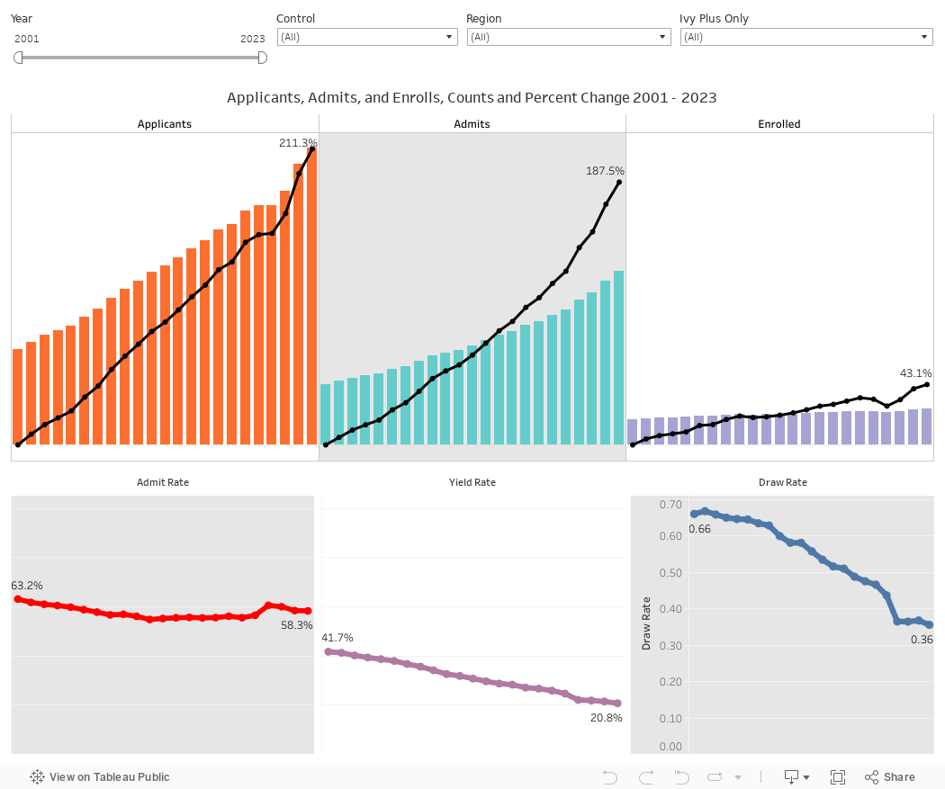
First, let's review what yield rate is: Colleges get applications, and they admit a certain percentage of them. In aggregate colleges admit the vast majority of applicants. Even though this visualization shows an aggregate admit rate of 58.3% in 2023 (the red line at bottom left), the set of colleges in the data only include colleges required to report to IPEDS; this excludes community colleges and any other institution that considers itself an Open Admissions institution.
Of that 58%, some percentage enroll, and that's called the yield rate. As you can see, the yield rate (the purple line at bottom center) has been falling every single year since 2001. This is a function of math. Applications (the orange bars at top left) have risen 211%, while the total enrolled has increased by only 43%. If you do the mental math, you can tell that more students are applying to more institutions, and getting more offers of admission. In this scenario, yield rate goes down based on simple algebra.
Which is not to say, of course, that some colleges haven't shown increases in yield rates. More on that in a moment.
There is one more calculation of interest, called the Draw Rate. I did not invent the Draw Rate figure, and I do not know who did. I only remember hearing it referred to sometime in the mid-1980s as I was a young admission officer. It's the college's yield rate divided by the admit rate, and it is in some sense the best measure of market power and position. It only became interesting to me when colleges started trying to pump up applications in order to appear to be more selective, believing that selectivity was what students and parents wanted.
When you drive up applications artificially via things like Fast Apps, Smart Apps, VIP Apps, massive fee waivers, and other things, you generate applications from students who are far less likely to enroll (or yield). And even though you might get nominally more selective, you lose that value when your yield rate goes down as a result. Draw Rate accounts for that, in some measure, although it too, can be manipulated by taking half (or more) of your class via Early Decision or Restrictive Early Action. Draw rate goes up when your yield rate increases and/or your admit rate falls.
The blue line shows what has happened to our collective fascination with application increases: We're working harder, and spinning our wheels faster, all in vain. To be sure, you have to do this because your competitors are. But it would be great if we never would have started down this path.
Remember what I said about some colleges increasing yield even when collectively the rate has gone down? Use the control at top right to put only the 12 Ivy Plus institutions into the visualization, and see what happens. Note the Draw Rate, and remember that the collective average is 0.36.
That's why I like that measure: It helps separate the market's most powerful entities from all the rest.
Stay tuned: We'll have the 2024 data in about a year!
Comments
Post a Comment