
Public University Tuition over time

The cost of college has been a hot topic for a while now, and even though some studies suggest the net cost of college has been falling post-COVID, it's clear that sticker prices have not been. 

And because the overwhelming majority of college and university students in the US attend public institutions, that's a good place to start the discussion.

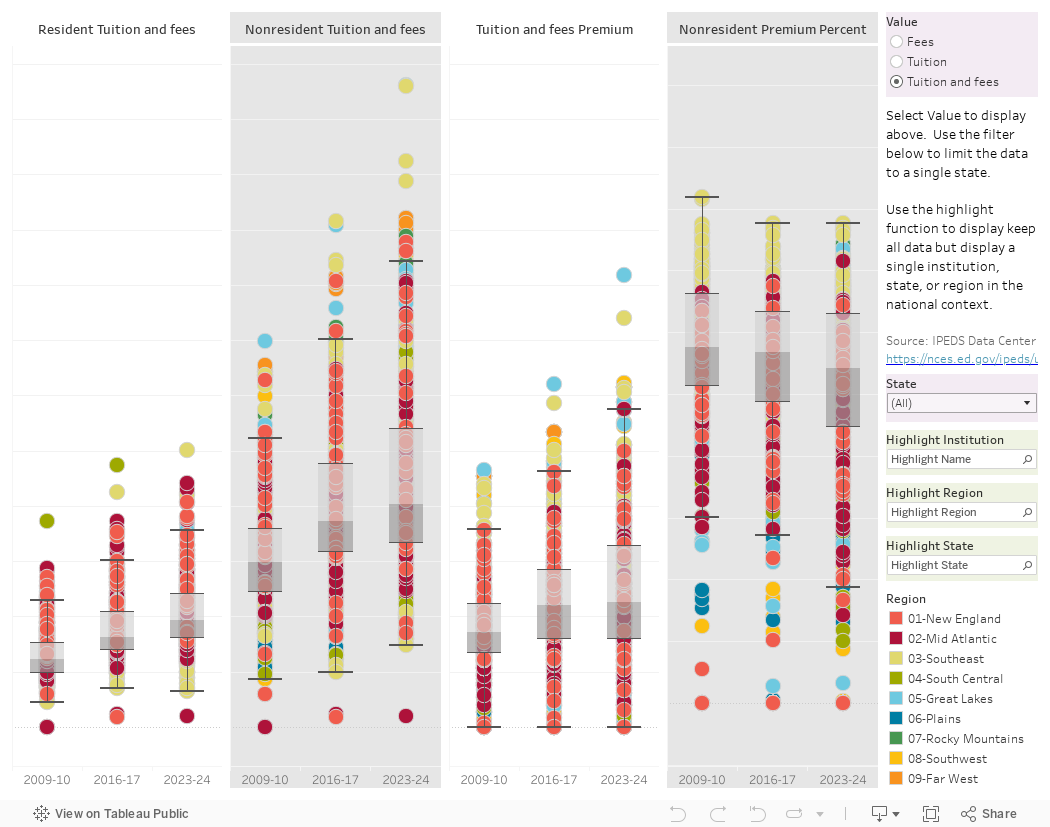
This is data from IPEDS, showing published cost about 530 public, four-year institutions that award the bachelor's degree, excluding community colleges that have been creeping into that category over time. Each dot represents an institution, and the data are from 2009, 2016, and 2023 to show long-term trends. The dots are colored by geographic region.

The data are displayed four ways, from left to right and default to published Tuition and Fees: Resident, Nonresident, the premium nonresidents pay (in dollars), and the premium not residents pay (as a percentage of what residents pay.)  You can change this to show just tuition or just fees by using the control at the top right.

You can also filter to a single state, if you wish, to get a sense of how that state things about tuition.

The green-shaded Highlight boxes at right will allow you to make either one institution, one region, or one state standout, without filtering the other data.

The data are displayed in a box-and-whisker format: The shaded boxes cover the middle 50% of the range, with the dividing line the 50th percentile. The rest of the data are mostly contained within the boundary created by the top bar and bottom bar, with outliers being shown above or below it.  These are not enrollment weighted.

As always, I happy to hear what you got out of this.  Leave a comment below or send me an email.


Comments

Popular posts from this blog

Educational Attainment and the Presidential Elections

I've been fascinated for a while by the connection between political leanings and education: The correlation is so strong that I once suggested that perhaps Republicans were so anti-education because, in general, places with a higher percentage of bachelor's degree recipients were more likely to vote for Democrats. The 2024 presidential election puzzled a lot of us in higher education, and perhaps these charts will show you why: We work and probably hang around mostly people with college degrees (or higher).  Our perception is limited. With the 2024 election data just out , I thought I'd take a look at the last three elections and see if the pattern I noticed in 2016 and 2020 held.  Spoiler: It did, mostly. Before you dive into this, a couple of tips: Alaska's data is always reported in a funky way, so just ignore it here.  It's a small state (in population, that is) and it's very red.  It doesn't change the overall trends even if I could figure out how to c...

First-year student (freshman) migration, 2022

A new approach to freshman migration, which is always a popular post on Higher Ed Data Stories. If you're a regular reader, you can go right to the visualization and start interacting with it.  And I can't stress enough: You need to use the controls and click away to get the most from these visualizations. If you're new, this post focuses on one of the most interesting data elements in IPEDS: The geographic origins of first-year (freshman) students over time.  My data set includes institutions in the 50 states and DC.  It includes four-year public and four-year, private not-for-profits that participate in Title IV programs; and it includes traditional institutions using the Carnegie classification (Doctoral, Masters, Baccalaureate, and Special Focus Schools in business, engineering, and art/design. Data from other institutions is noisy and often unreliable, or (in the case of colleges in Puerto Rico, American Samoa, and other territories, often shows close to 100% of enro...

Changes in SAT Scores after Test-optional

One of the intended consequences of test-optional admission policies at some institutions prior to the COVID-19 pandemic was to raise test scores reported to US News and World Report.  It's rare that you would see a proponent of test-optional admission like me admit that, but to deny it would be foolish. Because I worked at DePaul, which was an early adopter of the approach (at least among large universities), I fielded a lot of calls from colleagues who were considering it, some of whom were explicit in their reasons for doing so.  One person I spoke to came right out at the start of the call: She was only calling, she said, because her provost wanted to know how much they could raise scores if they went test-optional. If I sensed or heard that motivation, I advised people against it.  In those days, the vast majority of students took standardized admission tests like the SAT or ACT, but the percentage of students applying without tests was still relatively small; the ne...