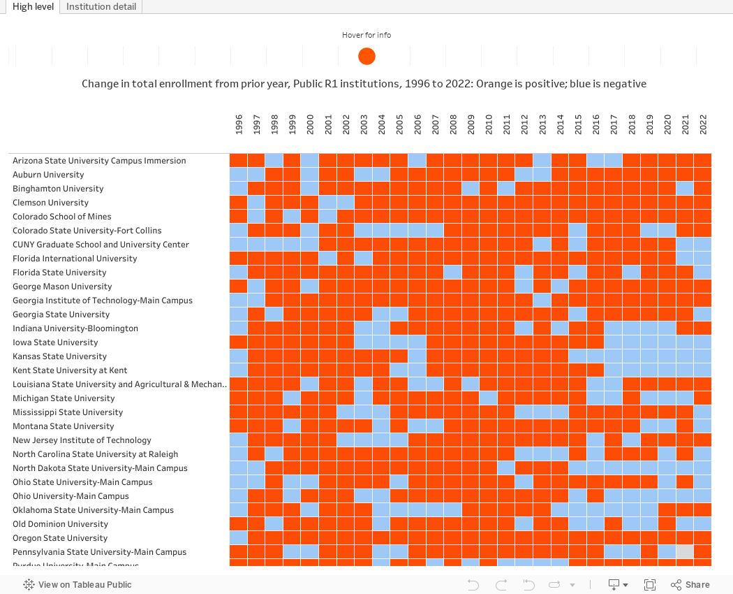
A while ago, I made the claim that Oregon State University has the longest streak of consecutive years of fall-over-fall enrollment growth of any public, Research 1 university in America. A few people have asked me, not exactly doubting the claim, but thinking maybe I had made a mistake, for the source of it.
This started as a curiosity: I knew from our own internal documentation that the last time OSU (the oldest OSU...not the one in Ohio or Oklahoma) had a fall-to-fall enrollment drop was 1996, and I was curious to see if any other institution could make that claim. So I went to the IPEDS Data Center and downloaded the data.
It's below. First, a few points: My comparison group is 108 Public, four-year, Research 1 Universities as designated by the Carnegie Commission on Higher Education as of Fall, 2022, the latest IPEDS data available. The R1 designation is actually called "Doctoral Institutions: Very High Research Activity" but the nickname R1 is a holdover from prior years. The category contains those institutions who produce the highest research activity and output among American universities.
What you can't see here is that 2023 showed an increase (it's not yet in IPEDS, but trust me), and that 2024 will also show an increase once our census is final. So OSU's record is the 26 shown, plus last year, plus this coming year, for a total of 28 years.
There are a couple of small anomalies with the data, as there always seems to be. First, some institutions missed a year or two in their reporting. Even if those years had shown an increase, they were already nullified by other decreases. And Penn State has bounced around from being one institution to being several to being one again; this too does not seem to make a difference in the tally.
The first chart here shows all years and all institutions (you'll have to scroll down to see them all using the bar on the right.) You'll notice that every institution shown (other than OSU) has at least two years with a blue box after 1997, meaning a decrease. Hover over the box for details. Orange shows an increase from the prior year.
The second chart shows individual enrollment data for any institution you select, using the filter at the top. The bars are colored similarly: Orange for increase, and blue for decrease.
If I've missed something or you think these data points are wrong, let me know. If a university decided intentionally to shrink, for whatever reason, that's interesting, but not the point of this visualization. If you want to look at just graduates or undergraduates or men or women or students of color or some other variable, I encourage you to read my posts here and here about how to download IPEDS data for yourself.
And as always, leave a comment below if you find something interesting.
Appreciate this data visualization. And congrats on impressive performance by Oregon State. At quick glance, it seems that -- after OSU -- Mines has the 2nd longer streak of fall UG enrollment gains (with consecutive increases since 2002). And University of Texas Dallas has the fewest number of fall over fall decreases (only 2 years of reported declines) during that time period. (Arkansas, Clemson, Georgia Tech, North Texas, TAMU, UC-Davis, UC-San Diego, UCF, UMass, and Mines all had only 3 years of declines.) Struck me how many land grant (& land grant adjacent [eg, GT, Mines]) institutions (and how few traditional non-Morrill flagships) have demonstrated consistent enrollment growth. Also, not surprising that public universities located on the coasts & within the Sun Belt seem to show more consistent increases than peers within the Great Lakes/ Midwest/ Plains states.
ReplyDelete