This is a reboot of a visualization I did in 2018, which I found fascinating, but which didn't get much traffic at the time, and thus, I've not refreshed it. But I still find it compelling and instructive.
Each year, the Association of American Medical Colleges publishes a lot of data about admission to medical colleges in the US. But frankly, it's a mess, and takes a lot of effort to clean up and visualize: Each link is a separate spreadsheet, and each spreadsheet has spacer rows and merged cells and lots of stuff that needs to be scrubbed (carefully) before analyzing and visualizing. So, if you use this work in a professional capacity, I'd appreciate your support for my time, software and hosting costs at this link. As a reminder, I don't accept contributions from high school counselors, students, or parents who are using the site. (And if you know anyone at AAMC, tell them raw data would be much appreciated).
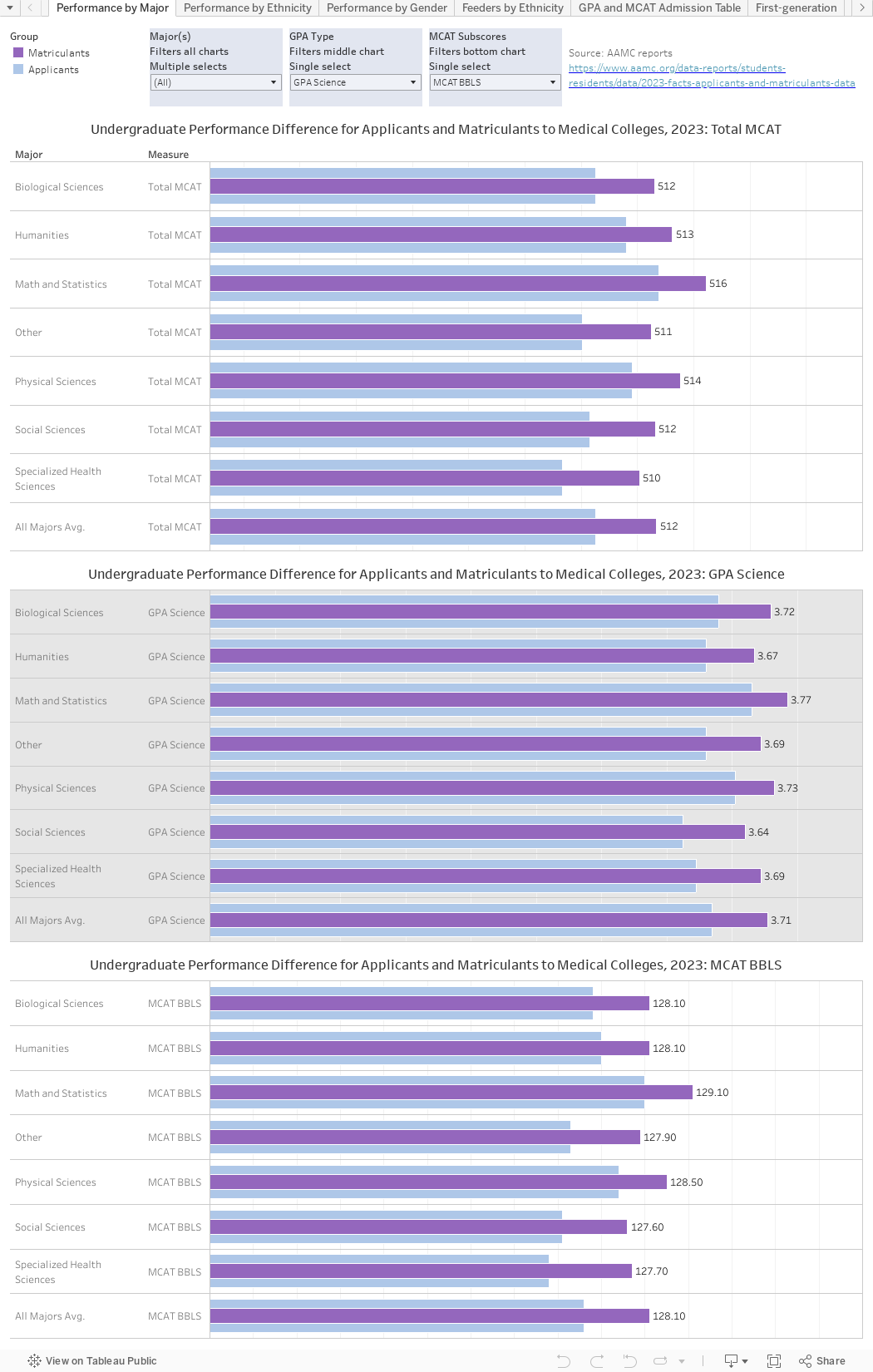
There are seven views here, some of which combine several data sets. Use the tabs across the top to access the views.
The first three tabs show similar data, broken out three ways: By undergraduate major, by ethnicity, and by gender for applicants and matriculants. Don't be afraid to use the filters to get what you want; you won't break anything, and there is a reset button at the bottom.
The top chart on these three views shows Total MCAT scores for applicants (blue) and matriculants (purple). The middle chart shows your choice of GPA, using the filter at the top: Science, Non-Science, and Overall. And the bottom chart shows sub-scores on the MCAT, again, based on the filter you choose. Hover over a bar for details.
Total MCAT scores range from 472 to 578 with 500 being the mid-score, and each of the four sections--Biological and Biochemical Foundations of Living Systems; Chemical and Physical Foundations of Biological Systems; Psychological, Social, and Biological Foundations of Behavior; and Critical Analysis and Reasoning Skills--is scored from a low of 118 to a high of 132, with a midpoint of 125. Read about them here, whence I shamelessly stole this information.
The fourth tab shows which undergraduate institutions sent applications to US Medical Schools in what quantity, based on student ethnicity. Note that the data are not complete, but rather a compilation of five different reports, for colleges sending applications from at least 100 White students, 50 Asian students, 15 African-American students, 10 Hispanic students, or five Native American/Alaska Native students. A college can be on one list but not another: For instance, the University of Oklahoma is #1 for Native students, but not on the list of institutions sending at least 50 Asian students.
When you hover over the bars, you can see that institution in larger context, like this:

The fifth tab gets into the nitty-gritty, and show the distribution of applicants and admits by GPA and MCAT ranges (top two charts), as well as the admission rate (bottom), showing the success of being admitted to at least one medical college.
The sixth and seventh tabs are simple summaries by first-generation status, and gender over time.
There is an awful lot of data here, and again, if you have any sway with the AAMC, tell them I'd sign my life away to get raw data in one big file. As always, let me know what you see here.
Comments
Post a Comment