There has been a lot written about the death of the English degree in higher education. Is it true?
Sort of. But there are other interesting trends in patterns across the country in the past dozen years. I downloaded IPEDS data from 2010 to 2022 (even years) and created the visualization to show those changes and patterns in bachelor's degrees awarded. There are six views, and some of them are interactive.
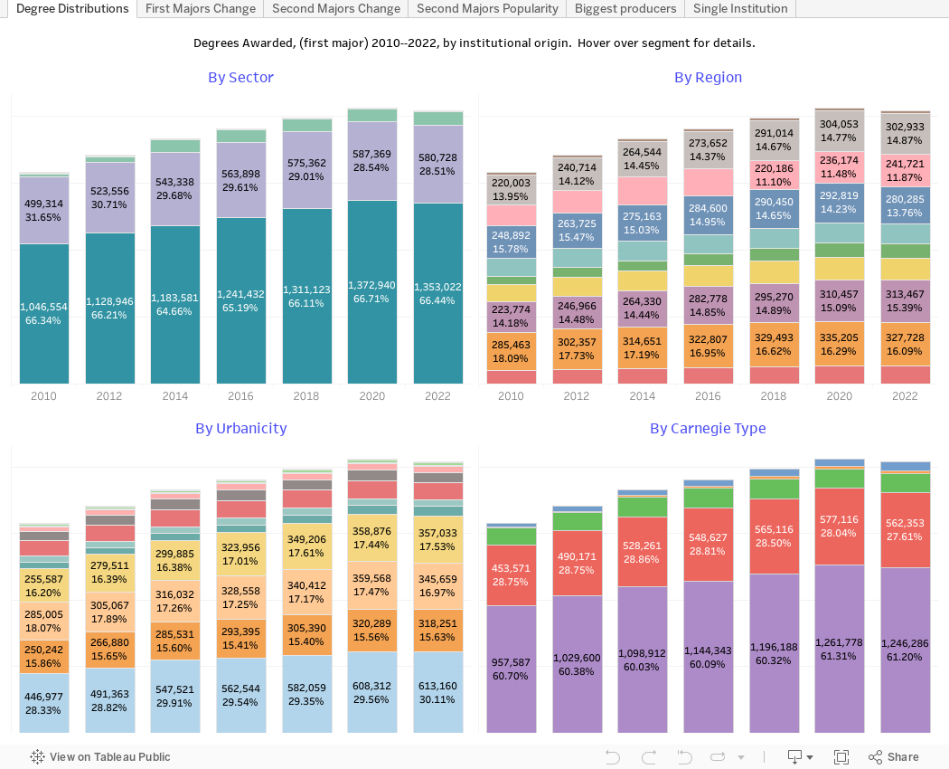
The first (using the tabs across the top) shows degrees by the institutions where they're awarded. You can see the college or university sector, region, urbanicity, and Carnegie classification (rolled up into larger segments for clarity.) You'll see little change: Most degrees are still awarded by public institutions, doctoral institutions, in larger cities. Hover for details.
Over the years, degrees (in first majors) increased about 29% and the second view allows you to see the changes by area (using 2020 CIP codes that cluster degrees in broad areas). You can see the growth in computer science, health professions, and engineering relative to the gray line: All career and professional focus areas; and you can see the drop in traditional degrees in liberal arts.
The third view is identical, but shows growth in second degrees, which increased about 19% over time.
The fourth view also focuses on second majors: Click a single year or the "All" button to drill down or summarize.
The fifth view is highly interactive and allows you to see just what you want to see in terms of the biggest producers of bachelor's degrees in aggregate or for a specific academic area. Choose a year, academic area, Carnegie type, region and sector, and the filter to size using the slider filter. The view will update to show you wish institutions produce the most degrees in that area.
And finally, if you want to drill down to a single institution, try the last view. It starts showing Oregon State University and five academic areas, but you can change the institution using the filter at the top, and you can add or remove academic areas based on your interests. I recommend no more than five or six for the purpose of clarity, but you do what you want.
As is always the case, the Penn State data are problematic over time due to various names and IPEDS ID designations over time. My tech skills have not figured out a way to normalize this, and I'm not sure it's worth the effort to do so anyway. You can look up their data on their site if you're interested.
And one note: The increase in Military Science degrees is over 2000% (on a very small base) and for the sake of clarity, I took it out of the displays showing change over time).
Let me know what jumps out at you here.
I was hoping it might be easy for you to disaggregate physical sciences into chemistry, physics, and other. I wonder if my casual perusal of IPEDS has led to a correct observation that there's been an increase in physics majors relative to chemistry.
ReplyDelete