
Enrollment is complicated, redux

 Enrollment, as I like to say, is complicated.  But that never stopped anyone from asking a question like, "How does enrollment look?"

To help answer, I downloaded IPEDS data of enrollment from 2009 to 2022, breaking it out by full-time and part-time, graduate and undergraduate, and gender, and put it into three different views, below, using the tabs across the top.  As always, you need to be a bit careful jumping to any conclusions about this: There is no easy (or even any hard) way I know of to account for the way Penn State has named and renamed itself over time, and changed the way it reported data, for instance, so anomalies will always show up there. 

But for the most part, this information is very accurate. 

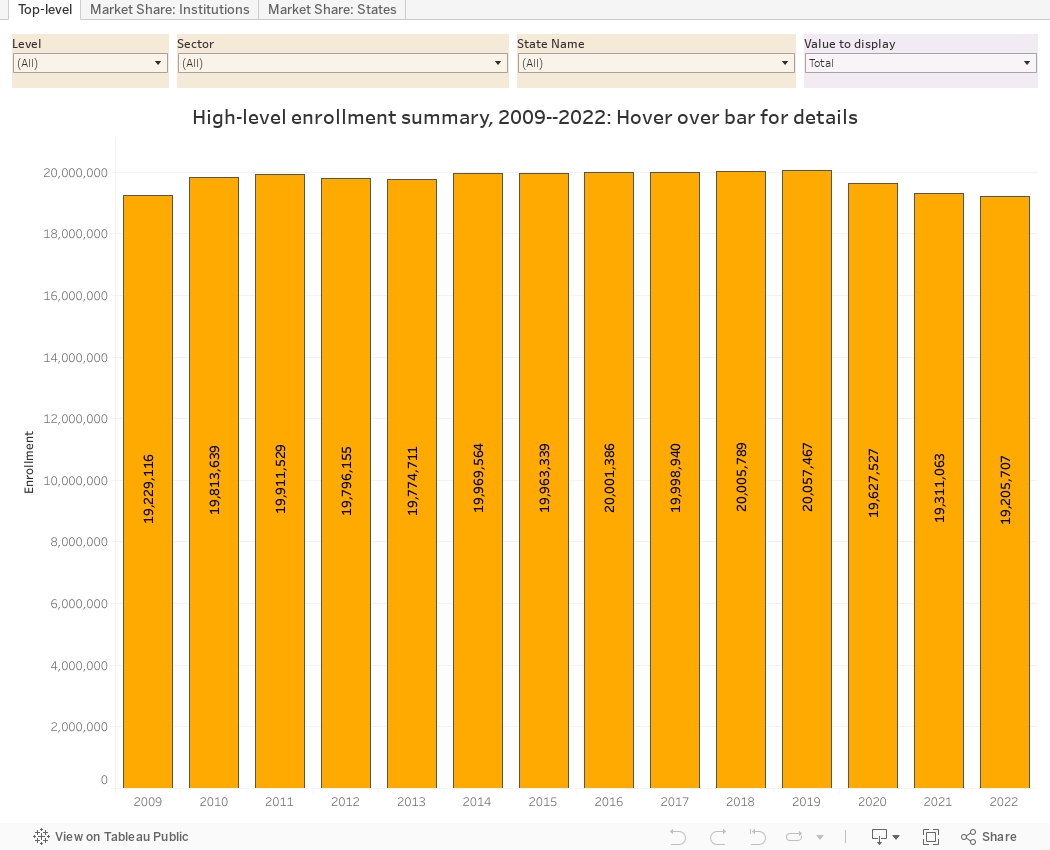
The first view shows summary data.  This is just to get topline information about trends in US higher education enrollments over time.  Choose the type of enrollment at top right, then filter down to the specific categories you'd like to see.  You cannot break anything by interacting.

The second view can be a little messy, but is handy for my admissions and enrollment management colleagues.  It shows market share of every institution in a state; you can only select one state at a time, and the view starts with Washington, where you see UW and WSU dominate.  But what if you want to look at just private colleges? One click will get you there (and the percent of total will recalculate to only that segment).  The same thing applies if you want to look at the enrollment of full-time men at community colleges in Tennessee.  Just click until you get what you need.

The third view started out mostly as fun, but I learned a few things from it, which is always nice. Some examples are in this Twitter thread (which is a series of sequential tweets tied together.)

This blog is mostly a public service to parents, students, and high school counselors, who should always browse to your heart's content and consider it free.  But if you use this in your work, you can support my hosting, computer, and software costs by buying me a coffee at this link.

As always, let me know what you find interesting, compelling, or just hard to believe. 

Comments

Popular posts from this blog

Changes in AP Scores, 2022 to 2024

Used to be, with a little work, you could download very detailed data on AP results from the College Board website: For every state, and for every course, you could see performance by ethnicity.  And, if you wanted to dig really deep, you could break out details by private and public schools, and by grade level.  I used to publish the data every couple of years. Those days are gone.  The transparency The College Board touts as a value seems to have its limits, and I understand this to some extent: Racists loved to twist the data using single-factor analysis, and that's not good for a company who is trying to make business inroads with under-represented communities as they cloak their pursuit of revenue as an altruistic push toward access. They still publish data, but as I wrote about in my last post , it's far less detailed; what's more, what is easily accessible is fairly sterile, and what's more detailed seems to be structured in a way that suggests the company doesn...

The Highly Rejective Colleges

If you're not following Akil Bello on Twitter, you should be.  His timeline is filled with great insights about standardized testing, and he takes great effort to point out racism (both subtle and not-so-subtle) in higher education, all while throwing in references to the Knicks and his daughter Enid, making the experience interesting, compelling, and sometimes, fun. Recently, he created the term " highly rejective colleges " as a more apt description for what are otherwise called "highly selective colleges."  As I've said before, a college that admits 15% of applicants really has a rejections office, not an admissions office.  The term appears to have taken off on Twitter, and I hope it will stick. So I took a look at the highly rejectives (really, that's all I'm going to call them from now on) and found some interesting patterns in the data. Take a look:  The 1,132 four-year, private colleges and universities with admissions data in IPEDS are incl...

Changes in SAT Scores after Test-optional

One of the intended consequences of test-optional admission policies at some institutions prior to the COVID-19 pandemic was to raise test scores reported to US News and World Report.  It's rare that you would see a proponent of test-optional admission like me admit that, but to deny it would be foolish. Because I worked at DePaul, which was an early adopter of the approach (at least among large universities), I fielded a lot of calls from colleagues who were considering it, some of whom were explicit in their reasons for doing so.  One person I spoke to came right out at the start of the call: She was only calling, she said, because her provost wanted to know how much they could raise scores if they went test-optional. If I sensed or heard that motivation, I advised people against it.  In those days, the vast majority of students took standardized admission tests like the SAT or ACT, but the percentage of students applying without tests was still relatively small; the ne...