
Yes, your yield rate is STILL falling, version 2022

We finally got the delayed 2022 admissions data from IPEDS yesterday, and I spent the better part of the evening working on pulling this together.  Counselors, parents, students, and admissions/enrollment management officers tell me this is a helpful tool to use while thinking about the state of college admission.

There are four views here:

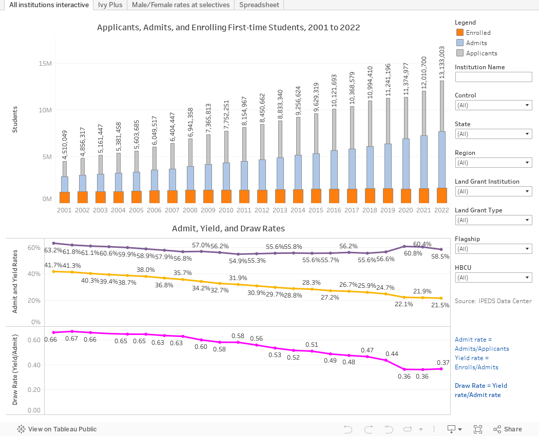
All institutions interactive shows admission data for all institutions who report it to IPEDS: The number of applications for the first-year class, the number of students offered admission, and the number who enrolled, shown on the bar charts at top.  Then, below, I've calculated admit rates, yield rates, and draw rates.  Admit rate is total admits/total applications; Yield rate is total enrolls/total admits.  And draw rate is yield/admit rate.

Draw rate is intended to show fake, artificially deflated admit rates.  I've written about this a lot, but essentially if you try to look more selective than you are by pumping up soft applications, you'll take a hit on yield.  I like Draw rate because it really helps sort out institutions at the top of the pecking order by looking beyond admit rates: The average industry draw is 0.37.  Meanwhile, Harvard is 25; Stanford is 22; Penn is 10; Northwestern is 7.6.  

Over time, the national draw rate has fallen, from 0.66 to 0.37.  At the Big 13 (second tab), it's gone from 3.0 to 14.  The race is over, folks.  

Use the filters at right to select single institutions or groups of colleges to see how things stacked up in 2022, and how they've changed over time.

The third view shows breakouts of male/female admit rates (IPEDS collects gender as binary, so that's their issue, not mine).  I selected institutions who had admit rates of less than 50% in 2022 and who received at least 1,500 applications.  Men are purple, women orange, and overall rates are shown in gray.

Finally, the last view shows the data in a spreadsheet format if you prefer.  Select the years you want, and groups for smaller selections.  I recommend no more than six years for the best view.

Some notes: There are always anomalies in IPEDS data, usually driven by mistakes in data submission or an inexperienced person filling out the form.  The data here is what IPEDS has.  And good luck with the Penn State data.  Up until 2019, the campuses reported separately.  Then in 2020 and 2021 they reported collectively, as The Pennsylvania State University.  And in 2022 we're back to the old method, apparently.  I'm not going to try to fix it.  Call them if you need the data in a format you can use.

Speaking of using, if you are a parent, student, or high school counselor, use this information widely and freely.  If you use it in your for-profit business, or if you use it to make points with your Board of Trustees at a college, you can support web hosting and software costs by buying me a coffee. Click here to do so.

Comments

Popular posts from this blog

The Highly Rejective Colleges

If you're not following Akil Bello on Twitter, you should be.  His timeline is filled with great insights about standardized testing, and he takes great effort to point out racism (both subtle and not-so-subtle) in higher education, all while throwing in references to the Knicks and his daughter Enid, making the experience interesting, compelling, and sometimes, fun. Recently, he created the term " highly rejective colleges " as a more apt description for what are otherwise called "highly selective colleges."  As I've said before, a college that admits 15% of applicants really has a rejections office, not an admissions office.  The term appears to have taken off on Twitter, and I hope it will stick. So I took a look at the highly rejectives (really, that's all I'm going to call them from now on) and found some interesting patterns in the data. Take a look:  The 1,132 four-year, private colleges and universities with admissions data in IPEDS are incl

Freshman Migration, 1986 to 2020

(Note: I discovered that in IPEDS, Penn State Main Campus now reports with "The Pennsylvania State University" as one system.  So when you'd look at things over time, Penn State would have data until 2018, and then The Penn....etc would show up in 2020.  I found out Penn State main campus still reports its own data on the website, so I went there, and edited the IPEDS data by hand.  So if you noticed that error, it should be corrected now, but I'm not sure what I'll do in years going forward.) Freshman migration to and from the states is always a favorite visualization of mine, both because I find it a compelling and interesting topic, and because I had a few breakthroughs with calculated variables the first time I tried to do it. If you're a loyal reader, you know what this shows: The number of freshman and their movement between the states.  And if you're a loyal viewer and you use this for your work in your business, please consider supporting the costs

The College Finder

Note: A few people have commented on slow loading with the visualization.  If you have troubles, click here to be taken right to the visualization .  It should open in a new tab and you can follow along from there.    This is always a popular post with high school counselors, IECs, parents, and students who are looking for general information on degrees awarded, or a very specific combination of academic programs, location, and other institutional characteristics. It uses IPEDS data I downloaded as soon as I can when it became available (and before a looming government shutdown), and shows all 1,700 majors recognized by the federal government in the IPEDS system, using CIP codes, and the number of degrees awarded by college in any selected area. For instance, you might have a question about which college awards the most degrees in French Language and Literature: A few clicks, and you find it's the University of Arizona.  If you want a colder climate, choose the Great Lakes region,