
The College Finder

Note: A few people have commented on slow loading with the visualization.  If you have troubles, click here to be taken right to the visualization.  It should open in a new tab and you can follow along from there.   

This is always a popular post with high school counselors, IECs, parents, and students who are looking for general information on degrees awarded, or a very specific combination of academic programs, location, and other institutional characteristics.

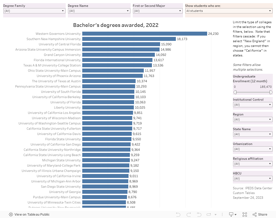
It uses IPEDS data I downloaded as soon as I can when it became available (and before a looming government shutdown), and shows all 1,700 majors recognized by the federal government in the IPEDS system, using CIP codes, and the number of degrees awarded by college in any selected area.

For instance, you might have a question about which college awards the most degrees in French Language and Literature: A few clicks, and you find it's the University of Arizona.  If you want a colder climate, choose the Great Lakes region, for instance, and you'll see it's The University of Michigan.  If you want a private college, another two clicks and you find it's Oberlin.

This takes a lot of time and effort to bring about, and if you use this in your business, you can support hosting, software, and the cost of my time by Buying Me A Coffee (click here). If you're a high school counselor or a student or a parent, please skip the link and go right to the next paragraph.

Here's how you work this visualization.  In the top right, you can choose whether you want to see degrees awarded to all students, men, women, or any federally recognized ethnic or racial group.  You decide; I think it's especially helpful for finding good places for students of color, or women in STEM, for instance.

Along the top, I recommend you choose a family first: Agriculture, or Engineering, or Business, for instance, and then use the degree name to find a specific major.  In the major box, start typing a few letters of the major you're looking for: The more you type, the better.  Typing C-O-M, for instance, will allow you to choose from Communications or Computer Science or Comedy Writing, depending on what family you've selected.  The chart will update.

Along the right, you can limit the type of institutions displayed: By control, by size, by region or state, or a few other variables.  If you ever want to start over, use the controls at lower right.

A lot of the ways I've shared these posts in the past have changed, so you should feel free to share this with anyone you wish.  The more, the merrier.

Let me know if anything looks off with this view.  It's a fresh data set, and although I've spot checked it, there is always a chance something is out of kilter.  

Comments

Popular posts from this blog

Changes in AP Scores, 2022 to 2024

Used to be, with a little work, you could download very detailed data on AP results from the College Board website: For every state, and for every course, you could see performance by ethnicity.  And, if you wanted to dig really deep, you could break out details by private and public schools, and by grade level.  I used to publish the data every couple of years. Those days are gone.  The transparency The College Board touts as a value seems to have its limits, and I understand this to some extent: Racists loved to twist the data using single-factor analysis, and that's not good for a company who is trying to make business inroads with under-represented communities as they cloak their pursuit of revenue as an altruistic push toward access. They still publish data, but as I wrote about in my last post , it's far less detailed; what's more, what is easily accessible is fairly sterile, and what's more detailed seems to be structured in a way that suggests the company doesn...

The Highly Rejective Colleges

If you're not following Akil Bello on Twitter, you should be.  His timeline is filled with great insights about standardized testing, and he takes great effort to point out racism (both subtle and not-so-subtle) in higher education, all while throwing in references to the Knicks and his daughter Enid, making the experience interesting, compelling, and sometimes, fun. Recently, he created the term " highly rejective colleges " as a more apt description for what are otherwise called "highly selective colleges."  As I've said before, a college that admits 15% of applicants really has a rejections office, not an admissions office.  The term appears to have taken off on Twitter, and I hope it will stick. So I took a look at the highly rejectives (really, that's all I'm going to call them from now on) and found some interesting patterns in the data. Take a look:  The 1,132 four-year, private colleges and universities with admissions data in IPEDS are incl...

Changes in SAT Scores after Test-optional

One of the intended consequences of test-optional admission policies at some institutions prior to the COVID-19 pandemic was to raise test scores reported to US News and World Report.  It's rare that you would see a proponent of test-optional admission like me admit that, but to deny it would be foolish. Because I worked at DePaul, which was an early adopter of the approach (at least among large universities), I fielded a lot of calls from colleagues who were considering it, some of whom were explicit in their reasons for doing so.  One person I spoke to came right out at the start of the call: She was only calling, she said, because her provost wanted to know how much they could raise scores if they went test-optional. If I sensed or heard that motivation, I advised people against it.  In those days, the vast majority of students took standardized admission tests like the SAT or ACT, but the percentage of students applying without tests was still relatively small; the ne...