I don't mean the business of enrollment is complicated (although it is, at times); I mean talking about enrollment is complicated. When I get on the elevator with someone, the question is always, "how is enrollment looking?"
Unless everything is wonderful, or everything is awful, there is really no answer to that, because even at one institution, enrollment is made up of several different types of enrollment: New first-year, new transfers, overall graduates, overall undergraduates. returning students, full-time, part-time, students in different colleges, and, if you work at a public institution, residents and nonresidents. There are ebbs and flows in all those streams, but of course, the average elevator ride is not long enough to explain that all.
So, too, our national discussions about enrollment are complicated. You have heard about the enrollment crisis, of course, but when you dive down, you see it's really mostly a challenge at our nation's community colleges. And clearly, it varies by region. And level. And the type of location. And student ethnicity.
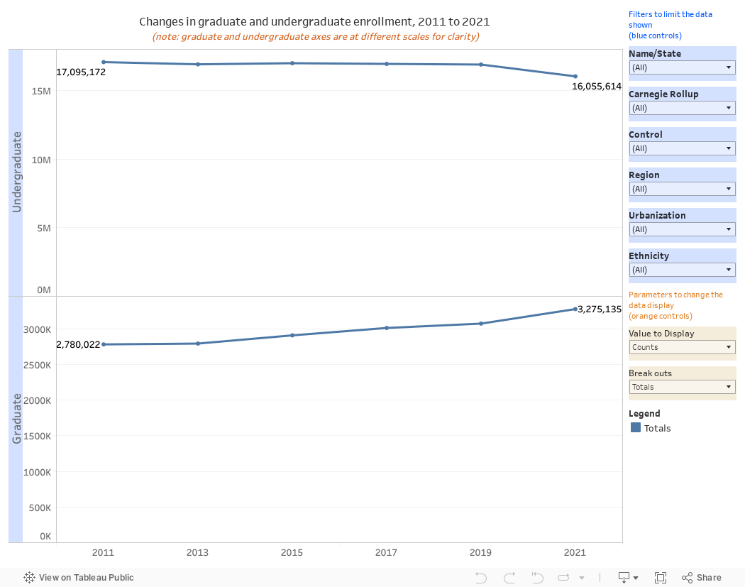
This can help you get a sense of how enrollment is changing: It's just one view, with graduate and undergraduate enrollment separated. Note the different scales to add some clarity.
Use the controls in the blue boxes to limit the data that shows up on the view. You might want to look at just public institutions, for instance, or private colleges in New England, or international students. You can look at a single institution (type part of the name and hit enter to help the filter along).
Then use the orange controls to break out the data, and to choose how it's displayed: Counts, changes, percentage changes, etc.; and/or broken out by region, campus setting, or control. The possibilities are not endless, but it may seem that way. You'll see quickly, of course, that some trends are positive, and some are negative. Just like enrollment everywhere.
As always, let me know what you see.
Comments
Post a Comment