
What do counselors think about test-optional admission?

Last week, we conducted a--well, not a survey, exactly--of high school and independent counselors, asking them what they thought about test-optional and test-free admission policies.  This is more a testing of the waters of those interested enough and motivated enough to respond.

So, before the fans of tests (who can do their own testing of the water at any time, of course), point this out, file this under "interesting, but not definitive."  It might drive discussions, but it won't make a decision for us.  And it shouldn't for you, either.

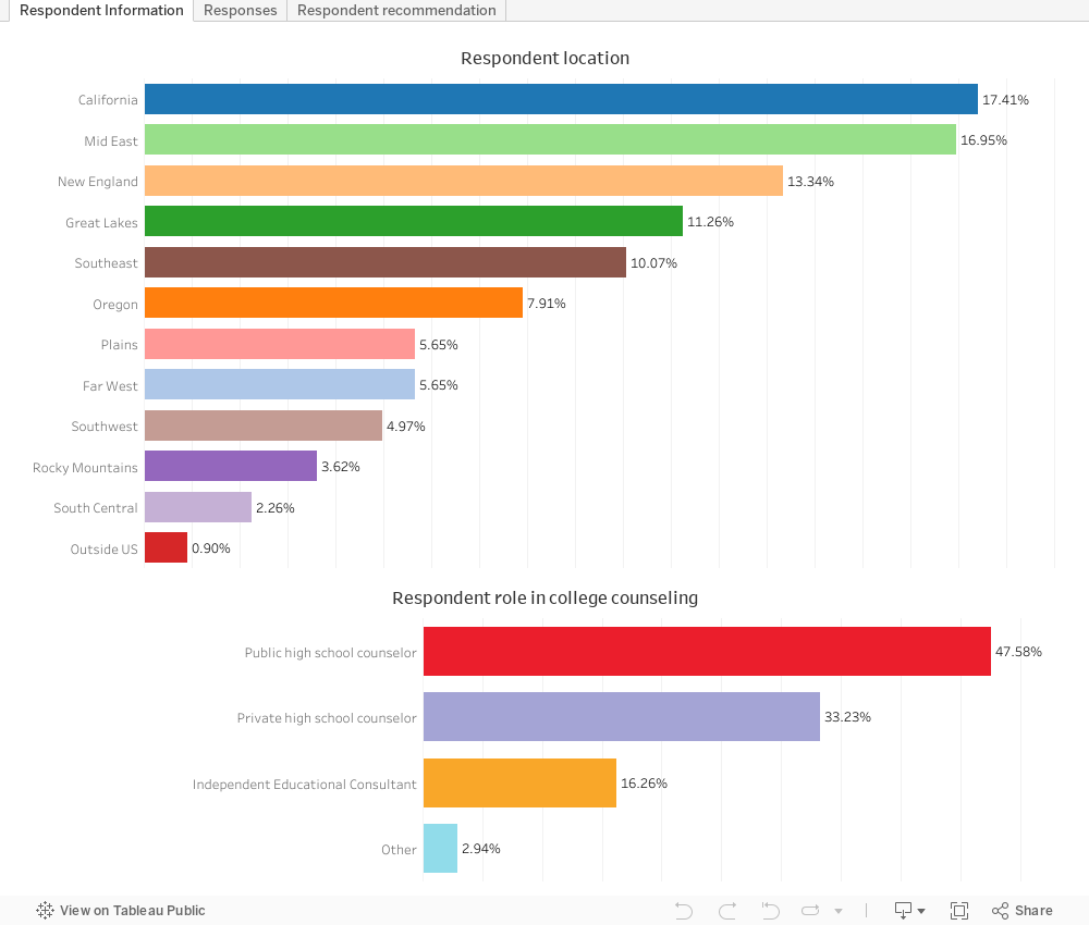
We received about 440 responses, mostly responding to an email we sent to high school counselors across the country.  Those responses came from all over, including some from schools that had probably never sent an applicant, let alone an enrolling student to OSU; but we can't be sure because the survey was anonymous.  But we received almost as many responses from Massachusetts, New York, and New Jersey as we did from Oregon, interestingly enough.

Here are the high level results.  The first view (using the tabs across the top) shows the role and location of the respondents.  The second shows responses to the survey questions, filtering out those who didn't have an opinion one way or the other.  On that view, you can filter by professional role, and choose either the questions about test-optional or test-free admission policies.

And finally, I asked counselors what they'd do if they were in charge at OSU.  Those results are on the final tab, filterable by role and/or location. 

What do you think?  What do you notice?  Is it the big thing I noticed? Drop me an email or post a comment below.


Comments

Popular posts from this blog

First-year student (freshman) migration, 2022

A new approach to freshman migration, which is always a popular post on Higher Ed Data Stories. If you're a regular reader, you can go right to the visualization and start interacting with it.  And I can't stress enough: You need to use the controls and click away to get the most from these visualizations. If you're new, this post focuses on one of the most interesting data elements in IPEDS: The geographic origins of first-year (freshman) students over time.  My data set includes institutions in the 50 states and DC.  It includes four-year public and four-year, private not-for-profits that participate in Title IV programs; and it includes traditional institutions using the Carnegie classification (Doctoral, Masters, Baccalaureate, and Special Focus Schools in business, engineering, and art/design. Data from other institutions is noisy and often unreliable, or (in the case of colleges in Puerto Rico, American Samoa, and other territories, often shows close to 100% of enro...

Educational Attainment and the Presidential Elections

I've been fascinated for a while by the connection between political leanings and education: The correlation is so strong that I once suggested that perhaps Republicans were so anti-education because, in general, places with a higher percentage of bachelor's degree recipients were more likely to vote for Democrats. The 2024 presidential election puzzled a lot of us in higher education, and perhaps these charts will show you why: We work and probably hang around mostly people with college degrees (or higher).  Our perception is limited. With the 2024 election data just out , I thought I'd take a look at the last three elections and see if the pattern I noticed in 2016 and 2020 held.  Spoiler: It did, mostly. Before you dive into this, a couple of tips: Alaska's data is always reported in a funky way, so just ignore it here.  It's a small state (in population, that is) and it's very red.  It doesn't change the overall trends even if I could figure out how to c...

Education Levels in the US, by State and Attainment

Attainment has always been an interesting topic for me, every since I first got stunned into disbelief when I looked at the data over time.  Even looking at shorter periods can lead to some revelations that many don't make sense at first. Here is the latest data from NCES, published in the Digest of Education Statistics . Please note that this is for informational purposes only, and I've not even attempted to visualize the standard errors in this data, which vary from state-to-state.  There are four views year, all looking at educational attainment by state in 2012 and 2022.   The first shows data on a map: Choose the year, and choose the level of attainment.  Note that the top three categories can be confusing: BA means a Bachelor's degree only; Grad degree means at least a Master's (or higher, of course); and BA or more presumably combines those two.  Again, standard errors might mean the numbers don't always add up perfectly. The second shows the data o...