If you want a definitive answer, you can stop now. As Mark Twain allegedly said, "I was gratified to be able to give an answer right away. I said I didn't know."
However, critics of test optional like to trot out this study from 2014, suggesting test-optional policies do not increase diversity. There are a couple of problems with using that paper to prop up this argument, however: First, the study included about 200 liberal arts colleges, and nowhere does it suggest that the conclusions can be generalized, or even that the results are reflective of reality every where else. Second, the study explicitly states that the SAT sorts students by social class, not just academic ability. You can't cite the outcomes without including lines like, "Despite the clear relationship between privilege and standardized test performance..." but somehow test lovers overlook that. Finally, admissions, opportunity, culture, and policy are complex. The belief that waving a wand will somehow address centuries of differing opportunities might be, um, naïve. At best.
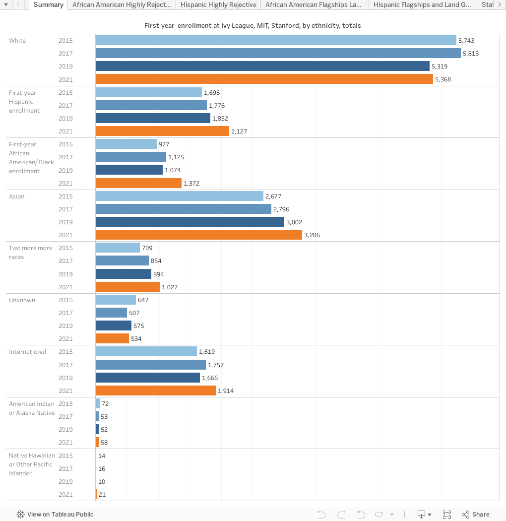
There are some problems with leaping to conclusions about the data here, too. You'll notice that between 2019 (the last normal year before COVID) and 2021 (the first year things returned to something closer to normal), that most selective (more about that) institutions did, in fact, become more diverse. You'll also notice, perhaps, the big drop in African American enrollment at the University of Florida, one loud resistor of test optional during the pandemic. It would be a mistake to draw facile conclusions based on what you see here.
Beyond that, there are two other reasons to temper your test optional enthusiasm about the results here. First, the population of high school graduates is getting more diverse. Some of this could be a natural remnant of that demographic reality. Perhaps more important, however, is that IPEDS data only includes enrolling students, not admitted students. Admissions offers the opportunity to enroll, but enrollment is driven by the student after factoring in many other factors. So we don't know what the admit pools look like. That would be critical, of course.
The final view allows you to look at all institutions, but for the others, I've used selectivity as a factor in the display. This is because most institutions admit a very large percentage of applicants; the shape of their class is often largely driven by who applies, and we know COVID ramifications still affected student behavior and preparation. It's only at those colleges and universities that are selective, and that can shape their class, that test optional policies really have a dramatic affect.
So, the viz: Only the last view is interactive.
The first view (using the tabs across the top) shows the Ivy League, plus MIT and Stanford, and the total first-year enrollment by ethnicity.
The next two show those same institutions, broken out by college, year, and ethnicity: First, African American and then Hispanic. The data show numbers and percentage of the first-year, degree-seeking students.
Next are selective (admit rates of less than 50%) public land grant and flagship institutions, using a similar format.
And finally, the final view is more interactive but less granular. Find your region, control, Carnegie rollup, selectivity, and specific ethnicity, and the display updates for you.
We won't know about this until some deeper analysis happens, but for now, I think the signs are good. Time will tell.
As always, if you find something you think is interesting, comment or drop me a line.
Comments
Post a Comment