Note: A reader pointed out that there are two years of data in this set (Fall 2021 enrolling data and Fall 2020 Financial Aid data). In all probability, this will cause discount rates to be a bit lower on this view than in reality. As always, don't take or make any important decisions based on information on a free website.
Discount rate is a hot topic among private college leaders, and although it's an interesting measure, it's not as helpful as some people might think it is. And it's a little hard to grasp and hard to explain. But I'm going to try.
Discount rate can be helpful when measuring yourself against yourself over time; and it can be helpful when measuring yourself against similar peers. But as a thing unto itself? Pretty worthless, actually. Here's why.
First some definitions: Discount rate measures the amount of institutional aid you award as a function of how much gross tuition you charge. If you collect $10,000,000 in tuition, and award $4,000,000 in your own, institutional aid, your discount rate is 4,000,000 / 10,000,000, or 40%. Here's where it gets a little tricky.
If your aid is unfunded (most of it is), you simply forego that $4,000,000, and collect $6,000,000. The scholarship or aid is just an accounting transaction. That $6,000,000 is how much you have in cash to pay professors, heat the buildings, and cut the grass. And that cash can come from the student, state or federal grants, or student loans; it's all cash, and you don't care about the source for these accounting purposes, even if you do care for other reasons.
In the case of discounted aid, it's not real money. So you can't "re-distribute it" away from students in one group to students in the other, because doing so will change the amount of gross revenue; and without the gross revenue, there is nothing to discount. And nothing left to spend.
If it's funded (that is, some source is providing you the scholarship money, like a funded award), you get the $6M from the student and the $4M from the scholarship source, or the full $10M. This is rare.
So the amount of actual cash revenue, divided by the number of students, is an important measure. If you had $6M in net revenue and 400 students, your net revenue per student is about $15,000. If you collect that $6M and have 600 students, your net revenue per student is about $10,000. That is a real difference.
So let's look at four colleges, all enrolling 400 new students.
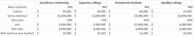
You can see that the first three institutions, with three very different discount rates, generate about the same amount of cash for operations. And you can see the two that have the most similar discount rates at right are the farthest apart on net revenue per student. TLDR: Discount rate is a function of a numerator and a denominator. You shouldn't use it to compare colleges with very different tuition rates, or substantially different enrollment numbers.
So, let's take a look at private college discount rates for 2020. I don't look at public universities because doing so is only meaningful within a state because of funding models that vary from one state to another. You can't compare public universities on discount in Alabama, Arizona, and Arkansas in a meaningful way without a lot deeper dive on the data.
If you work in EM or financial aid and you want to use this with your cabinet or board of trustees, I'd appreciate your support for my time and costs for webhosting and software costs by buying me a coffee.
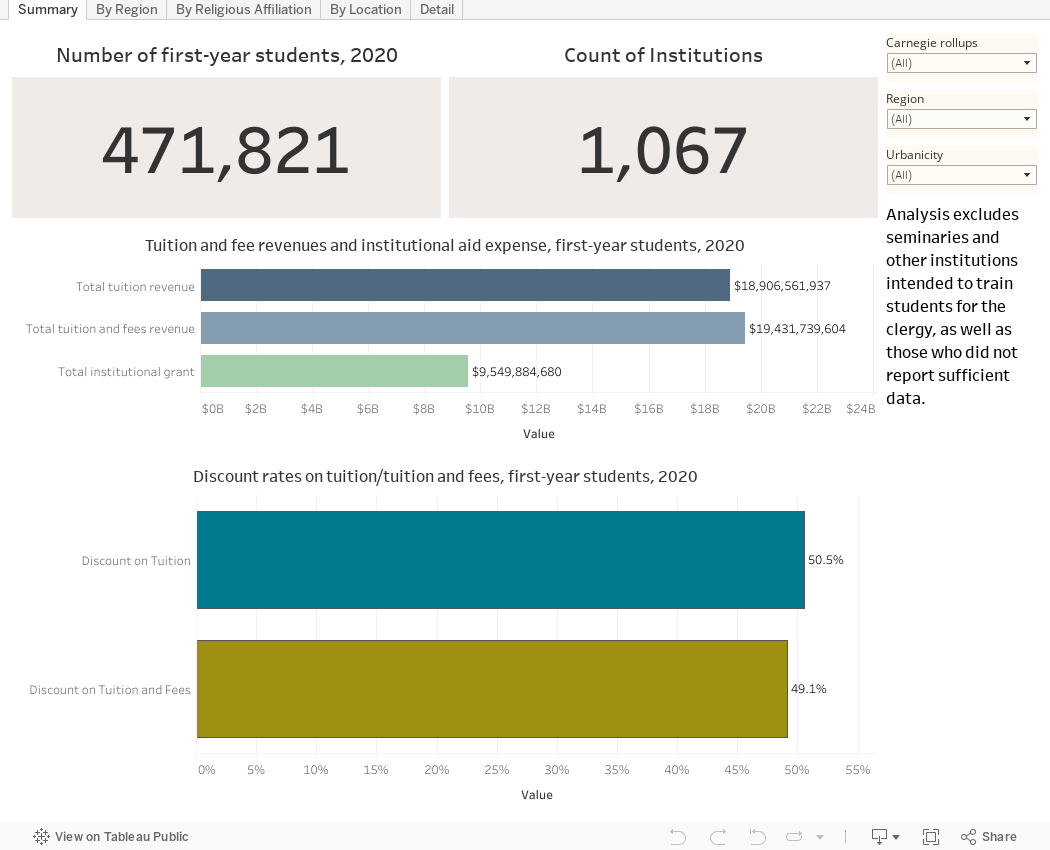
Below is the data, in several views, using the tabs across the top. Summary shows the raw data: Counts, revenue, and aid. Filter to specific types of institutions at the right.
The next three views break things out by Region, Religious Affiliation, and Campus Location. The filters help you drill down some more. This might be useful if you want to get a set of your peers or competitors or just similar institutions.
The final view shows Detail for the 1,000 or so colleges in the data set. You can see net revenue per student (measured two ways) and discount rate. The filters help you narrow down the group to a set that you might consider your peers.
Note that I've taken our seminaries and yeshivas and other institutions that are designed to train people for the clergy. Their funding models are often very different, and they make the view very noisy.
Use this data carefully and in context, and as always with IPEDs Data (especially from a COVID year) don't rush to judgment on what this all means unless you have some background. And as always, let me know what you notice here.
Comments
Post a Comment