I'm not sure if this will be the last AP post I make, but it sure seems that way, unless people (including those of us who are members of the, you know, membership organization called College Board) put enough pressure on them to continue providing data in the detailed format like they've always done.
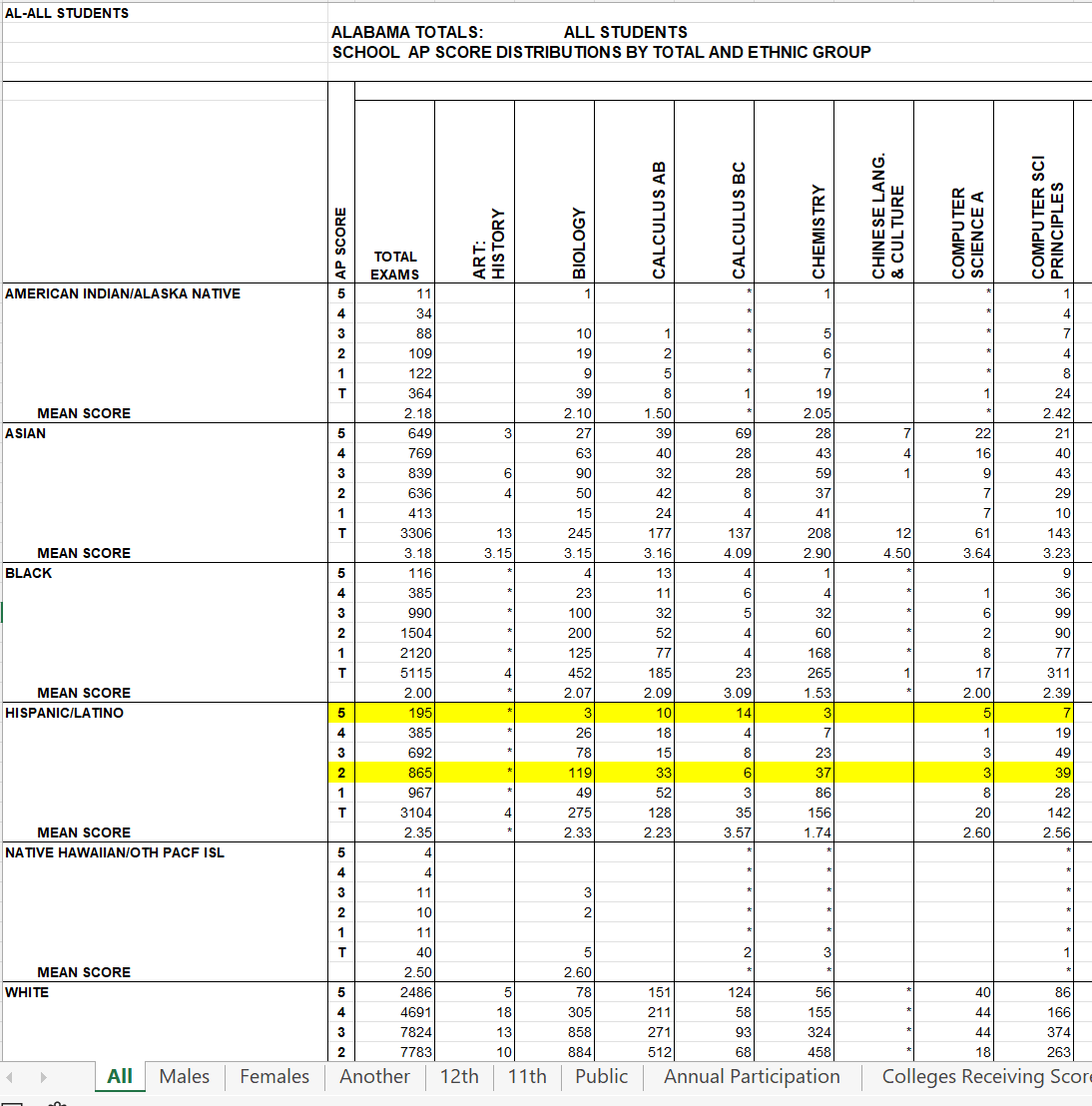
In case you don't know, College Board used to put very granular data on its website, for anyone to download and examine. You could look at data by state, by student ethnicity, by specific exam, and by AP score. For instance, this was a sample from one of the years showing the state of Alabama. You can see the data, and at the bottom, see other breakouts: Public schools, male/female, 11th/12th graders, etc. It was a gold mine of data, if you wanted to spend the time looking and digging and calculating. I've only scratched the surface in the three or four posts I've done on this blog, partly because the data are in spreadsheet format, and it takes a lot of cleanup to get it into useable shape for Tableau.
If you use Higher Ed Data Stories in your work at a college or a for-profit company or practice, consider supporting the costs of software, time, and web hosting by buying me a coffee at this link. If you're a high school counselor or you work at a CBO, please don't contribute; it's on me.
So anyway, I had taken a look at AP scores in 2019 and 2020 to see how they changed during COVID. It looked to me that scores had risen, which was probably not a problem in itself, for a lot of reasons:
We were dealing with COVID, and there was major disruption everywhere, including schools, but of course things that happen in a student's home affect school, too
The exams were converted to 45-minute, take-at-home formats. College Board assured us that they could predict a student's actual score with fewer and shorter questions, but I don't recall being shown that data. You just have to believe.
The populations of students who took the test probably changed, too. Students with lower performance may have dropped out. Students from lower-income families might not have access to computers at the precise time they needed to test. It was suggested that if bandwidth at home was a problem, students could just take their exams in a parking lot of a McDonald's using the free wifi. There were some difficulties in the technology. too as students who completed the exam couldn't upload their results.
The grading process may have been compromised in unintentional ways: Teachers may have been confused about the new format. And, during a time when we could all use a little grace and understanding and compassion, those things might have entered into the grading calculations, too. No one could fault people for giving kids the benefit of the doubt.
And no one could have blamed the College Board for the effects of the pandemic. Except in one area.
When College Board announced the new 45-minute exams, they said the colleges would accept them just like they accepted the results from previous years. Problem is, they didn't exactly ask the colleges, so once they announced it, it was unlikely that any college was going to unilaterally be the bad guy. It was a genius move from a strategy angle, of course. A stroke of strategic (if evil) genius, if you will.
College Board, of course, claims it did ask colleges, but it seems like the only ones it really asked were its trustees, who are, of course, trustees because they align philosophically with College Board. And the trustees helped out by making a video telling students that it was their responsibility to take the exams. Sweet.
Because the alternative would have been to cancel the tests. And College Board likes its revenue, so that wasn't going to be an option.
But once the worst of COVID was over, I wanted to see if the 2021 scores had returned to some semblance of normal. I think all colleges have a right to this information, given that we grant academic credit--the coin of the realm in higher education--trusting that the exams measure and assess what they say they do. Without warning, College Board pulled the data off its website, and did not publish the granular data for inspection for 2021.
I complained about it on Twitter. Not only do colleges have a right to this, so do students, teachers, and parents, even if most will never look at it. And College Board is touting AP as a good substitute in a test-optional college admissions world as the SAT has taken a life-threatening blow, so more transparency is critical, I think. I re-tweeted it later. The whole time I was reminded of the frequent tweets of Akil Bello, pointing out David Coleman's claim of "transparency" in all they do.
Some right-leaning and even alt-right sites picked it up, and made it seem like the race issue was the big one. It wasn't, and in fact, I've visualized the data from prior years showing differences by ethnicity. It pissed me off, but I suppose that's where we are in America these days. So on the visualization below, you won't see any comparisons of scores by race.
The interesting thing is that if College Board had published the data, and I had visualized it, maybe 2,500 people would have seen it. As it is, I'm sure tens, if not hundreds of thousands of people have had the opportunity to think about this: About College Board's responsibility to members (colleges and high schools) and to students, not to mention society writ large.
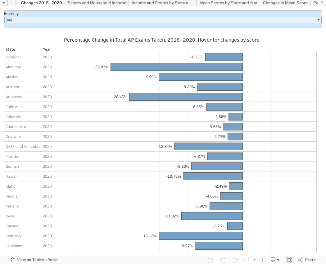
So, after all that, the data, below, in six views, using the tabs across the top. The first view Changes 2018--2020 shows changes in volume by state from 2018 to 2019. If you hover over a state bar, you'll see a pop-up of the changes in that state by score distribution: The 5s increased by 2%, or the 3s were down 8%, for instance. Again, causality is a dangerous thing. Don't rush to judgements.
The second view, Scores and Household Income is for the racists. Nothing is labeled, so you can't tell which point shows which, but you should see the relationship between income and performance on exams. Chalk it up to race if you want, but it's not quite that simple. Income and ethnicity are tied together in America, and if you don't believe me, argue with the data. The filter will take you from national to state data if you wish. Actually, I encourage you to do so.
The third view, Income and Scores by State shows the same thing, broken out in more detail, for the skeptics. Again, no labels. Just look at the patterns.
The fourth view, Mean Scores by State, shows mean scores for 2018, 2019, and 2020 by state. You can filter to specific tests using the control at the top.
The fifth view, Changes in Mean Scores, shows the difference between means in 2018 and 2020. Use the controls to change the state or ethnicity if you'd like.
And finally, Participation by Ethnicity shows three years of exam volume by student race on the bars, and year-over-year percentage changes on the lines.
As always, email me or leave a comment if you see something of interest. Thanks for reading.
I've been fascinated for a while by the connection between political leanings and education: The correlation is so strong that I once suggested that perhaps Republicans were so anti-education because, in general, places with a higher percentage of bachelor's degree recipients were more likely to vote for Democrats. The 2024 presidential election puzzled a lot of us in higher education, and perhaps these charts will show you why: We work and probably hang around mostly people with college degrees (or higher). Our perception is limited. With the 2024 election data just out , I thought I'd take a look at the last three elections and see if the pattern I noticed in 2016 and 2020 held. Spoiler: It did, mostly. Before you dive into this, a couple of tips: Alaska's data is always reported in a funky way, so just ignore it here. It's a small state (in population, that is) and it's very red. It doesn't change the overall trends even if I could figure out how to c...
A new approach to freshman migration, which is always a popular post on Higher Ed Data Stories. If you're a regular reader, you can go right to the visualization and start interacting with it. And I can't stress enough: You need to use the controls and click away to get the most from these visualizations. If you're new, this post focuses on one of the most interesting data elements in IPEDS: The geographic origins of first-year (freshman) students over time. My data set includes institutions in the 50 states and DC. It includes four-year public and four-year, private not-for-profits that participate in Title IV programs; and it includes traditional institutions using the Carnegie classification (Doctoral, Masters, Baccalaureate, and Special Focus Schools in business, engineering, and art/design. Data from other institutions is noisy and often unreliable, or (in the case of colleges in Puerto Rico, American Samoa, and other territories, often shows close to 100% of enro...
Attainment has always been an interesting topic for me, every since I first got stunned into disbelief when I looked at the data over time. Even looking at shorter periods can lead to some revelations that many don't make sense at first. Here is the latest data from NCES, published in the Digest of Education Statistics . Please note that this is for informational purposes only, and I've not even attempted to visualize the standard errors in this data, which vary from state-to-state. There are four views year, all looking at educational attainment by state in 2012 and 2022. The first shows data on a map: Choose the year, and choose the level of attainment. Note that the top three categories can be confusing: BA means a Bachelor's degree only; Grad degree means at least a Master's (or higher, of course); and BA or more presumably combines those two. Again, standard errors might mean the numbers don't always add up perfectly. The second shows the data o...
Comments
Post a Comment