There is another article making the rounds in higher education about the advantages men have in the admissions process. It's sort of interesting, because while you can look at the available data a lot of different ways, you'd really need to look at the data you can't see to draw the conclusions everyone seems to have drawn.
Here is the article, and what you'll probably notice is that the headline--the part everyone reads--is sort of walked back in the article. I know the people who write the headlines are not the same people who write the article, but sometimes it seems like the two should actually, you know, talk to each other.
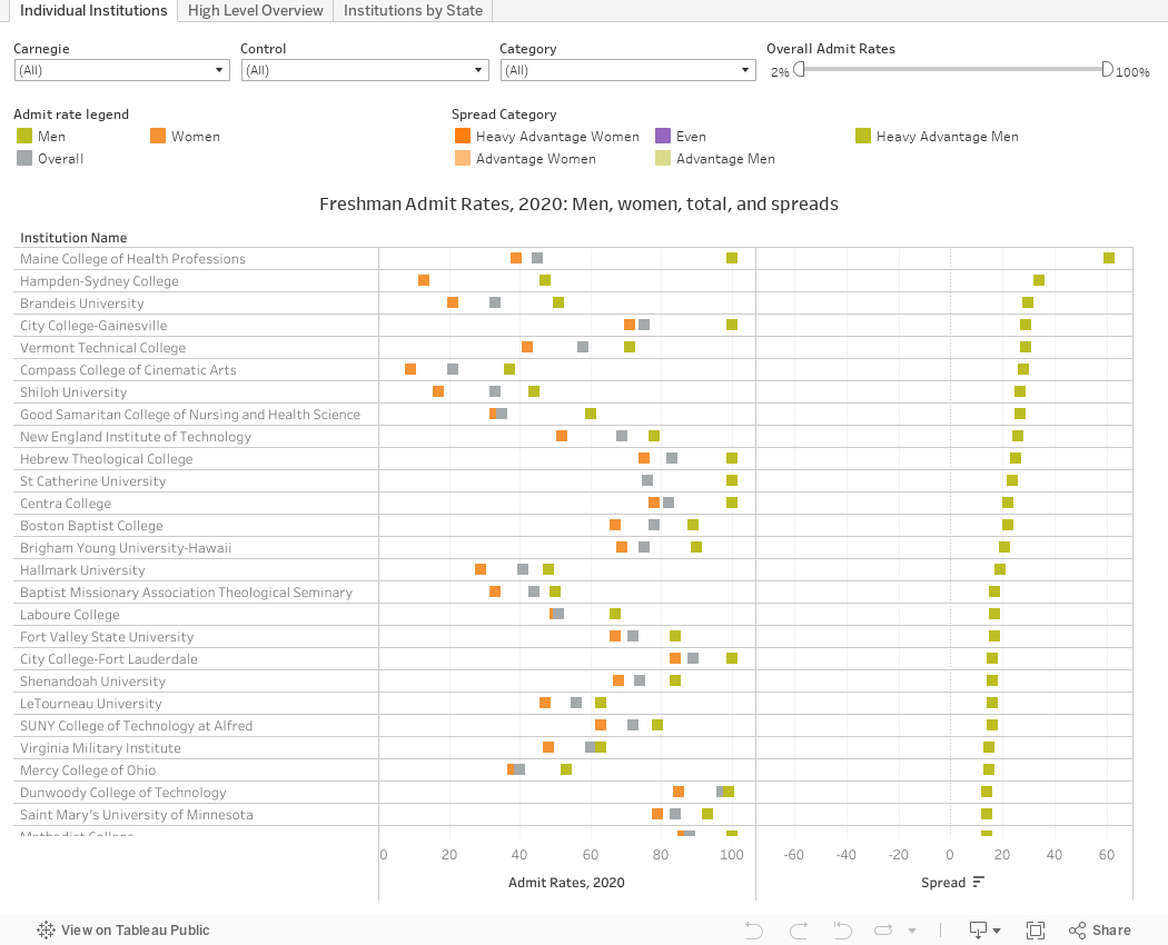
First, the data, in three views below, followed by a caveat:
The first view, Individual Institutions, shows all the public and private, not-for-profit four-year institutions who a) admit freshmen, b) publish data for both men and women (which excludes a lot of women's colleges, and Yeshivahs, for instance) and c) say they are not open admissions in the 2020 version of IPEDS. That's 1,484 institutions, give or take.
You can look at the individual 2020 freshman admit rates for women (orange), men (gold) and overall (gray). In the right-hand column (the way the data are sorted) you can see the "advantage" to one group. If the spread is more than six points, it's heavy, if it's within two points, it's even, else it's just an advantage.
Now, because no one really cares about The Sul Ross State Universities or the Mount Aloysius Colleges of the world (hyperbolically speaking, of course), you can use the filter at top right to focus on the colleges everyone really likes to talk about. Pull the right hand slider down to 20%, for instance, and you'll see in the right-hand column that the vast majority of the highly rejective colleges are pretty even; but of those who are not, more favor women (these tend to be STEM institutions.) Surprised? I thought so.
You can use the other filters if you want to look at institutions by Carnegie type, control, or just those with admissions skews (or not). We aim to please.
And if you're pleased with the information you get from Higher Ed Data Stories, and if you use it in your work at a university or with clients, you can support my software and web-hosting costs by buying me a coffee, here. (Please don't click if you're a high school counselor or you work at a CBO.)
The second view, High Level Overview, shows the same data but rolls it up into counts. Again, look at the most selective, least selective, public, private institutions, or just colleges in your region of interest, in any combination.
The third view, Institutions by State, arrays colleges by state and sorts by admissions advantage, and again allows you to filter in a variety of ways. The display shows just the advantage number, but you can see the admit rate details when you hover over the bar.
Now, the caveat about the data: The fact that men or women as a group are admitted at higher or lower rates is really meaningless (or almost so). We know that women tend to have higher high school grades, and men higher test scores. But we don't know about the applicant pools at the 1,484 colleges shown here. If women are substantially better qualified and being admitted at lower rates, that's a problem (and the same would be true of men, of course). That women are disadvantaged is the opinion of a few admissions officers at a few places, but that, of course is anecdotal information, and some of it is not current; one of the people interviewed worked at the institution in question almost a decade ago.
And having said that, it might, in fact be true. It would not surprise me, and it would be an interesting research study.
As always, drop me a note or comment below if you notice anything interesting (other than whacky data in IPEDS, which I'm not responsible for and not inclined to fix.)
Comments
Post a Comment