The world of college admission--or at least the discussion of it--is too often focused on freshman admission, and then, too often focused on freshman admission at the highly rejective colleges (h/t to Akil Bello). People tend to think most students apply to a college at age 17 or 18, spend four years at that one institution, and then graduate.
But just like the Kardashians aren't reflective of the typical American family even though they get a lot of press, neither is that little sliver of college admissions reflective of the reality of our profession.
Transfers have become a topic of interest to people who cover higher education recently, with stories in all the big, national media outlets. So I decided to take a look at some data from IPEDS to see what the national trends look like.
Even though I limited the view of this data to four-year colleges and universities that offer degrees, that doesn't tell the whole story: A lot of students transfer from a four-year college to a community college, even though we think the pattern is almost exclusively the opposite. That might be a post for another day.
This data shows comparisons of freshman and transfer enrollment at about 1,665 four-year, degree-granting institutions in the US. The actual count varies a bit by year. And there are four views to consider the data, and a couple of important caveats:
- First, some institutions consider transfers for different programs in different ways. Columbia University, for instance, shows a relatively high number of transfer students, but people who know suggest this is due to admission to the General Studies Program, not the traditional colleges of the university. Others have said the same is true for Penn. I've not verified either of these, but they come from people I trust; the point is really that you have to take data a college sends to IPEDS with a grain of salt. It's not always that the college is trying to be duplicitous, of course, but it is frequently the case that IPEDS questions cannot be nuanced for every college or university.
- Second, this shows fall data. Transfer students are often likely to enroll in spring or winter or even summer, and while many do start in fall, the other terms of data are missing here, and thus incomplete. For those institutions that show almost no transfer activity relative to freshmen, it's probably a safe bet to say that the numbers are accurate; for colleges with higher fall numbers, it's probably safe to say that this data under-reports reality. Of course, off-term admission occurs for freshmen, too, but not in the same quantity.
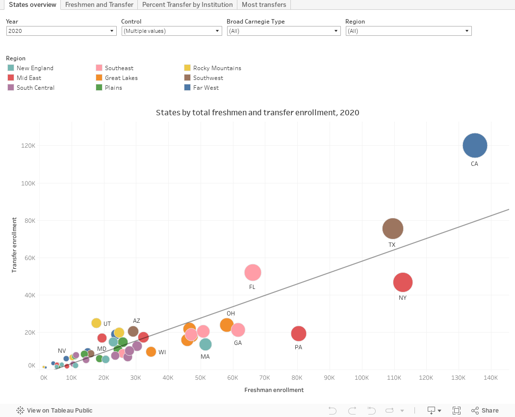
View 1 (using the tabs across the top) States Overview puts all the states on a scatter of freshman and transfer enrollment, so you can get a sense of which states are more transfer friendly. States above the line enroll more transfers relative to freshman than other states. You can filter by several variables using the dropdown boxes, and the data and the regression line will update to that set.
View 2 Freshman and Transfer arrays the actual counts on respective axes. I recommend a liberal use of the filters here, because a few outliers make the data points hard to separate. Try Baccalaureate colleges in the Rocky Mountains, for instance (Here's a Tableau tip you can apply anywhere on this visualization: On that view, because BYU-Idaho is such an outlier, you can click on it, and select "Exclude" and your view becomes much more helpful. Try it. Ctrl+Z will undo it if you want.)
View 3 Percent Transfer by Institution shows the percentage of new undergraduates in the fall who entered as transfers. Again, a liberal use of the filters will get you the data you want. The bars are colored by Carnegie type, which you can see in the tool tip when you hover.
And finally, View 4 Most Transfers just arrays institutions by the actual count of new fall transfers. Not surprisingly, the big, mostly online institutions dominate here, but you can use the filters to get yourself a better view. The bars are colored by the percentage of transfers in the incoming class.
See something interesting or not right? Let me know in the comments below.
Comments
Post a Comment