It's been a while since I wrote about diversity using Simpson's Diversity Index, which is an ecologist's way of looking at diversity of a population. Essentially, Simpson's gives us a number that helps us answer this question: If two members of a population are randomly selected, what is the probability that they will be from different groups? The formula for Simpson's creates a value between 0 and 1. If we use it to look at different racial or ethnic groups in colleges, we'd find that a college with a score of .62 is more diverse than one with a score of .51, for instance.
This is different than the way we think about diversity in higher education, which often means the percentage of students who are from underrepresented groups (Hispanic, or African-American for instance.) Using that classic definition, Florida A&M (with 86% African-American enrollment) would be very diverse; using Simpson's, it is the least diverse public institution in Florida. Both measures have some value, of course, depending on what you're interested in.
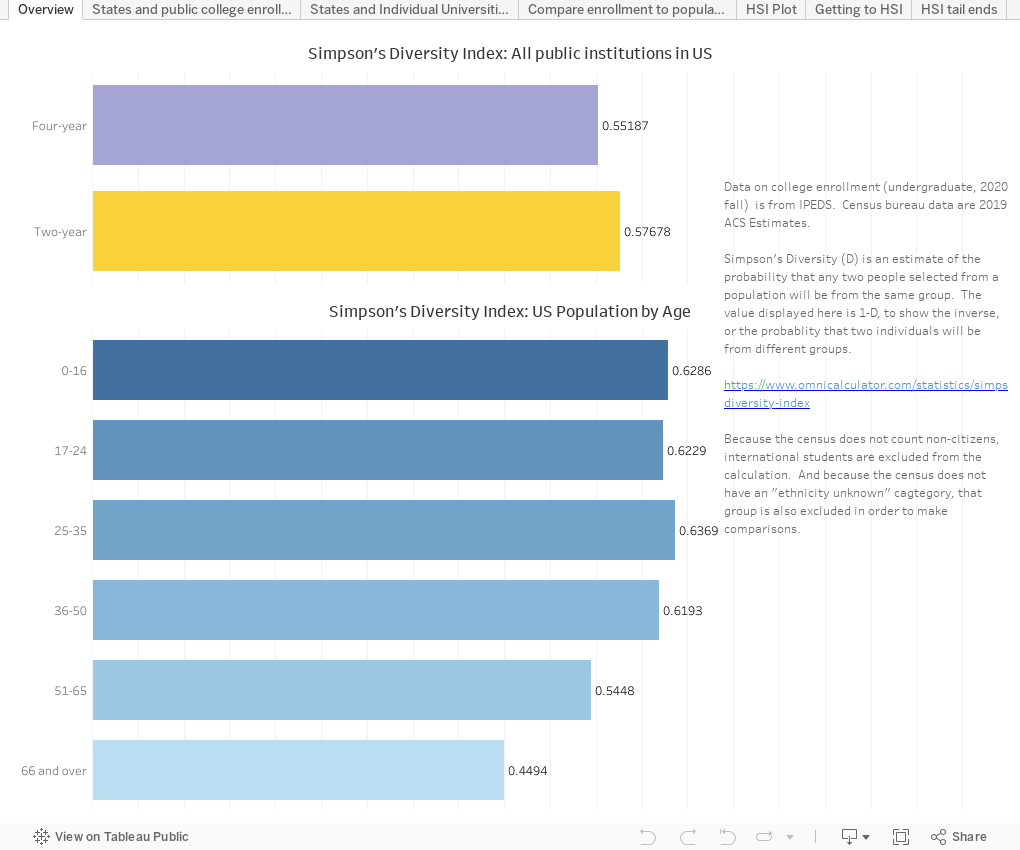
Two caveats here: This is 2020 undergraduate enrollment only. You could do it adding in graduate enrollment if you wanted, of course. And in order to compare colleges to state populations, I had to adjust the college data to include the same seven race or ethnicity categories as the US Census includes. Therefore, my calculations don't include international students or those with "ethnicity unknown."
If you use this in your work at a college or in your professional practice, I'll ask you to consider supporting the cost of Higher Ed Data Stories via the Buy Me A Coffee site. I'd appreciate it (but I ask you not to contribute if you are a high school counselor or parent, or if you've contributed in the past.)
So, the seven views, using the tabs across the top:
Overview shows all public institutions and their collective Simpson's Diversity (.55 for four-year institutions and .57 for two-year colleges). At the bottom, you see the diversity of the US population by age band. As you can see, younger populations are more diverse than older ones.
States and public college enrollment allows you to look at diversity in the traditional way, by showing ethnic breakouts of two- and four-year institutions, and state populations. You can choose to look at any single state for both; or all the land grant institutions, or any combination of Carnegie types, for the colleges.
States and individual universities again allows you to look at a single state and see each public institution and the diversity of the state's population. The view starts with Kansas, but you can select any state you want, and any single Carnegie type to make the view smaller. Bars on top are coded by Carnegie type.
Compare enrollment to population scatters the Simpson's Diversity of the state population (ages 17 to 24 are selected) to the public college enrollment, subject to your selections. Bubbles are colored by the region and sized by enrollment.
The last three views focus on the national designation of HSI, or Hispanic Serving Institutions, which confers some benefits on institutions with at least 25% Hispanic enrollment.
HSI Plot: Because there is no file of IDs of all the current HSIs, I created an estimator to color the bubbles, arrayed by total undergraduate enrollment and Hispanic enrollment. The reference line is at 25, and the yellow bubbles above the line are almost certainly HSIs (or HSI-eligible) and the red ones below the line are probably not. The gray ones are too close to call. To no one's surprise, probably, states with higher Hispanic populations (Texas, California, and Florida) are more likely to have HSIs and others (Maine, Michigan, and Nebraska) are not so likely.
Getting to HSI is an intellectual exercise: What if a college decided to pursue becoming an HSI not (as you would expect) by increasing Hispanic enrollment, but by decreasing non-Hispanic enrollment to make the percentage increase? These numbers are so wild I did hand calculations to make sure they were accurate. Colleges with orange bars and negative numbers show how many non-Hispanic students they would have to lose to get to 25% Hispanic; blue bars with positive numbers show colleges that have such high percentages of Hispanic students that they could add that number of non-Hispanic students and still be an HSI. For instance, Penn State would have to lose 44,391 non-Hispanic students while keeping its Hispanic population flat; Florida International could grow by 117,701 non-Hispanic students and still be an HSI.
Finally, HSI Tail Ends shows non-HSI-eligible colleges that enroll the most Hispanic students (University of Florida at 8,136, for instance) and which HSIs enroll the fewest Hispanic students (like Oklahoma Panhandle State University, with 349, for instance.) It sort of makes you wonder if there shouldn't be other ways for colleges to qualify as an HSI.
As always, let me know what you see here that jumps out at you.
Comments
Post a Comment