Yes, it may be that your enrollment is falling. Or, it may be rising. That could be bad, or it could be good. But if you do enrollment management for a living, and you talk to your trustees or alumni or anyone else who's interested, you might be interested in another metric that is perhaps more telling: Market share.
As I've written many times, there are factors outside of our control that influence how many students enroll in our institutions: Demographics, the economy, your appearance in the Final Four (or maybe not), things that happen on campus, bad media exposure, or even perhaps, the weather. The amount of the effect, of course is debatable, and it's too easy to get roped into the post hoc, ergo propter hoc fallacy. (When I worked in Chicago we once had an admitted student program on St. Patrick's Day, and a few drunk revelers found their way into the Student Center at 10 am and passed out, requiring an ambulance. The yield on that event was among the highest we'd ever had, contrary to what we expected.)
People don't always understand the externality of things. They think enrollment is a function of marketing spends and operations and lots of other things. To some extent it is, of course, but what if everyone in your region is showing the same trends as you in headcount. Is that all your fault, too?
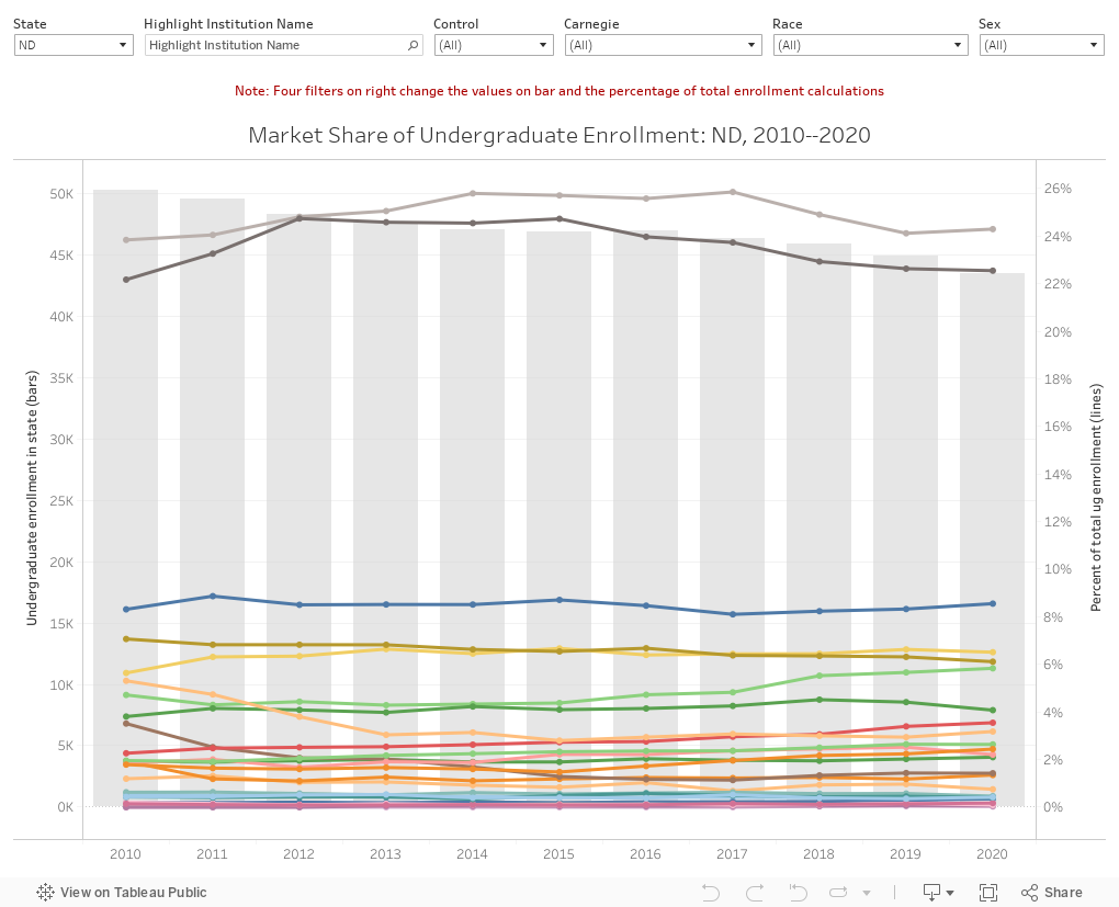
One way to control for these external factors is to look at market share, or the percentage of all enrollment that enrolls in your institution. It puts your numbers into a larger context of the environment in which you operate. That's what this visualization is meant to do.
If you want to share this with your trustees or senior leaders, feel free. Also feel free to chip in and buy me a coffee to support the time and software and hosting costs I incur with Higher Ed Data Stories. You can do so here (but not if you are a high school counselor or you work at a CBO.)
This is pretty simple: Choose a state and the light gray bars show the total undergraduate enrollment trend in that state from 2010 to 2020. The view starts with North Dakota, just for the sake of clarity, but you can choose any state you want. Some states, like California or New York, get crowded. In that case (or in any case, even a state like Rhode Island, for instance) you can use the filters.
Use the highlight function to, well, highlight any college on the display.
Do note that if you use the four filters on the right, they will filter the total number and the percentage calculation. So, for instance, if you choose Doctoral institutions on the Carnegie filter, the bar updates to show only that enrollment, and the percentage of total. Try it on North Dakota, and you'll see that of all the enrollment in doctoral institutions, about half goes to each of the two big doctoral institutions. This can help you see your market share among similar types of institutions, or to see your market share with certain populations (men, Hispanic students or International students, for instance.)
Hover on the lines between the bars to see the college name.
Here's a challenge for you: Find the institution with the highest market share in its state in 2020. (Hint: It's easier to dominate a state that's remote, more rural than urban, with fewer institutions and smaller populations. So you can skip California and New York in your search, for instance.)
Also, note that there are a few states with strange data points: Kennesaw State in Georgia, or Ivy Tech in Indiana, or what used to be Penn State but is now a consolidated campus system. These are few in number but hard to hunt down and repair. Take the data with a grain of salt.
As always, let me know what you see here, or if there are any questions that pop up.
Comments
Post a Comment