
Undergraduate application fees, 2020

I often wonder if we'd have an application fee if we were creating the admissions process from scratch today.  But we do, and there are actually some good reasons for doing so, not the least of which is that it costs a lot of money to process and manage applications.

Some people have wondered aloud whether app fees are simply a money-making enterprise for colleges, and the answer is yes, no, and sort of.  We can't think of universities as charities, and the people doing the work of admissions have to get paid; conceptually, it makes sense to charge a fee to applicants, since some substantial percentage of them will never pay tuition on your campus.

But it's too easy and incorrect to multiply applications by the app fee and assume that money flows into the admissions office.  Even at those universities where the streams are directed to admissions rather than into a general fund, some substantial percentage of students get a fee waiver.  And, as you'll see, about half of the post-secondary options in the US don't charge an application fee at all.

Do you like Higher Ed Data Stories, and do you use it in your work?  If so, you can help contribute to my webhosting and software costs and time by buying me a coffee.  Just click here. (If you're a high school counselor or work at a CBO, please skip right over that link.)

There are four views here;

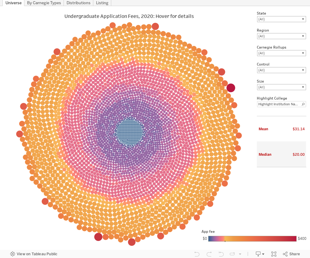
Universe shows all 6,400+ post secondary institutions in IPEDS, arrayed and colored by the 2020 undergraduate application fee.  Use the filters to limit the colleges displayed, and use the Highlight box to find one particular institution.

By Carnegie Types arrays app fees by, well, Carnegie types, using a box-and-whisker plot.  The points are colored by institutional control, and you can filter if you'd like.

Distributions shows a count for every application fee listed, and the number of colleges charging that amount.  As you can see, $0, $50, and $100 fees are the most popular, but some colleges charge $1, $2, or even--for some reason--$99.  (I didn't vet these, so of course there may be data entry errors by the people filling out the surveys.)

Finally, Listing is just a bar chart of all the fees.  Scroll down and see, or use the box at the top to filter to some institutions based on a key word.

Let me know if these views surprise you, or if you have other topics that might be of interest.


Comments

Popular posts from this blog

The Highly Rejective Colleges

If you're not following Akil Bello on Twitter, you should be.  His timeline is filled with great insights about standardized testing, and he takes great effort to point out racism (both subtle and not-so-subtle) in higher education, all while throwing in references to the Knicks and his daughter Enid, making the experience interesting, compelling, and sometimes, fun. Recently, he created the term " highly rejective colleges " as a more apt description for what are otherwise called "highly selective colleges."  As I've said before, a college that admits 15% of applicants really has a rejections office, not an admissions office.  The term appears to have taken off on Twitter, and I hope it will stick. So I took a look at the highly rejectives (really, that's all I'm going to call them from now on) and found some interesting patterns in the data. Take a look:  The 1,132 four-year, private colleges and universities with admissions data in IPEDS are incl

Freshman Migration, 1986 to 2020

(Note: I discovered that in IPEDS, Penn State Main Campus now reports with "The Pennsylvania State University" as one system.  So when you'd look at things over time, Penn State would have data until 2018, and then The Penn....etc would show up in 2020.  I found out Penn State main campus still reports its own data on the website, so I went there, and edited the IPEDS data by hand.  So if you noticed that error, it should be corrected now, but I'm not sure what I'll do in years going forward.) Freshman migration to and from the states is always a favorite visualization of mine, both because I find it a compelling and interesting topic, and because I had a few breakthroughs with calculated variables the first time I tried to do it. If you're a loyal reader, you know what this shows: The number of freshman and their movement between the states.  And if you're a loyal viewer and you use this for your work in your business, please consider supporting the costs

Doctoral recipients by bachelor's degree-granting institution, 2016-2020

Each time I publish this visualization I get a lot of traffic on the site, and I can see why. It shows all doctoral recipients (in 2016-2020) broken out by where they received their bachelor's degrees.  So, for instance, the top level view shows that UC Berkeley is the alma mater of more doctoral recipients than any other institution, followed by The University of Michigan and Cornell University. That would be interesting, but of course, these are large institutions, and it's natural to think lots of graduates will lead to lots of doctoral degrees.  No surprise there. So the visualization allows you to look at the types of colleges you or your students might want: Select a state, select public or private, select by Carnegie type if you wish.  You can also look at HBCUs if you'd like.  Most important, you can filter by doctoral degree, so if you want to see which institution sends the most students to doctorates in chemistry, you can do so. To head off the questions I get ev