I'm going to recommend you read this one closely before you dive into the visualization, as there is a lot of context necessary to understand it. It's mostly driven by the different ways the US Government counts its own citizens compared to the ways in which the US Government requires colleges to count its students.
As you probably know, when a student applies for admission (or any time after they enroll), they have the option of indicating race or ethnicity. If a student indicates Hispanic origin, regardless of their race, they're counted as Hispanic. If not, students can indicate a race or ethnicity (Asian, Native American, etc.).
In the census, "Hispanic" is not considered a race or ethnicity, but an origin. People who indicate they are of Hispanic origin are still asked to indicate a race on the census form.
Thus, when you want to compare the diversity of education to the diversity of the population, you're faced with comparing apples to oranges. And the age of college students is not bound by age, but it's fair to say most college students skew younger than the general population. The diversity of the US population varies by age (older populations are more White; younger populations are more Hispanic, for instance). So this is not perfect, by any means. But it's still interesting.
I started by downloading census bureau data (table 6) on population by age, ethnicity, and state. I then recoded it so that all people of Hispanic origin are counted as Hispanic; all people who are not of Hispanic origin are coded by their race. This allows us to more accurately compare populations to enrollment.
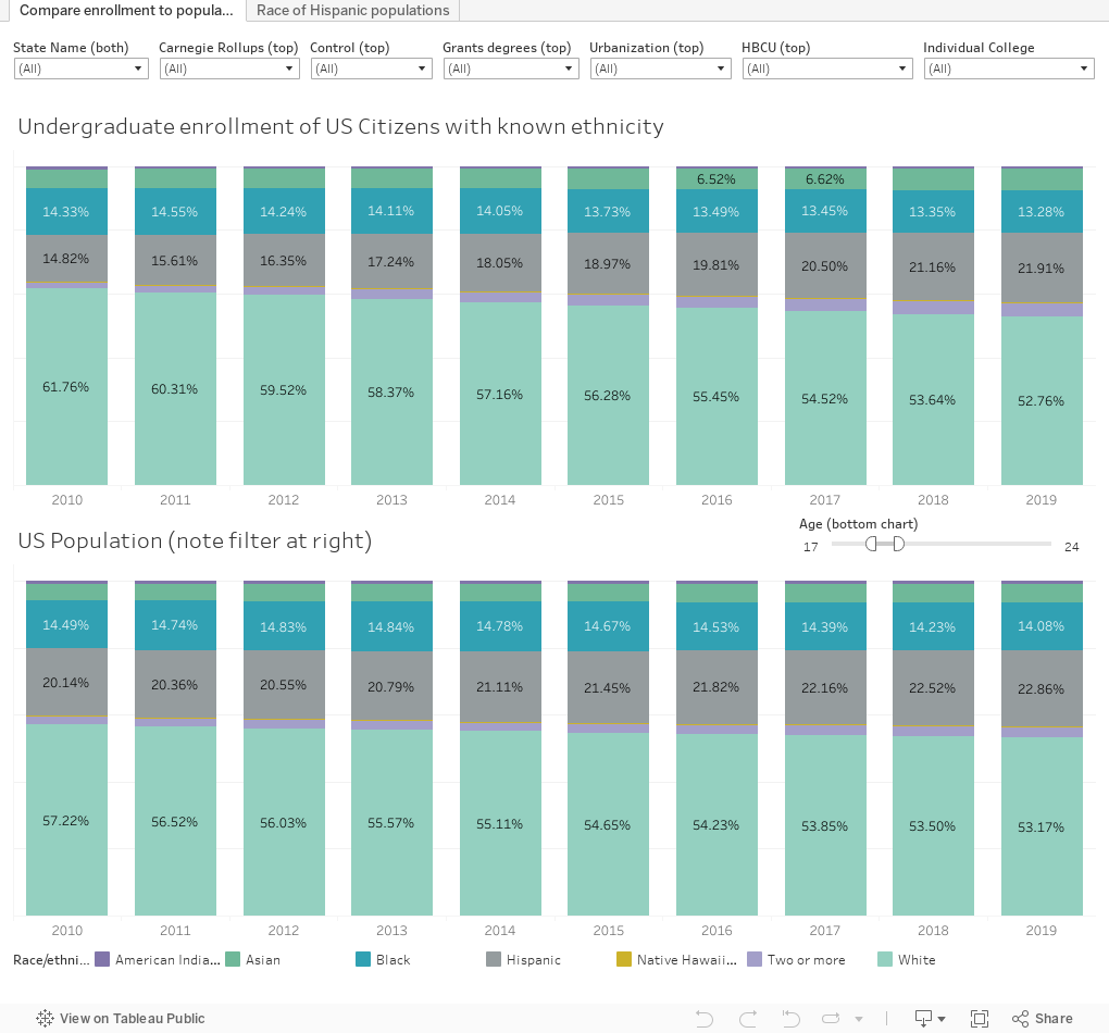
Then, I downloaded data on undergraduate enrollment at US Colleges and Universities from the IPEDS data center. And did my usual work on that file. It's important to note here that my enrollment data excludes international students and students with unknown ethnicity, since those two categories are not available in the census data.
And I started vizzing. If you use the information on Higher Ed Data Stories (for instance, for your college's strategic planning efforts) and want to support it, you can buy me a coffee here to help defray the costs of software, computers, time, and webhosting. Please don't donate if you're a high school counselor or you work at a CBO. Just enjoy.
The main view here compares undergraduate enrollment to the population, and for the latter, I've filtered to ages 17-24. You might want to change that, depending on your college, and accounting for the fact that these data are from 2019. The filter on the bottom chart helps you do that.
If you want to compare the enrollment profile of community colleges in Connecticut, or doctoral institutions in California, or baccalaureate colleges in Iowa, the top filters help you do that. The state filter works on both charts; all the others work on the top chart only.
If you want to compare a specific college to the population of its state, you need to use two filters: Select the college on the far right, and the state at far left.
And just for the sake of interest, I did a second chart that shows the census bureau data, breaking out Hispanic populations by race. I had never seen that displayed before, and since I found it interesting, I thought you would too. The effect of the predominantly White population among Hispanics in the US (if colleges counted the same way as the government does) would be to make colleges show more White students and fewer students from other racial groups.
Sorry for the long post. If you've been paying attention, race and ethnicity in the US is a complicated subject, and it can be even harder to visualize.
Comments
Post a Comment