
It's going to be hard

I've posted this visualization a few times, but never embedded it in a blog post.

Now's the time.  Teresa Watanabe of the LA Times tweeted this today.


So, for the foreseeable future, no one will need an ACT or SAT to gain admission to the UC or Cal State system campuses.  And in fact, testing won't help you get in, either.  For lots of students, there will be no need to test. Consider:

  • In 2018, about 275,000 students enrolled in California public four-year, and private, not-for-profit four year institutions (I'm using 2018 as it's the last good year prior to 2020's COVID-affected enrollment numbers).
  • Just under 250,000 of them came from California. 
  • California exported about 40,000 students to other states. About 90% of them (roughly 36,000) went to the types of colleges that might require the SAT or ACT (four-year public and private not-for-profits).
What this means: Fewer students testing in California.  Neighboring and western test-optional-friendly states like Oregon, Washington, and Arizona will likely see fewer tests as well.  This will probably mean fewer test dates, or fewer test centers.  Maybe reductions in school day SATs as well.

In short, taking the test could end up being more trouble than it's worth.  This will send some ripples through private colleges in California too.  They'll have to compete for students, but more important, they'll have to convince students that yes, Berkeley can make a good admissions decision without the SAT, but we need it.  Good luck.

And then there are those colleges that enroll a lot of students from California.  They'll have to make the same argument, and they'll be adding an extra step in the admission process.  Some will be able to get away with it, of course, if they choose to do so.  Others might find it risky.

If you use Higher Ed Data Stories in your work and you're not a high school counselor, you can support the visualizations and web hosting fees by buying me a beer at this link.  (Please, no high school counselors, and no repeat supporters.)

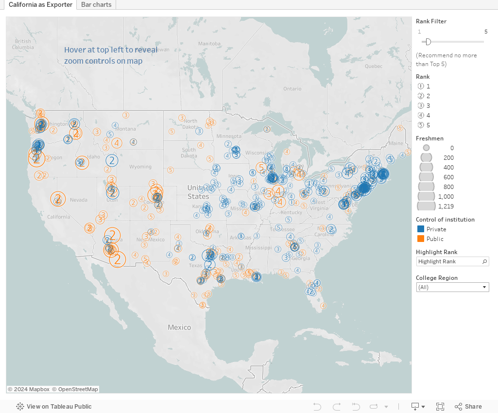
There are just two views below.  The first is a map that shows all the colleges who have California in their top five feeder states.  Orange marks are public, blue marks are private institutions.  The number shows the rank (a 3 means California is the third most represented state in the freshman class).  The size of the mark indicates how many freshmen enrolled in 2018.  Just hover for details.  If you want to just show the 1st most important, or the 2nd and 3rd, use the slider to limit that view.  

The second view is a bar series.  The bars from left are: The rank of California in the freshman class, the total number of freshmen, and the number from California in 2018.  For instance, at Oberlin, California was the #1 state in the freshmen class of 696, with 97 freshmen from California.

Think about what happens to a lot of those California apps if you go back to requiring tests.  And ask yourself if you feel lucky.

Comments

Popular posts from this blog

The Highly Rejective Colleges

If you're not following Akil Bello on Twitter, you should be.  His timeline is filled with great insights about standardized testing, and he takes great effort to point out racism (both subtle and not-so-subtle) in higher education, all while throwing in references to the Knicks and his daughter Enid, making the experience interesting, compelling, and sometimes, fun. Recently, he created the term " highly rejective colleges " as a more apt description for what are otherwise called "highly selective colleges."  As I've said before, a college that admits 15% of applicants really has a rejections office, not an admissions office.  The term appears to have taken off on Twitter, and I hope it will stick. So I took a look at the highly rejectives (really, that's all I'm going to call them from now on) and found some interesting patterns in the data. Take a look:  The 1,132 four-year, private colleges and universities with admissions data in IPEDS are incl

The College Finder

Note: A few people have commented on slow loading with the visualization.  If you have troubles, click here to be taken right to the visualization .  It should open in a new tab and you can follow along from there.    This is always a popular post with high school counselors, IECs, parents, and students who are looking for general information on degrees awarded, or a very specific combination of academic programs, location, and other institutional characteristics. It uses IPEDS data I downloaded as soon as I can when it became available (and before a looming government shutdown), and shows all 1,700 majors recognized by the federal government in the IPEDS system, using CIP codes, and the number of degrees awarded by college in any selected area. For instance, you might have a question about which college awards the most degrees in French Language and Literature: A few clicks, and you find it's the University of Arizona.  If you want a colder climate, choose the Great Lakes region,

Freshman Migration, 1986 to 2020

(Note: I discovered that in IPEDS, Penn State Main Campus now reports with "The Pennsylvania State University" as one system.  So when you'd look at things over time, Penn State would have data until 2018, and then The Penn....etc would show up in 2020.  I found out Penn State main campus still reports its own data on the website, so I went there, and edited the IPEDS data by hand.  So if you noticed that error, it should be corrected now, but I'm not sure what I'll do in years going forward.) Freshman migration to and from the states is always a favorite visualization of mine, both because I find it a compelling and interesting topic, and because I had a few breakthroughs with calculated variables the first time I tried to do it. If you're a loyal reader, you know what this shows: The number of freshman and their movement between the states.  And if you're a loyal viewer and you use this for your work in your business, please consider supporting the costs