Each year, NACUBO comes out with its discount study. If you're not a member, you get a nice press release and some pdfs. Even if you are a member, you only get a chance to buy the study. And that's enough for most people. But not for the readers of Higher Ed Data Stories, I've found.
Let's talk about discount for a minute. Different colleges talk about it differently, and even with this IPEDS data, it's impossible to be precise. But discount rate essentially calculates how much of a college's tuition revenue is offered to students as institutional financial aid.
But there are some nuances to it. Let's start with an example. College X enrolls 1,000 students, and it charges tuition of $40,000. That means gross revenue is $40,000,000. If that college offers institutional aid of $10,000,000 to students, its discount rate is 10/40 or 25%. If it offers $20,000,000 its discount is 20/40 or 50%. Sounds easy.
But the assumption is that this aid is unfunded. That is, for a typical student under that second scenario, college X says, "We'll charge you $40,000 and then apply a "scholarship" of $20,000, which is really an accounting transaction. In other words, we'll educate you for $20,000 in cash. We've discounted your tuition by 50%.
Some aid, but typically not much, at private colleges in America is funded aid. That is, it comes in as cash from another source, like an endowed scholarship. When that happens, College X might charge $40,000, offer $10,000 of unfunded discount, and then use $10,000 of funded aid from that scholarship. In this case, the college's net revenue is $30,000 ($10,000 from the scholarship in cash, and $20,000 from the student). The discount is then only 25%.
Of course, most colleges have students with a range of discounts, and they all add up to create one number, which tells you about the college, not individual students.
For this, we're going to assume that all institutional aid is unfunded, because, as I indicated, most of it is.
That net revenue piece is important, too. Colleges need cash to operate (amazingly, some people think "not-for-profit" means colleges don't care about money. They care.) If that student in the first scenario is from a upper-middle class family, the $20,000 might come from family money like savings or checking or a 529 plan. If that student comes from a very low-income family, the $20,000 might come from a Pell Grant of $6,000, a state grant of $5,000, a campus job, and a loan. Where that cash comes from makes no difference to the college. It's all cash, and it explains why colleges with lower tuitions can often afford to enroll lower-income students.
Is this helpful? Do you use it in your job? If so, I appreciate your supporting my costs to run Higher Ed Data Stories. You can do so by clicking this link. (If you're a high school counselor, or you work with a CBO counseling low-income students, you've already done enough. Just ignore the link.)
This visualization shows freshman discount, net revenue, and other data for the entering class of 2019, and should not be taken as a definitive snapshot of a college's financial health. You will find colleges on this visualization that don't make sense: College of the Ozarks, Cooper Union, Soka University, BYU, Webb Institute, Berea College, and others that have very different financial models. Try to ignore them.
I've started most of the views looking at Doctoral, Master's, and Baccalaureate institutions only. There are two other categories (Special focus and "Other") that expand the universe, but add some noise. These might include Baptist Seminaries, Rabbinical Schools, Art Institutes, or other colleges that operate under different models. Add them back in, or look at them by themselves.
One final thought: The year 2019 represents the last entering class before COVID, and will likely be the last year where these numbers are meaningful for a while, although it will be interesting to see how things change in 2020 and beyond. And I only do this for private colleges, because public institutions have different funding models and different university foundation relationships from state-to-state, and thus comparisons across borders are mostly meaningless (although you can do this yourself for publics within your state. I do.)
Now, the views:
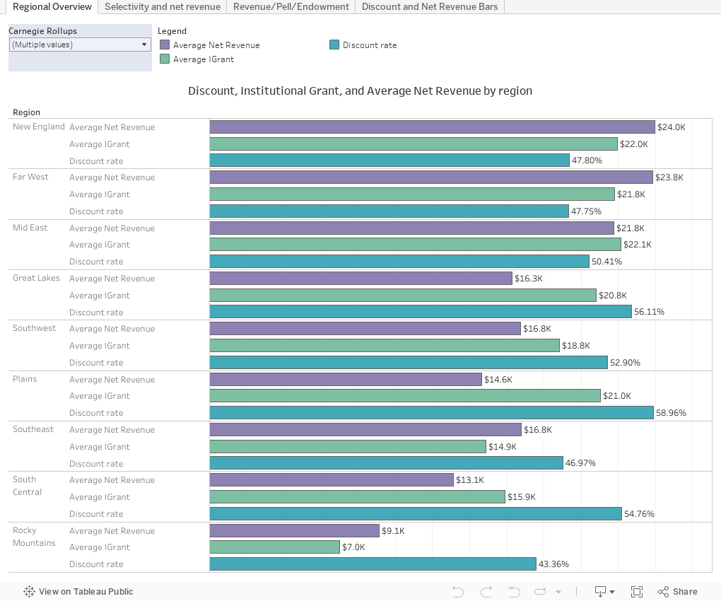
Regional Overview shows rolled up weighted Average Net Revenue, Average Discount rate, and Average Net Revenue per student. One filter at top left lets you choose different types of colleges.
Selectivity and Net Revenue shows the relationship between admit rates and net revenue. Two filters let you change the colleges displayed, and the Highlight box allows you to find a college in the mass. Just type any part of the name (typing "Dayton" and hitting enter will allow you to select from University of Dayton or two other colleges with Dayton in the name. The bubbles are sized by the 2018 undergrad enrollment.
Revenue/Pell/Endowment has the same filters, but displays in two dimensions Average Net Revenue and the Percentage of Freshmen with Pell. The bubbles are sized by the FY 2018 Endowment per FTE or full-time-equivalent student. And it's important to note that endowment, while nice to have, is not just a big pot of money you can use to write checks; sometimes endowment gifts can actually cost an institution money (but you'd still want more endowment, probably.)
Discount and Net Revenue Bars has the same filters, but displays each college's data for discount and net revenue. Cut down the view to compare similar institutions. You can sort the data by clicking on the icon at the bottom near the axis label. And you can always start fresh using the controls at bottom right.
If you're a young admissions or financial aid person, these are concepts you need to understand if you want to advance in your career. If you're a high school counselor or parent, this might be a good place to put your feet down, but it's not designed to offer individual student guidance.
Let me know what you see.
Comments
Post a Comment