This week our trade publication, The Chronicle of Higher Education took a quick look at changes in enrollment between Fall, 2019, and Fall, 2020. If you don't work in higher ed, you can read a few stories per month for free with a registration. If you do, there is no reason you shouldn't be a subscriber.
Something happened in the spring of 2019 that might have had a big effect on college enrollment. But we're never, of course, 100% sure just how much effect it had. But the subject is fascinating, of course, and I found the Chronicle's overview to be less than fulfilling. That's OK, of course. A good report will cause you to have more questions, not fewer.
So I went off to the IPEDS data center and downloaded data to look for myself. My methodology is a little different than CHE's (I included all colleges, whereas they excluded some smaller institutions). While the overall results are similar, the nuances--those things you find between the cracks are more interesting and compelling, and, I think, frankly surprising.
The visualization below has six views, and it was hard keeping it to six. Use the tabs across the top to navigate. But before you dive in, consider supporting my webhosting and other costs at this link, if you use this information in your job (excluding high school counselors, who should always consider this a part of my service to the profession). I appreciate your support and it keeps HEDS free for everyone.
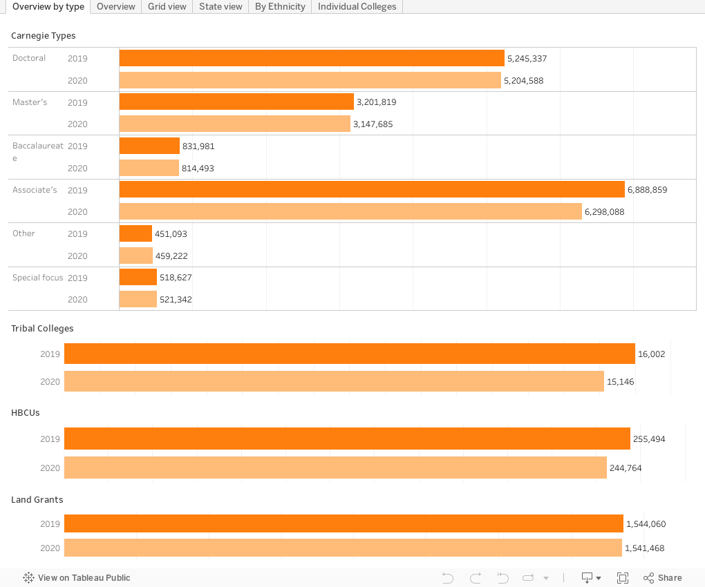
Overview by type is static, and just shows the highest level trends in overall headcount enrollment by broad categories.
Overview is more detailed and shows changes by sector: 2019 and 2020 enrollments, on the bar charts, and numeric and percentage change in text. You can select a state or ethnicities to drill down. As always, if you get stuck, you can hit the reset arrow (the arrow pointing to the line on its left) to reset.
Grid view gets a little more detailed. It starts at the highest level, showing the intersection of Sector and Ethnicity. For instance, you'll see that American Indian or Alaska Natives enrolled at four-year publics (top left box) dropped 2,515 students, or -5.2%. Note that I use IPEDS labels for ethnicity where possible.
State view aggregates to each individual state, but you can drill down with the filters. The bars are colored by region.
By Ethnicity breaks out enrollment at the top level by ethnicity, and then allows you to drill farther if you'd like. A couple of easy surprises for you: Asian enrollment overall went up in 2020, by 0.3%. While Hispanic enrollment dropped by 3.2%, click on the sector and choose only four-year publics, and see that it went up 2.15 at those institutions.
Individual Colleges allows you to select and compare individual institutions (I recommend no more than 12 for clarity). I've started the view for you with a dozen large, public universities. Use the boxes to de-select and add more. (Hint: Type any part of the name in the filter's box after clicking, and then hit enter. You'll see the results of a wildcard match, so typing "louis" will get you a list that includes Louisiana State and Saint Louis U.) Note that because prior years data for Penn State breaks out enrollment by campus and now the system reports as one, there might be a few confusing points. I've rolled the old Penn State Main Campus and The Pennsylvania State University into one, called "Penn State Main Campus.)
Two other notes: This is IPEDS Preliminary 2020 data, and might change when the final release comes out. And, while 2019 was of course the onset of the pandemic, it's not prudent to assume all enrollment change was driven by COVID-19. Community college enrollment, down almost 11% from 2019 to 2020, has been falling steadily since at least 2010, from 6.2M in 2010 to 5.3M in 2019.

Comments
Post a Comment