This weekend an article appeared in the Wall Street Journal about the enrollment of young men in colleges across America. If you don't have a subscription, James Murphy did a good job of summarizing and critiquing the story in this Twitter thread. If you're not proficient on Twitter, you can read the whole thread unrolled here.
The story cites 2020 enrollment data from the National Clearinghouse, which is fast; I only have data from IPEDS which trails a year, but is much more accurate and granular. There are two important points to make here: Not having data for 2020 means I can't document or leap to conclusions about what happened in 2020; and even if I did have 2020 data, one year's data point and discussions with a handful of people does not a trend make, so I wouldn't leap to conclusions anyway, even if I did have the data.
In fact, the trend has been a long time developing and a long time coming. That it's continuing is hardly surprising to anyone who's watched this for a while.
Promo: If you like Higher Ed Data Stories and use it in your job, you can support the effort by buying me a coffee (or a beer, or web hosting, as the case may be) via a click here. Public and private high school counselors should always use this site guilt-free, for free, for ever.
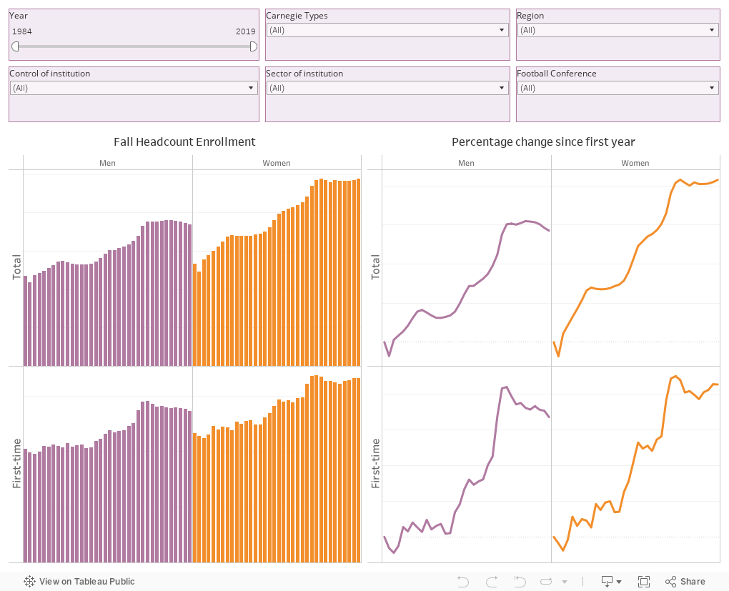
This visualization will show you the long term trends, breaking out headcount of men and women undergraduates on the left, and percentage change since the first year selected on the right. Both total (top) and new freshman students (bottom) are included.
As you can see, the trend is pretty clear, but is it surprising? Or troubling? Is it even uniform? The first two questions are for you to decide, but the answer to the third is pretty clear, as James's tweets indicated. Consider making a few clicks and watch the data change.
I recommend you click first on the "Sector" control and choose "Public, four-year and above." Or, if you want, click on "Big 10" under "Football Conference." Interesting?
Now reset (using the controls at the bottom) and choose "Public, two-year. In that case, you see a very different trend: Community colleges are in fact suffering, and have been for some time.
Note the spike in male (and female) enrollment right after the recession of 2007 and beyond. And note the falloff in the last several years. While most economists think there is no such thing as a "negative beta industry" (where business is better when the economy is worse and vice versa) higher education would be one of the contenders. And community colleges are on the leading edge of that trend.
There is, it seems, more economic opportunity for young men without a college degree than there is for women without a college degree. There always has been, of course, but 50 years ago educational opportunity for women was constrained, too. When that opportunity shrinks, college becomes more viable. When it expands, it becomes less important in the short term. There is some support in the data for this theory: On another blog I write, you can see that completions in Oregon community colleges, while falling overall, have been more dramatically affected in vocational and technical programs (use the second tab on the visualization here).
Girls are better students than boys at almost all levels (which makes you wonder why their standardized college admissions tests scores are lower, or is that just me?) so it's probably not surprising that they would pursue higher education--and persist--at higher rates.
Maybe we just need to figure out why they don't seem to like the Big 10.
Comments
Post a Comment